A manual for writers of research papers, theses, and dissertations, 7th edition - Kate L. Turabian 2007
Design tables and figures - Frame each graphic to help your readers understand it
Presenting evidence in tables and figures
Part I. Research and writing: from planning to production
Computer programs now let you create graphics so dazzling that you might be tempted to let your software make your design decisions. But readers don't care how elaborate your graphics look if they are confusing, misleading, or irrelevant to your point. You have to decide how to make them clear, focused, and relevant, then set your software to reflect that judgment. (See A.3.1 on creating and inserting tables and figures in your paper.)
8.3.1 Frame each graphic to help your readers understand it
A graphic representing complex numbers rarely speaks for itself. You must frame it so that readers know what to see in it and how to understand its relevance to your argument.
1. Introduce tables and figures with a sentence in your text that states how the data support your point. Include in that sentence any specific number that you want readers to focus on. (That number must also appear in the table or figure.)
2. Label every table and figure in a way that describes its data and, if possible, their important relationships. For a table, the label is called a title and is set flush left above; for a figure, the label is called a caption (or legend) and is set flush left below. (For the forms of titles and captions, see chapter 26.) Keep titles and captions short but descriptive enough to indicate the specific nature of the data and to differentiate every graphic from every other one.
![]() Avoid making the title or caption a general topic:
Avoid making the title or caption a general topic:
Not: Heads of households
But: Changes in one- and two-parent heads of households, 1970—2000
![]() Use noun phrases; avoid relative clauses in favor of participles:
Use noun phrases; avoid relative clauses in favor of participles:
Not: Number of families that subscribe to weekly news magazines
But: Number of families subscribing to weekly news magazines
![]() Do not give background information or characterize the implications of the data:
Do not give background information or characterize the implications of the data:
Not: Weaker effects of counseling on depressed children before professionalization of staff, 1995—2004
But: Effect of counseling on depressed children, 1995—2004
![]() Be sure labels distinguish graphics presenting similar data:
Be sure labels distinguish graphics presenting similar data:
Risk factors for high blood pressure among men in Maywood, Illinois
Risk factors for high blood pressure among men in Kingston, Jamaica
3. Put into the table or figure information that helps readers see how the data support your point. For example, if numbers in a table show a trend, and if the size of the change matters, add the change to the final column. Or if a line on a graph changes in response to an influence not mentioned on the graph, as in figure 8.3, add text to the image to explain it:
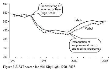
Although reading and math scores initially declined by almost 100 points following redistricting, that trend was substantially reversed by the introduction of supplemental math and reading programs.
4. Highlight the part of the table or figure that you want readers to focus on, particularly any number or relationship mentioned in the sentence introducing the table or figure. For example, we have to study table 8.3 closely to see how it supports the introductory sentence:
Most predictions about gasoline consumption have proved wrong.
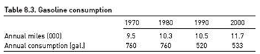
We need another sentence explaining how the numbers relate to the claim, a more informative title, and visual help that focuses us on what to see (table 8.4):
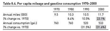
Gasoline consumption did not grow as many had predicted. Even though Americans drove 23 percent more miles in 2000 than in 1970, they used 32 percent less fuel.
The added sentence tells us how to interpret the key data in table 8.4, and the highlight tells us where to find it.