A manual for writers of research papers, theses, and dissertations, 7th edition - Kate L. Turabian 2007
Follow guidelines for tables, bar charts, and line graphs
Presenting evidence in tables and figures
Part I. Research and writing: from planning to production
TABLES. Tables with lots of data can seem especially dense, so keep their image and content as simple as possible.
![]() Order the rows and columns by a principle that lets readers quickly find what you want them to see. Do not automatically choose alphabetic order.
Order the rows and columns by a principle that lets readers quickly find what you want them to see. Do not automatically choose alphabetic order.
![]() Round numbers to relevant values. If differences of less than 1,000 don't matter, then 2,123,499 and 2,124,886 are irrelevantly precise.
Round numbers to relevant values. If differences of less than 1,000 don't matter, then 2,123,499 and 2,124,886 are irrelevantly precise.
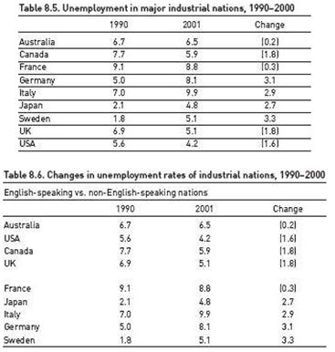
![]() Sum totals at the bottom of a column or at the end of a row, not at the top or left. Compare tables 8.5 and 8.6. Table 8.5 looks cluttered and its items aren't helpfully organized. In contrast, table 8.6 is clearer because its title is more informative, the table has less distracting visual clutter, and its items are organized to let us see patterns more easily.
Sum totals at the bottom of a column or at the end of a row, not at the top or left. Compare tables 8.5 and 8.6. Table 8.5 looks cluttered and its items aren't helpfully organized. In contrast, table 8.6 is clearer because its title is more informative, the table has less distracting visual clutter, and its items are organized to let us see patterns more easily.
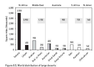
BAR CHARTS. Bar charts communicate as much by image as by specific numbers. Bars that seem to be arranged in no pattern imply no point, so if possible, group and arrange bars to give readers an image of an order that matches your point.
Most of the desert area in the world is concentrated in North Africa and the Middle East.
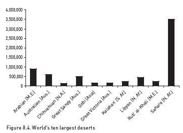
For example, look at figure 8.4 in the context of the explanatory sentence before it. The items are listed alphabetically, an order that doesn't help readers see the point. In contrast, figure 8.5 supports the claim with a coherent image.
Most of the desert area in the world is concentrated in North Africa and the Middle East.
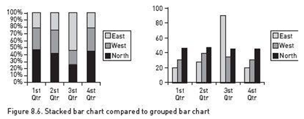
In standard bar charts, each bar represents 100% of a whole. But some times it helps readers if they can see specific values for parts of the whole. You can do that in two ways:
![]() A “stacked bar” chart subdivides the bars into proportional parts, as in the chart on the left in figure 8.6.
A “stacked bar” chart subdivides the bars into proportional parts, as in the chart on the left in figure 8.6.
![]() A “grouped bar” chart uses a separate bar for each part of the whole but groups the bars, as in the chart on the right in figure 8.6.
A “grouped bar” chart uses a separate bar for each part of the whole but groups the bars, as in the chart on the right in figure 8.6.
Use stacked bars only when it's more important to compare whole values than it is to compare their segments. Readers, however, can't easily gauge proportions by eye alone, so if you do use stacked bars, do this:
![]() Arrange segments in a logical order. If possible, put the largest segment at the bottom in the darkest shade.
Arrange segments in a logical order. If possible, put the largest segment at the bottom in the darkest shade.
![]() Label segments with specific numbers and connect corresponding segments with grey lines to help clarify proportions.
Label segments with specific numbers and connect corresponding segments with grey lines to help clarify proportions.
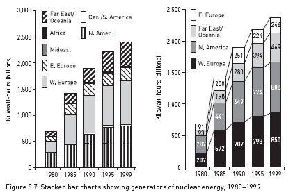
Figure 8.7 shows how a stacked bar chart is more readable when irrelevant segments are eliminated and those kept are logically ordered and fully labeled.
A grouped bar chart makes it easy for readers to compare parts of a whole, but difficult to compare different wholes because they must do mental arithmetic. If you group bars because the segments are more important than the wholes, do this:
![]() Arrange groups of bars in a logical order; if possible put bars of similar size next to one another (order bars within groups in the same way).
Arrange groups of bars in a logical order; if possible put bars of similar size next to one another (order bars within groups in the same way).
![]() Label groups with the number for the whole, either above each group or below the labels on the bottom.
Label groups with the number for the whole, either above each group or below the labels on the bottom.
Most data that fit a bar chart can also be represented in a pie chart. It is a popular choice in magazines, tabloids, and annual reports, but it's harder to read than a bar chart, and it invites misinterpretation because readers must mentally compare proportions of segments whose size is hard to judge in the first place. Most researchers consider them amateurish. Use bar charts instead.
LINE GRAPHS. Because a line graph emphasizes trends, readers must see a clear image to interpret it correctly. To create a clear image, do the following:
![]() Choose the variable that makes the line go in the direction, up or down, that supports your point. If the good news is a reduction (down) in high school dropouts, you can more effectively represent the same data as an increase in retention (up).
Choose the variable that makes the line go in the direction, up or down, that supports your point. If the good news is a reduction (down) in high school dropouts, you can more effectively represent the same data as an increase in retention (up).
![]() Plot more than six lines on one graph only if you cannot make your point in any other way.
Plot more than six lines on one graph only if you cannot make your point in any other way.
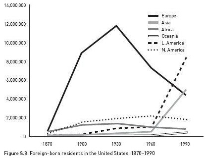
![]() Do not depend on different shades of gray to distinguish lines, as in figure 8.8.
Do not depend on different shades of gray to distinguish lines, as in figure 8.8.
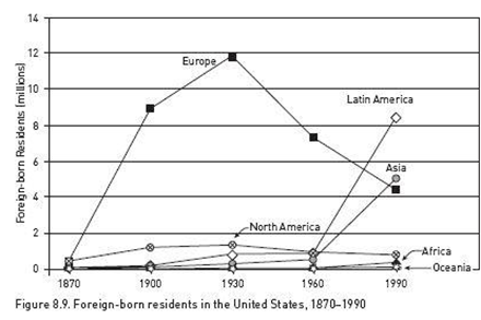
![]() When you create a line graph from only a few values, the lines will be less precise. So if you plot fewer than ten values (called data points), indicate that by adding a dot at each data point, as in figure 8.9. If those values are relevant, you can add numbers above the dots. Do not add dots to lines plotted from ten or more data points.
When you create a line graph from only a few values, the lines will be less precise. So if you plot fewer than ten values (called data points), indicate that by adding a dot at each data point, as in figure 8.9. If those values are relevant, you can add numbers above the dots. Do not add dots to lines plotted from ten or more data points.
Compare figure 8.8 and figure 8.9. Beyond its general story, figure 8.8 is harder to read because the shades of gray do not distinguish the lines well and because our eyes have to flick back and forth to connect lines with variables and their numbers. Figure 8.9 makes those connections clearer.
![]()
These different ways of showing the same data can be confusing. You can cut through that confusion if you first represent the same data in different ways (your computer program will usually let you do that quickly), and then ask someone unfamiliar with the data to judge the representations for impact and clarity. Be sure to introduce the representations with a sentence that states the claim you want the table or figure to support.