A manual for writers of research papers, theses, and dissertations, 7th edition - Kate L. Turabian 2007
Communicate data ethically
Presenting evidence in tables and figures
Part I. Research and writing: from planning to production
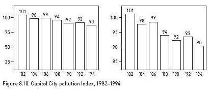
Your graphic must be not only clear, accurate, and relevant, but honest. It should not distort its data or their relationships to make a point. For example, the two bar charts in figure 8.10 display identical data, yet seem to send different messages. The full scale in the figure on the left creates a fairly flat slope, which makes the drop in pollution seem small. The vertical scale in the figure on the right, however, begins not at 0 but at 80. When a scale is that truncated, its drawn-out slope exaggerates small contrasts.
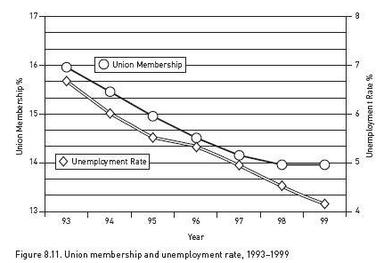
Graphs can also mislead by implying false correlations. Someone might claim that unemployment goes down when union membership goes down, and offer figure 8.11 as evidence. And indeed, union membership and the unemployment rate seem to move together so closely that a reader might infer they are causally related. But the scale for the left axis (union membership) differs from the scale for the right axis (the unemployment rate). The two scales have been deliberately skewed to make the two declines seem parallel. They may be related, but that distorted image doesn't prove it.
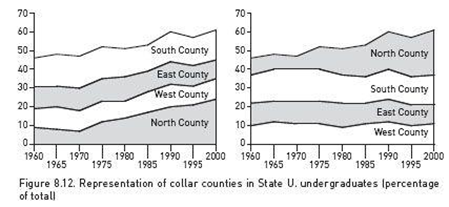
Graphs can also mislead when the image encourages readers to misjudge values. The two charts in figure 8.12 seem to communicate different messages, even though they represent exactly the same data. The charts in figure 8.12 are “stacked area” charts. Despite their visual differences, they represent the same data. These stacked area charts represent differences in values not by the angles of the lines, but by the areas between them. In both charts, the bands for south, east, and west are roughly the same width throughout, indicating little change in the values they represent. The band for the north, however, widens sharply, representing a large increase in the value it represents. In the chart on the left, readers are likely to misjudge the top three bands, because they are on top of the rising north band, making those bands seem to rise as well. In the chart on the right, on the other hand, those three bands do not rise because they are on the bottom. Now only the band for the north rises.
Here are four guidelines for avoiding visual misrepresentations:
![]() Do not manipulate a scale to magnify or reduce a contrast.
Do not manipulate a scale to magnify or reduce a contrast.
![]() Do not use a figure whose image distorts values.
Do not use a figure whose image distorts values.
![]() Do not make a table or figure unnecessarily complex or misleadingly simple.
Do not make a table or figure unnecessarily complex or misleadingly simple.
![]() If the table or figure supports a point, state it.
If the table or figure supports a point, state it.
![]()
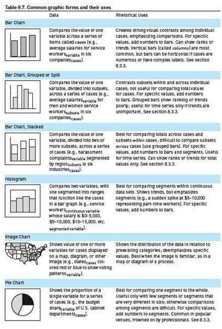
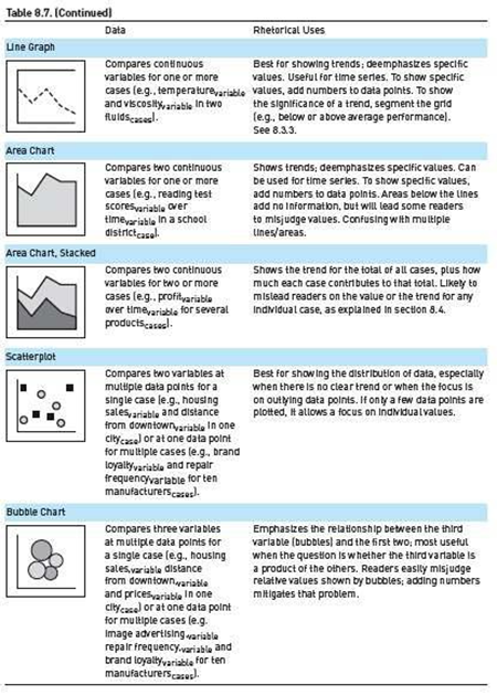
1. A note on terminology: The terms for graphics vary, so we will stipulate ours. In this chapter, we use the term graphics to refer to all visual representations of evidence. Another term sometimes used for such representations is illustrations. Traditionally, graphics are divided into tables and figures. A table is a grid with columns and rows that present data in numbers or words organized by categories. Figures are all other graphic forms, including graphs, charts, photographs, drawings, and diagrams. Figures that present quantitative data are divided into charts, typically consisting of bars, circles, points, or other shapes, and graphs, typically consisting of continuous lines. For a selection of common figures, see table 8.7.