A manual for writers of research papers, theses, and dissertations, Ninth edition - Kate L. Turabian 2018
Design tables and figures
Presenting evidence in tables and figures
Research and writing
Computer programs create graphics so dazzling that you might be tempted to let your software determine their design. But readers don’t care how fancy a graphic looks if it doesn’t communicate your point clearly. Here are some principles for designing effective graphics. To follow them, you may have to change default settings in your graphics software. (See A.3.1.3 and A.1.3.4 on creating and inserting tables and figures in your paper.)
8.3.1 Frame Each Graphic to Help Your Readers Understand It
A graphic representing complex numbers rarely speaks for itself. You must frame it to show readers know what to see in it and how to understand its relevance to your argument.
1. 1. Introduce tables and figures with a sentence in your text that states how the data support your point. Include in that sentence any specific number that you want readers to focus on. That number must also appear in the table or figure.
2. 2. Label every table and figure in a way that describes its data and, if possible, their important relationships. For a table, the label is called a title and is set flush left above the table; for a figure, the label is called a caption and is set flush left below the figure. (For the forms of titles and captions, see chapter 26.) Keep titles and captions short but descriptive enough to distinguish every graphic from every other one.
o ▪ Avoid making the title or caption a general topic:
Not Heads of households
But Changes in one- and two-parent heads of households, 1970—2010
o ▪ Use noun phrases; avoid relative clauses in favor of participles:
Not Number of families that subscribe to online streaming services
But Number of families subscribing to online streaming services
o ▪ Do not give background information or characterize what the data imply:
Not Weaker effects of counseling on depressed children before professionalization of staff, 1995—2014
But Effect of counseling on depressed children, 1995—2014
o ▪ Be sure labels distinguish graphics presenting similar data:
Not Risk factors for high blood pressure
But Risk factors for high blood pressure among men in Maywood, Illinois
Or Risk factors for high blood pressure among men in Kingston, Jamaica
3. 3. Insert into the table or figure information that helps readers see how the data support your point. For example, if numbers in a table show a trend and the size of the trend matters, indicate the change in a final column. If a line on a graph changes in response to an influence not mentioned on the graph, as in figure 8.3, add text to the image to explain it:
Although reading and math scores initially declined by almost 100 points following redistricting, that trend was substantially reversed by the introduction of supplemental math and reading programs.
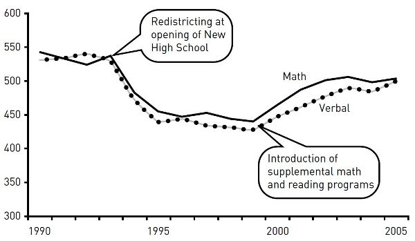
Figure 8.3. SAT scores for Mid-City High, 1990—2005
4. 4. Introduce the table or figure with a sentence that explains how to interpret it. Then highlight the part of the table or figure that you want readers to focus on, particularly any number or relationship mentioned in that introductory sentence. For example, we have to study table 8.3 to see how it supports the sentence that introduces it:
Most predictions about gasoline consumption have proved wrong.
We need another sentence explaining how the numbers support or explain the claim. We also need a more informative title and visual help that focuses us on what we should see in the table (table 8.4):
Gasoline consumption has not grown as predicted. Though Americans drove 28 percent more miles in 2010 than in 1970, they used 32 percent less fuel.
The added sentence tells us how to interpret the key data in table 8.4, and the highlight tells us where to find it.
Table 8.3. Gasoline consumption
|
1970 |
1980 |
1990 |
2000 |
2010 |
|
Annual miles (000) |
9.5 |
10.3 |
10.5 |
11.7 |
12.2 |
Annual consumption (gal.) |
760 |
760 |
520 |
533 |
515 |
Table 8.4. Per capita mileage and gasoline consumption, 1970—2010
|
1970 |
1980 |
1990 |
2000 |
2010 |
|
Annual miles (000) |
9.5 |
10.3 |
10.5 |
11.7 |
12.2 |
(% change vs. 1970) |
8.4% |
10.5% |
23.1% |
28.4% |
|
Annual consumption (gal.) |
760 |
760 |
520 |
533 |
515 |
(% change vs. 1970) |
(31.5%) |
(31.6%) |
(32.2%) |
8.3.2 Keep All Graphics as Simple as Their Content Allows
Some guides encourage you to put as much data as you can into a graphic. But readers want to see only the data relevant to your point, free of distractions.
✵ ▪ For All Graphics
1. 1. Include only relevant data. If you include data only for the record, label it accordingly and put it in an appendix (see A.2.3.2).
2. 2. Keep the visual impact simple.
§ ▪ Box a graphic only if you group two or more figures.
§ ▪ Use caution in employing shading or color to convey meaning. Even if you print your paper on a color printer or submit it as a PDF, it may be printed or copied later in black and white.
§ ▪ Do not use a three-dimensional background for a two-dimensional graphic. The added depth contributes nothing and can distort how readers judge values.
3. 3. Use clear labels.
✵ ▪ Label rows and columns in tables and both axes in charts and graphs. (See chapter 26 for punctuation and spelling in labels.)
✵ ▪ Use tick marks and labels to indicate intervals on the vertical axis of a graph (see fig. 8.4).
✵ ▪ If possible, label lines, bar segments, and the like on the image rather than in a caption set to the side. Do so in the caption only if labels would make the image too complex to read.
✵ ▪ When specific numbers matter, add them to bars, segments or segments in charts or to dots on lines in graphs.
✵ ▪ For Tables
1. ▪ Never use both horizontal and vertical lines to divide columns and rows. Use light gray lines if you want to direct your reader’s eyes in one direction to compare data or if the table is unusually complex.
2. ▪ For tables with many rows, lightly shading every fifth row will improve legibility.
3. ▪ To ensure legibility, do not use a font size smaller than eight points.
✵ ▪ For Charts and Graphs
1. ▪ Use grid lines only if the graphic is complex or readers need to see precise numbers. Make all grid lines light gray.
2. ▪ Color or shade lines or bars only to show a contrast. If you do use shading, make sure it does not obscure any text, and do not use multiple shades, which might not reproduce distinctly.
3. ▪ Plot data on three dimensions only when you cannot display the data in any other way and your readers are familiar with such graphs.
4. ▪ Never use iconic bars (for example, images of cars to represent automobile production). They can distort how readers judge values, and they look amateurish.
8.3.3 Follow Guidelines for Tables, Bar Charts, and Line Graphs
8.3.3.1 TABLES. Tables with lots of data can seem dense, so organize them to help readers.
✵ ▪ Order the rows and columns by a principle that lets readers quickly find what you want them to see. Do not automatically choose alphabetic order.
✵ ▪ Round numbers to relevant values. If differences of less than 1,000 don’t matter, then 2,123,499 and 2,124,886 are irrelevantly precise.
✵ ▪ Sum totals at the bottom of a column or at the end of a row, not at the top or left. Compare tables 8.5 and 8.6. Table 8.5 has a vague title and its items aren’t helpfully sorted. Table 8.6 is clearer because it has an informative title and its items are organized to let us see patterns more easily.
Table 8.5. Unemployment in major industrial nations, 2010—2015
|
2010 |
2015 |
Change |
|
Australia |
5.2 |
6.2 |
1.0 |
Canada |
8.0 |
6.9 |
(1.1) |
France |
9.7 |
10.7 |
1.0 |
Germany |
7.1 |
5.2 |
(1.9) |
Italy |
8.4 |
11.9 |
3.5 |
Japan |
5.0 |
3.9 |
(1.1) |
Sweden |
8.6 |
7.7 |
(0.9) |
United Kingdom |
7.9 |
6.6 |
(1.3) |
United States |
9.6 |
6.2 |
(3.4) |
Table 8.6. Changes in unemployment rates of industrial nations, 2010—2015
|
2010 |
2015 |
Change |
|
United States |
9.6 |
6.2 |
(3.4) |
Germany |
7.1 |
5.2 |
(1.9) |
United Kingdom |
7.9 |
6.6 |
(1.3) |
Canada |
8.0 |
6.9 |
(1.1) |
Japan |
5.0 |
3.9 |
(1.1) |
Sweden |
8.6 |
7.7 |
(0.9) |
Australia |
5.2 |
6.2 |
1.0 |
France |
9.7 |
10.7 |
1.0 |
Italy |
8.4 |
11.9 |
3.5 |
8.3.3.2 BAR CHARTS. Bar charts communicate as much by visual impact as by specific numbers. But bars arranged in no pattern imply no point. If possible, group and arrange bars to create an image that matches your point.
For example, look at figure 8.4 in the context of the explanatory sentence before it. The items are listed alphabetically, an order that doesn’t help readers see the point. In contrast, figure 8.5 supports the claim with a coherent image.
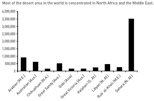
Figure 8.4. World’s ten largest deserts
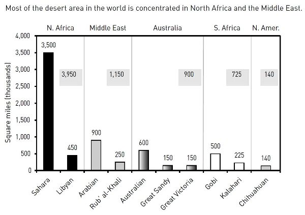
Figure 8.5. World distribution of large deserts
In standard bar charts, each bar represents 100 percent of a whole. But sometimes readers need to see specific values for parts of the whole. You can do that in two ways:
✵ ▪ Divide the bars into proportional parts, creating a “stacked bar,” as in the chart on the left in figure 8.6.
✵ ▪ Give each part of the whole its own bar, then group the bar into clusters, as in the chart on the right in figure 8.6.
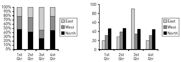
Figure 8.6. Stacked bar chart compared to grouped bar chart
Use stacked bars only when it’s more important to compare whole values than it is to compare their segments. Readers, however, can’t easily gauge proportions by eye alone, so if you do use stacked bars, do this:
✵ ▪ Arrange segments in a logical order. If possible, put the largest segment at the bottom in the darkest shade.
✵ ▪ Label segments with specific numbers and connect corresponding segments with gray lines to help clarify proportions.
Figure 8.7 shows how a stacked bar chart is more readable when irrelevant segments are eliminated and those kept are logically ordered and fully labeled.
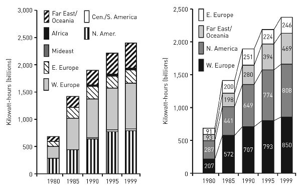
Figure 8.7. Stacked bar charts showing generators of nuclear energy, 1980—1999
A grouped bar chart makes it easy for readers to compare parts of a whole, but difficult for them to compare different wholes because they must do mental arithmetic. If you group bars because the segments are more important than the wholes, do this:
✵ ▪ Arrange groups of bars in a logical order; if possible, put bars of similar size next to one another (order bars within groups in the same way).
✵ ▪ Label groups with the number for the whole, either above each group or below the labels on the bottom.
Most data that fit a bar chart can also be represented in a pie chart. Pie charts are popular in magazines, tabloids, and annual reports, but they’re harder to read than bar charts and invite misinterpretation because readers must compare proportions of segments whose sizes are often hard to judge. Most researchers avoid pie charts, especially to convey quantitative data. They use bar charts.
8.3.3.3 LINE GRAPHS. Because a line graph emphasizes trends, readers must see a clear image to interpret it correctly. Do the following:
✵ ▪ Choose the variable that makes the line go in the direction, up or down, that supports your point. If the good news is a reduction (down) in high school dropouts, you can more effectively represent the same data as an increase in retention (up). If you want to emphasize bad news, find a way to represent your data as a falling line.
✵ ▪ Plot more than six lines on one graph only if you cannot make your point in any other way.
✵ ▪ Do not depend on different shades of gray to distinguish lines, as in figure 8.8.
✵ ▪ If you plot fewer than ten or so values (called data points), indicate each with a dot, as in figure 8.9. If those values are relevant, you can add numbers above the dots. Do not add dots to lines plotted from ten or more data points.
Compare figure 8.8 and figure 8.9. Beyond its general story, figure 8.8 is harder to read because the shades of gray do not distinguish the lines well and because our eyes have to flick back and forth to connect lines with variables and their numbers. Figure 8.9 makes those connections clearer.
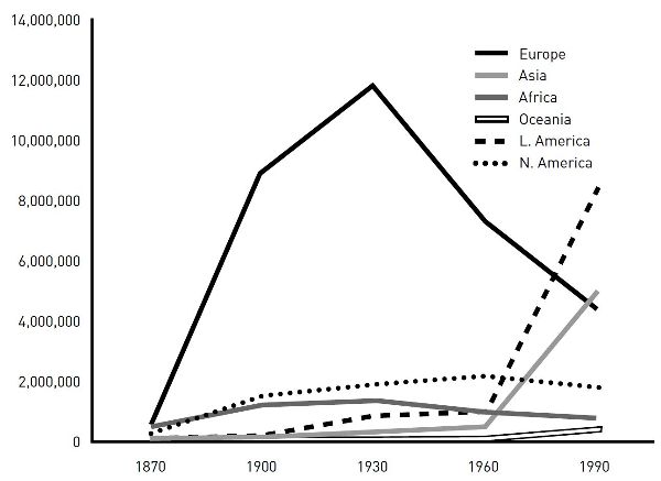
Figure 8.8. Foreign-born residents in the United States, 1870—1990
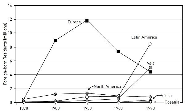
Figure 8.9. Foreign-born residents in the United States, 1870—1990
These different ways of showing the same data can be confusing. To cut through that confusion, test different ways of representing the same data. (Your software program will usually let you do that quickly.) Then ask someone not familiar with your data to judge the representations for their impact and clarity. Be sure to introduce your graphics with a sentence that states the claim you want the figures to support.