A manual for writers of research papers, theses, and dissertations, Ninth edition - Kate L. Turabian 2018
Communicating data ethically
Presenting evidence in tables and figures
Research and writing
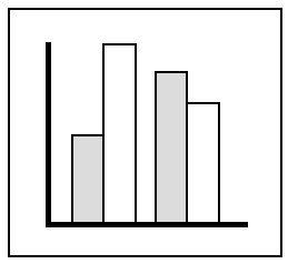
Your graphics must be not only clear and accurate but also honest. Do not distort the image of your data to make a point. For example, the two bar charts in figure 8.10 display identical data yet send different messages. The 0—100 scale in the figure on the left creates a fairly flat slope, which makes the drop in pollution seem small. The vertical scale in the figure on the right, however, begins not at 0 but at 80. When a scale is truncated, its sharper slope exaggerates small contrasts.
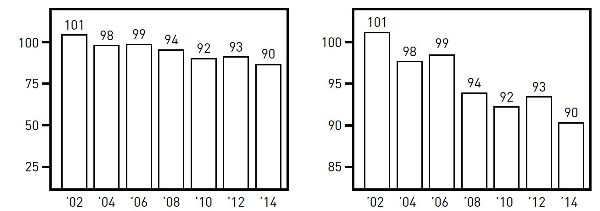
Figure 8.10. Capitol City pollution index, 2002—2014
Graphs can also mislead by implying false correlations. Someone claiming that unemployment goes down when union membership goes down might offer figure 8.11 as evidence. And indeed, in that graph, union membership and the unemployment rate do seem to move together so closely that a reader might infer one causes the other. But the scale for the left axis in figure 8.11 (union membership) differs from the scale for the right axis (unemployment rate). The two scales have been deliberately skewed to make it seem the two downward trends are related. They may be, but the distorted image doesn’t prove it.
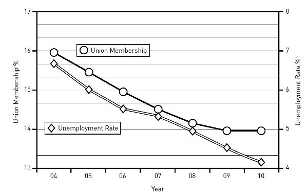
Figure 8.11. Union membership and unemployment rate, 2004—2010
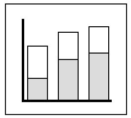
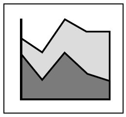
Graphs can also mislead when the image encourages readers to misjudge values. The two charts in figure 8.12 represent exactly the same data but seem to communicate different messages. These “stacked area” charts represent differences in values not by the angles of the lines but by the areas between them. In both charts, the bands for south, east, and west are roughly the same width throughout, indicating little change in the values they represent. The band for the north, however, widens sharply, representing a large increase in the value it represents. In the chart on the left, readers are likely to misjudge the top three bands because they are on top of the rising north band, making those bands seem to rise as well. In the chart on the right, on the other hand, those three bands do not rise because they are on the bottom. Here only the band for the north rises.
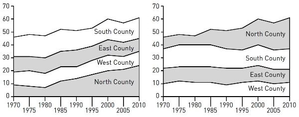
Figure 8.12. Representation of collar counties among State U. undergraduates (percentage of total)
Here are four guidelines for avoiding visual misrepresentations:
✵ ▪ Do not manipulate a scale to magnify or reduce a contrast.
✵ ▪ Do not use a figure whose image distorts values.
✵ ▪ Do not make a table or figure unnecessarily complex or misleadingly simple.
✵ ▪ If the table or figure supports a point, state it.
Table 8.7. Common graphic forms and their uses
|
Data |
Rhetorical uses |
|
|
Bar chart |
||
|
Compares the value of one variable across a series of items called cases (e.g., average salaries for service workervariable in six companiescases). |
Creates strong visual contrasts among individual cases, emphasizing comparisons. For specific values, add numbers to bars. Can show ranks or trends. Vertical bars (called columns) are most common, but bars can be horizontal if cases are numerous or have complex labels. See section 8.3.3.2. |
|
Bar chart, grouped or split |
||
|
Compares the value of one variable, divided into subsets, across a series of cases (e.g., average salariesvariable for men and women service workerssubsets in six companiescases). |
Contrasts subsets within and across individual cases; not useful for comparing total values for cases. For specific values, add numbers to bars. Grouped bars show ranking or trends poorly; useful for time series only if trends are unimportant. See section 8.3.3.2. |
|
Bar chart, stacked |
||
|
Compares the value of one variable, divided into two or more subsets, across a series of cases (e.g., harassment complaintsvariable segmented by regionsubsets in six industriescases). |
Best for comparing totals across cases and subsets within cases; difficult to compare subsets across cases (use grouped bars). For specific values, add numbers to bars and segments. Useful for time series. Can show ranks or trends for total values only. See section 8.3.3.2. |
|
Histogram |
||
|
Compares two variables, with one segmented into ranges that function like the cases in a bar graph (e.g., service workerscontinuous whose salary is $0—5,000, $5—10,000, $10—15,000, etc.segmented variable). |
Best for comparing segments within continuous data sets. Shows trends but emphasizes segments (e.g., a sudden spike at $5—10,000 representing part-time workers). For specific values, add numbers to bars. |
|
Image chart |
||
|
Shows value of one or more variables for cases displayed on a map, diagram, or other image (e.g., statescases colored red or blue to show voting patternsvariable). |
Shows the distribution of the data in relation to preexisting categories; deemphasizes specific values. Best when the image is familiar, as in a map or diagram of a process. |
|
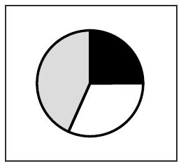
Pie chart |
||
|
Shows the proportion of a single variable for a series of cases (e.g., the budget sharevariable of US cabinet departmentscases). |
Best for comparing one segment to the whole. Useful only with few segments or segments that are very different in size; otherwise comparisons among segments are difficult. For specific values, add numbers to segments. Common in popular venues, frowned on by professionals. See 8.3.3.2. |
|
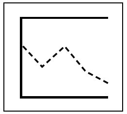
Line graph |
||
|
Compares continuous variables for one or more cases (e.g., temperaturevariable and viscosityvariable in two fluidscases). |
Best for showing trends; deemphasizes specific values. Useful for time series. To show specific values, add numbers to data points. To show the significance of a trend, segment the grid (e.g., below or above average performance). See 8.3.3.3. |
|
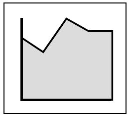
Area chart |
||
|
Compares two continuous variables for one or more cases (e.g., reading test scoresvariable over timevariable in a school districtcase). |
Shows trends; deemphasizes specific values. Can be used for time series. To show specific values, add numbers to data points. Areas below the lines add no information and will lead some readers to misjudge values. Confusing with multiple lines/areas. |
|
Area chart, stacked |
||
|
Compares two continuous variables for two or more cases (e.g., profitvariable over timevariable for several productscases). |
Shows the trend for the total of all cases, plus how much each case contributes to that total. Likely to mislead readers on the value or the trend for any individual case, as explained in section 8.4. |
|
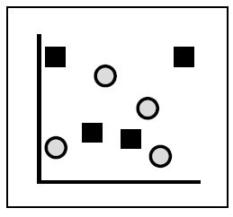
Scatterplot |
||
|
Compares two variables at multiple data points for a single case (e.g., housing salesvariable and distance from downtownvariable in one citycase) or at one data point for multiple cases (e.g., brand loyaltyvariable and repair frequencyvariable for ten manufacturerscases). |
Best for showing the distribution of data, especially when there is no clear trend or when the focus is on outlying data points. If only a few data points are plotted, it allows a focus on individual values. |
|
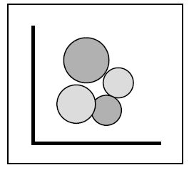
Bubble chart |
||
|
Compares three variables at multiple data points for a single case (e.g., housing sales,variable distance from downtown,variable and pricesvariable in one citycase) or at one data point for multiple cases (e.g., image advertising,variable repair frequency,variable and brand loyaltyvariable for ten manufacturerscases). |
Emphasizes the relationship between the third variable (bubbles) and the first two; most useful when the question is whether the third variable is a product of the others. Readers easily misjudge relative values shown by bubbles; adding numbers mitigates that problem. |
1. A note on terminology: In this chapter we use the term graphics to refer to all visual representations of evidence. Another term sometimes used for such representations is illustrations. Traditionally, graphics are divided into tables and figures. A table is a grid with columns and rows that present data in numbers or words organized by categories. Figures are all other graphic forms, including graphs, charts, photographs, drawings, and diagrams. Figures that present quantitative data are divided into charts, typically consisting of bars, circles, points, or other shapes, and graphs, typically consisting of continuous lines. For a survey of common figures, see table 8.7.