Success in Academic Writing - Trevor Day 2018
Posters
Planning and structuring more assignments
Designing posters at A1, A2 or A3 size is sometimes used as an assignment on undergraduate or postgraduate programmes. As with designing slides, seeking to include too much detail is a common failing. Simple yet elegant design often works well. As always, the guidance given here should be tempered in the light of the specific guidelines for your assignment.
Guidelines for designing posters:
✵If permissible, consider using a provocative title to capture audience interest, e.g. What makes students lazy?
✵Author’s details are usually given just beneath the title or at the bottom of the poster.
✵Use letters at least 25 mm tall for headings, at least 15 mm tall for subheadings, and 5 mm plus for body text.
✵Non-serif fonts are popular in posters and make for easy reading. Don’t overuse different fonts and sizes (6-8 styles are usually sufficient).
✵Bear in mind how your design might relate to your subject matter.
✵Background images, unusual shapes as text boxes, flow diagrams, or scans or photos of examples can show the audience what you are describing rather than you having to tell them in words.
✵Use colour to set a tone and highlight your poster’s features. Make sure that your text contrasts well with any background colour.
✵Use fewer than 500 words (perhaps far fewer).
✵Employ short sentences, bullet points, questions, quotes, photos, illustrations, graphs, charts and summary tables to get your points across.
✵Avoid overcrowding your poster. Leave clear spaces.
✵A poster is often read from top left to bottom right. Do you want the reader to follow this pattern, or move in a zig zag pattern or by reading down a column? Or do you want the audience to read the poster in a different way? Provide clear headings and signposting, perhaps using numbers or arrows, to help your audience navigate through the poster (Figure 6.2).
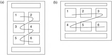
Figure 6.2 Whether your poster’s layout is (a) portrait, or (b) landscape, it is usually helpful to provide signposting to guide your audience through the poster’s elements in the right order
Be different, but not too different
Providing you meet the assignment guidelines, what can you say in words or show through design that will make your poster stand out from the crowd? You can be provocative or humorous as long as your ideas are well judged for your audience and you deliver them in style.