Practical argument: A text and anthology - Laurie G. Kirszner, Stephen R. Mandell 2019
Reading and responding to visual arguments
Reading and responding to arguments
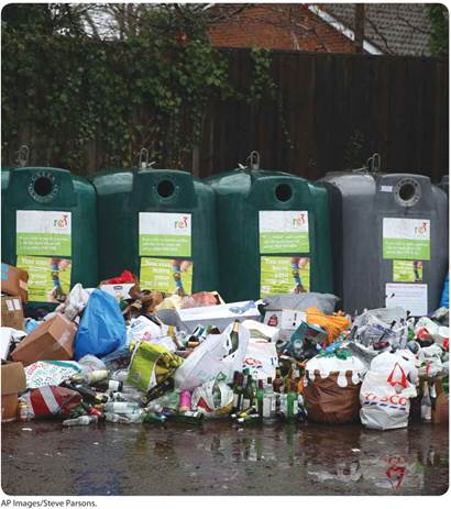
When recyclable materials are mishandled, such as being dumped near recycling containers rather than placed inside them as in this photo, the process can break down.
AT ISSUE
Does Recycling Really Accomplish Anything? (continued)
In Chapter 2, you read essays focusing on the advantages and limitations of recycling. Now, you will be introduced to a variety of visual texts that offer additional insights into this issue. At the same time, you will learn how to use the critical-reading strategies that you practiced in Chapter 2 to help you to interpret visual arguments and to use visuals as springboards for discussion and writing or as sources in your essays.
A visual argument can be an advertisement, a chart or graph or table, an infographic, a diagram, a web page, a photograph, a drawing, a cartoon, or a painting. Like an argumentative essay, a visual argument takes a position. Unlike an argumentative essay, however, a visual argument communicates its message (and offers evidence to support that message) largely through images rather than words.
When you approach a visual argument—particularly one that will be the subject of class discussion or writing—you should do so with a critical eye. Your primary goal is to understand the point that the creator of the visual is trying to make, but you also need to understand how the message is conveyed. In addition, you need to evaluate whether the methods used to persuade the audience are both logical and convincing.
VISUALS VERSUS VISUAL ARGUMENTS
Not every visual is an argument; many simply present information. For example, a diagram of a hunting rifle, with its principal parts labeled, tells viewers what the weapon looks like and how it works. However, a photo of two toddlers playing with a hunting rifle could make a powerful argument about the need for gun safety. Conversely, a photo of a family hunting trip featuring a teenager proudly holding up a rifle while his parents look on approvingly might serve as a positive argument for gun ownership.
Reading Visual Arguments
As you learned in Chapter 2, being a critical reader involves responding actively to the text of an argument. The active reading strategies that you practiced in Chapter 2—previewing, close reading, highlighting, and annotating—can also be applied to visual arguments.
When you approach a visual argument, you should look for clues to its main idea, or message. Some visuals, particularly advertising images, include words (sometimes called body copy) as well, and this written text often conveys the main points of the argument. (Such visuals are considered multimodal because they combine two methods of communication—in this case, words and images.) Apart from words, however, the images themselves can help you understand the visual’s purpose, its intended audience, and the argument that it is making.
COMPREHENSION CLUES
Focusing on the following elements can help you to understand a visual argument:
§ The individual images
§ The relative distance between images (close together or far apart)
§ The relative size of the images
§ The relationship between images and background
§ The use of empty space
§ The use of color and shading (for example, contrast between light and dark)
§ If people are pictured, their activities, gestures, facial expressions, positions, body language, dress, and so on
APPEALS: LOGOS, PATHOS, AND ETHOS
As you study a visual argument, you should consider the appeal (or appeals) that the visual uses to convince its audience:
§ An ad produced by Mothers Against Drunk Drivers (MADD) that includes statistics about alcohol-related auto fatalities might appeal to logic (logos).
§ Another MADD ad could appeal to the emotions (pathos) by showing photographs of an accident scene.
§ Still another ad could appeal to authority (ethos) by featuring a well-known sports figure warning of the dangers of drunk driving.
(For more on these appeals, see pp. 14—21.)
The following photograph presents a strong visual argument, using a powerful image to make an emotional appeal to those concerned about the environment. This photograph appeared on the cover of the June 2018 issue of National Geographic magazine.
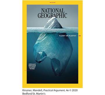
The photo shows a plastic bag floating like an iceberg in an ocean. Only a small portion of the bag is visible above the water while a larger portion lies submerged. Text reads, Planet or Plastic? 18 billion pounds of plastic ends up in the ocean each year. And that’s just the tip of the iceberg.
The visual below highlights one dramatic image: a floating plastic bag shaped like an iceberg. The placement of this image in the center of the visual emphasizes its importance, and the contrast between the small portion of the image protruding from the water and the large submerged portion makes the visual’s message clear: the environmental problems we see today are only “the tip of the iceberg.” The clear demarcation of the gray sky and the blue ocean confirms the contrast between the placid surface and the unseen threat that lies beneath it.
The text that accompanies the image is brief and to the point. At the top right, the stark choice that confronts us—“planet or plastic?”—is expressed as a dilemma that seems to have only one reasonable solution. At the bottom left, in smaller type, two succinct sentences spell out the problem, reinforcing the conflict between the natural world (ocean) and the pollution (plastic) that threatens to destroy it.
Because it presents only one image, and because the subject matter is probably familiar to most people, this visual is easy to understand. Its powerful image and text are not difficult to interpret, and the visual’s warning is straightforward: if we do not do something about the refuse that is polluting our oceans, we will risk losing them. The visual’s accessibility (as well as its obvious emotional appeal) suggests that it is aimed at a wide general audience rather than, for example, environmentalists.
The visual might have been created for any of several purposes. Most obviously, it is intended to raise awareness and, perhaps, to inspire action—for example, to encourage readers to use fewer plastic bags and to dispose of them responsibly. In addition, because it is a magazine cover, it is also intended to encourage people to buy, and to read, this issue of National Geographic.
Now, turn your attention to the following bar graph, “U.S. Better at Recycling Some Things Than Others”; it appears in the article “Five Charts That Explain Why Recycling Efforts May Not Result in Zero Waste,” published in the online newsletter Waste Dive. Unlike the National Geographic cover, which appeals to the emotions, this graph appeals to logic by providing evidence to support the article’s position: that recycling is not a magic cure.
The graph uses a simple, open design and clearly labels each category it lists, presenting them in a logical order. It provides readily accessible information, in the form of percentages, to show which kinds of waste are most (and least) efficiently disposed of. The main idea, or message, this graph conveys is summarized in its boldfaced title: “U.S. better at recycling some things than others.” This in turn supports the thesis of the article in which the graph appeared: that despite Americans’ best efforts at recycling, achieving “zero waste” may not be an achievable goal.
This idea might surprise those readers who assume that recycling can lead to the elimination of the waste that pollutes our environment. In a sense, then, this graph can be seen as a refutation of a commonly held assumption. Because the graph (like the article in which it appeared) presents information intended to challenge the audience’s probable assumptions, its purpose seems to be not just to inform readers but perhaps also to change the way they look at recycling.
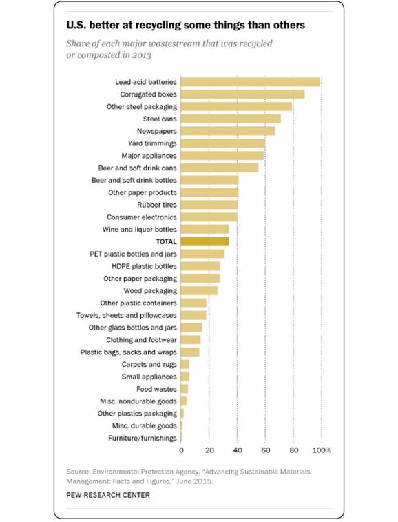
The approximate data read as follows. Lead-acid batteries 98 percent, Corrugated boxes 90 percent, Other steel packaging 79 percent, Steel cans 70 percent, Newspapers 65 percent, Yard trimmings 60 percent, Major appliances 59 percent, Beer and soft drink cans 55 percent, Beer and soft drink bottles 41 percent, Other paper products 41 percent, Rubber tires 40 percent, Consumer electronics 40 percent, Wine and liquor bottles 35 percent, Total 35 percent, P E T plastic bottles and jars 30 percent, H D P E plastic bottles 28 percent, Other paper packaging 28 percent, Wood packaging 27 percent, Other plastic containers 19 percent, Towels, sheets and pillowcases 19 percent, Other glass bottles and jars 18 percent, Clothing and footwear 18 percent, Plastic bags, sacks and wraps 17 percent, Carpets and rugs 8 percent, Small appliances 8 percent, Food waste 7 percent, Miscellaneous nondurable goods 5 percent, Other plastic packing 3 percent, Miscellaneous durable goods 2 percent, Furniture/furnishings 1 percent, A text below the graph reads, Source: Environmental Protection agency, open quotes Advancing Sustainable Materials Management: Facts and Figures, close quotes June 2015. P E W Research Center.
![]()
EXERCISE 3.1 READING VISUAL ARGUMENTS
Look carefully at each of the visuals on the pages that follow, and then answer the questions on page 99.
Reading Visual Arguments
1. Do you see all of the visuals on pages 92—98 as arguments, created to convey a message or make a point, or do you think any of them were created solely to present information?
2. What main idea does each visual communicate? State the main idea of each visual in a single sentence.
3. What elements (words and images) in each visual support this main idea?
4. What purpose does each visual seem designed to achieve?
5. What kind of audience do you think each visual is aimed at?
6. Does the visual appeal primarily to logos, pathos, or ethos?
7. Do you think the visual is effective? That is, is it likely to have the intended effect on its target audience?
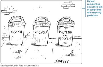
The first trash can is labeled Trash; the second is labeled, Recycle; and the third trash can is labeled, Pretend to recycle. A margin note reads, cartoon commenting on public’s lack of compliance with recycling guidelines.
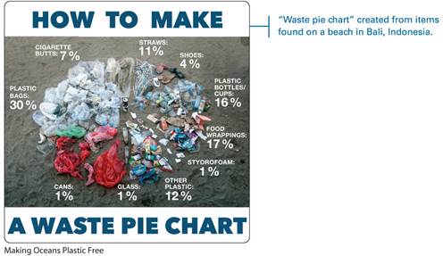
The waste pie chart shows the following arranged in a clockwise direction: Plastic bags 30 percent, cigarette butts 7 percent, straws 11 percent, shoes 4 percent, plastic bottles/cups 16 percent, food wrappings 17 percent, styrofoam 1 percent, other plastic 12 percent, glass 1 percent, and cans 1 percent. A margin note reads, open quotes Waste pie chart close quotes created from items found on a beach in Bali, Indonesia.
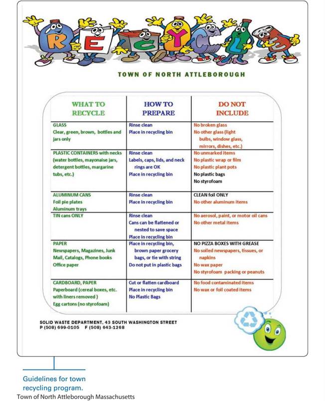
The chart is in a table format. The column headers of the table read, What to recycle; How to prepare; and Do not include. The text reads as follows.
Row 1. What to recycle: Glass (Clear, green, brown, bottles and jars only), How to Prepare: Rinse clean, Place in recycling bin, Do not include: No broken glass, No other glass (light bulbs, window glass, mirrors, dishes, et cetera)
Row 2. What to recycle: Plastic Containers with necks (water bottles, mayonaise jars, detergent bottles, margarine tubs, et cetera), How to Prepare: Rinse clean, Labels, caps, lids, and neck rings are okay, Place in a recycling bin, Do Not Include: No unmarked items, no plastic wrap or film, no plastic plant pots, no plastic bags, no styrofoam.
Row 3. What to recycle: Aluminum cans (Foil pie plates, Aluminum trays), How to Prepare: Rinse clean, Place in a recycling bin, Do Not Include: Clean foil only, no other aluminum items.
Row 4. What to recycle: Tin cans only, How to Prepare: Rinse clean, Cans can be flattened or nested to save space, Place in recycling bin, Do Not Include: No aerosol, paint, or motor oil cans, No other metal items.
Row 5. What to recycle: Paper (Newspapers, Magazines, Junk Mail, Catalogs, Phone books, Office paper), How to Prepare: Place in recycling bin, brown paper grocery bags, or tie with string, Do not put in plastic bags, Do Not Include: No pizza boxes with grease, No soiled newspapers, tissues, or napkins, No wax paper, No styrofoam packing or peanuts.
Row 6. What to recycle: Cardboard, Paper (Paperboard-cereal boxes, et cetera with liners removed; Egg cartons-no styrofoam), How to Prepare: Cut or flatten cardboard, Place in recycling bin, No plastic Bags, Do Not Include: No food contaminated, No wax or foil coated items.
Text below the table reads, Solid Waste Department, 43 South Washington Street P (508) 699-0105 F (508) 643-1268. A margin note reads, Guidelines for town recycling program.
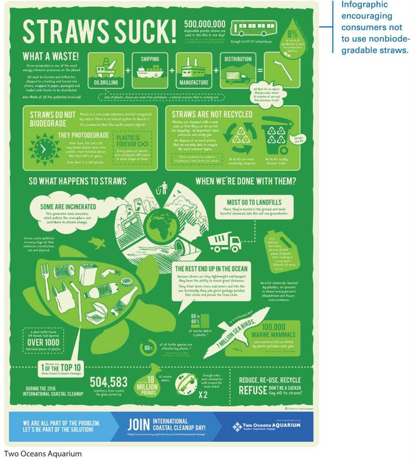
Text with illustrations reads as follows:
500,000,000 disposable plastic straws are used in the U S A in one day! According to Be Straw Free organization. Based on estimates provided by straw manufactures. This is accompanied by an image of a school bus with four windows, each window reading x, 1, 2, and 7 respectively. Text reads, Enough to fill 127 school buses.
A text on the left reads, What a waste!
Straw production is one of the most energy intensive processes on the planet. Oil must be located and drilled for, shipped to a factory and turned into straws: wrapped in paper, packaged and loaded onto trucks to be distributed. Now think of all the pollution involved!
Five images are shown. The first image shows an oil drilling unit with a note reading, Like all plastic, straws are made from petroleum, a natural resource that is running out. The second image labelled shipping shows a ship in the water, the third image labelled manufacture shows a factory, the fourth image labeled Distribution shows a truck, and the fifth image shows a straw. A dialog box pointing toward the fifth image reads, All that for an object that provides about 10 minutes of use and then becomes trash! Text in an oil drop illustration reads, 8% of world oil production is used to manufacture plastics.
Two text boxes are shown below. The first titled Straws do not biodegrade shows an image of a clock with text reading, Plastic is a man-made substance and not recognized by nature. There is no natural system to absorb it. It's a material that the earth cannot digest! They Photodegrade: Over time, the sun's U V rays break plastic down into smaller, more harmful pieces that last 100's of years. Even then it is still plastic. Plastic is forever: Every piece of plastic ever produced still exists in some shape or form.
The second text box titled Straws are not recycled shows a recycling symbol with the numbers 1, 2, 3 written within and a text below reads, Number 1 to 3 are most commonly recycled. A recycling trash can beside it has the numbers 4, 5, 6, 7 and a text below reads, Number 4 to 7 usually become trash. A callout reads, Straws are number 5. Text reads, Plastics are stamped with a resin code so that they can be sorted for recycling - an imperfect, labor intensive and costly job. We dispose of so much plastic that we are only able to recycle the common types. Plastic production has outpaced recycling by 5 times in the past decade.
So what happens to straws when we're done with them?
An image shows the world map surrounded by four wedges with images. The first image shows an icon of a man discarding tiny bits into a trash can. The second wedge shows a landfill and a loaded truck. Text reads, Most go to landfills: There they are buried in the ground and leach harmful chemicals into the soil and groundwater. The second wedge shows a huge pipe draining out into the ocean. Text reads, The rest end up in the ocean: Because straws are tiny, lightweight and buoyant, they have the ability to travel great distances. They float down rivers and sewers and into the sea. Eventually they join great garbage patches that choke and poison the food chain. The third wedge shows plumes of smoke emitting from big chimneys. Text reads, Some are incinerated. This generates toxic emissions which pollute the atmosphere and contribute to climate change.
An illustration shows a collection of things such as forks, cans, bottles, plastic cover, and straws on the shell of a turtle. A callout reads, Straws are one of the top ten items found in beach cleanups. A text box reads, A dead turtle found off Hawaii, had injested over 1000 individual pieces of plastic. An arc labeled 86 percent reads, of all, turtle species are affected by plastic. Text on an oil can reads, It is believed that there are over 18,000 pieces of plastic litter floating in every square kilometer of ocean. A bar graph shows 60 to 80% of marine debris is plastic. Text on the illustration of a flying bird reads, It is estimated that 1 million sea birds, 100,000 marine mammals and countless fish are killed by plastic pollution each year. Text with illustrated images read, During the 2016 international coastal cleanup, 504,583 volunteers from around the globe picked up more than 18 million pounds of marine debris. Enough miles were covered to walk around the moon twice. Reduce, Re-use, Recycle. Refuse: Don’t be a sucker. Say no to straws! We are all part of the problem. Let's be part of the solution. Join International Coastal Cleanup Day! h t t p s://oceanconservancy.org/trash-free-seas/international-coastal-cleanup/ Two Oceans Aquarium. Explore. Experience. Engage. W w w dot aquarium dot co dot za.
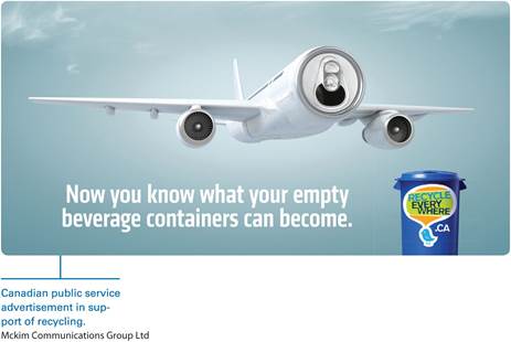
The main body of the plane is made of an empty beverage can. Text reads, Now you know what your empty beverage containers can become. Text on a trash can reads, recycle everywhere. Text below the poster reads, Mckim Communications Group Limited, and a margin note reads, Canadian public service advertisement in support of recycling.
Highlighting and Annotating Visual Arguments
Now, it’s time to look more closely at visual arguments and to learn how to highlight and annotate them. Unlike highlighting and annotating a written text, marking a visual text involves focusing your primary attention not on any words that appear but on the images.
After previewing the visual by looking at its overall appearance, begin highlighting to identify key images—perhaps by starring, boxing, or circling them—and then consider drawing lines or arrows to connect related images. Next, go on to make annotations on the visual, commenting on the effectiveness of its individual images in communicating the message of the whole. As in the case of a written text, your annotations can be in the form of comments or questions.
The visual on the following page shows how a student, Gabriel Dunn, highlighted and annotated a public-service advertisement prepared by the Surfrider Foundation.
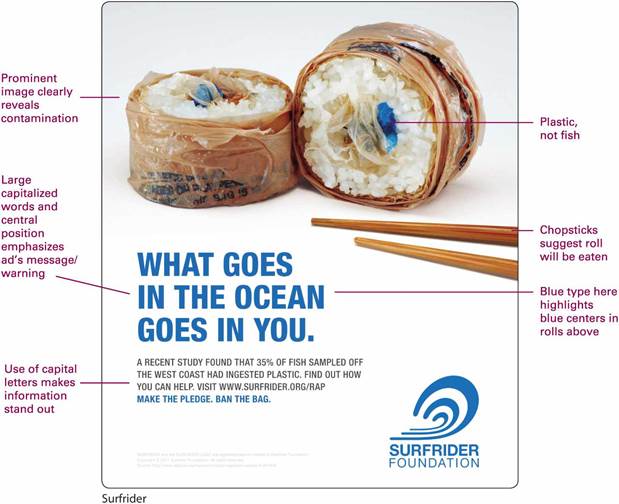
The poster shows a sushi roll wrapped in plastic instead of seaweed. The center of the roll shows colored plastic instead of seafood. A pair of chopsticks are placed near the dish. Text reads, What goes in the ocean goes in you. A recent study showed found that 35% of fish sampled off the west coast had ingested plastic. Find out how you can help. Visit w w w. Surfrider dot o r g forward slash r a p. Make the pledge. Ban the bag. A logo at the bottom right corner of the advertisement reads, Surfrider Foundation.
When he first looked at this public-service ad, Gabriel Dunn was immediately struck by the way the large blue letters of the central message drew his eye to the blue plastic center of the sushi roll, thus emphasizing its importance. When he highlighted and annotated the ad, he made (and starred) a note about this effective use of color and drew arrows to connect the blue type with the roll’s blue center. He then identified the largest (and most important) words and images and boxed the ad’s central message, also noting the unexpected presence of plastic and commenting on the partial image of chopsticks. Finally, he underlined and starred a key piece of information in the written text.
![]()
EXERCISE 3.2 HIGHLIGHTING AND ANNOTATING A VISUAL ARGUMENT
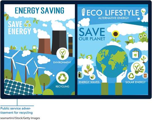
The visual that follows was created as a customizable template to illustrate the benefits of recycling and alternative energy sources. Rather than including text beneath its headings, the visual leaves blank space to be filled in with suitable text. (The images and headlines are designed to stay the same.) Look closely at the visual, and then highlight and annotate it to identify its most important images and their relationship to one another. Then, think about how the images work together to communicate a central message to the audience. What argument does this visual seem to make? How might that argument change based on the specific text that is supplied? How might it stay the same?
Responding Critically to Visual Arguments
As you learned in Chapter 2, a critical response analyzes the ideas in a text and expresses your reactions to them. When you respond in writing to a visual argument, you rely on your highlighting and annotations to help you understand the writer’s ideas and see how the words and images work together to convey a particular message.
As you prepare to write a critical response to a visual argument, keep in mind the questions in the following checklist.
When you write a critical response, begin by identifying the source and purpose of the visual. Next, state your reaction to the visual, and then examine its elements one at a time, considering how effective each is and how well the various elements work together to create a convincing visual argument. End with a strong concluding statement that summarizes your reaction.
The critical response that follows was written by the student who highlighted and annotated the visual on page 97.
CHECKLIST
Questions for Responding to Visual Arguments
· In what source did the visual appear? What is the target audience for this source?
· For what kind of audience was the visual created? Hostile? Friendly? Neutral?
· For what purpose was the visual created?
· Who (or what organization) created the visual? What do you know (and what can you find out) about the background and goals of this person or group?
· What issue is the visual addressing? What position does the visual take on this issue? How does it support this position?
· Does the visual include words? If so, are they essential? What purpose do they serve? Does the visual need more—or different—written text?
· Does the visual seem to be a refutation—that is, an argument against a particular position?
· Is the visual interesting? Clear? Attractive? Convincing?
· Do you agree with the position the visual takes on the issue? Why or why not?
RESPONSE TO “WHAT GOES IN THE OCEAN GOES IN YOU”
GABRIEL DUNN
Text reads as follows:
First paragraph: The public service advertisement produced by the Surfrider Foundation, an organization whose mission is to protect and enjoy “the world’s oceans, waves, and beaches through a powerful activist network,” clearly and effectively supports its stated goals (two corresponding margin notes read, Identification of visual’s source and purpose and Reaction to visual).
Second paragraph: Both words and images support the ad’s message. In the center of the visual, large, capitalized blue letters spell out this message: “What goes in the ocean goes in you” (corresponding margin note reads, Analysis of visual elements) At the top of the visual is a large cross section of a sushi roll. Although the rice remains, the roll is wrapped in plastic rather than seaweed, and it is filled with plastic rather than fish. The blue letters of the ad’s central message make the blue of the roll’s plastic center more prominent. Off to the side, chopsticks suggest that the roll is ready to be enjoyed. However, as the ad’s visual elements show, this usually tasty delicacy is not fit to eat.
Text reads as follows:
Third paragraph: Below the large letters of the central message, information from recent research studies, set in smaller type, reinforces the accuracy and seriousness of the message, and Surfrider’s contact information offers readers a way to “help turn the tide on plastic pollution” (corresponding margin note reads, Analysis, continued).
Fourth paragraph: Because millennials are probably more likely than other groups to eat sushi, the ad may be primarily directed at them. In any case, the message the ad conveys to its audience is also a warning: When we pollute our waters, we contaminate our food—and when we eat contaminated food, we pollute our bodies (corresponding margin note reads, Concluding statement).
TEMPLATE FOR RESPONDING TO VISUAL ARGUMENTS
Write a one-paragraph critical response to the visual you highlighted and annotated in Exercise 3.2 on pages 97—98. Use the following template to shape your paragraph.
The visual created by Surfrider.org shows . The goal of this organization seems to be to . This visual makes a powerful statement about . The central image shows . Other visual elements enhance the central image by . The visual includes words as well as images. These words suggest . The visual [is/is not] effective because .
![]()
EXERCISE 3.3 DEVELOP YOUR RESPONSE
Consulting the one-paragraph critical response that you wrote in the preceding template, write a more fully developed critical response to the visual on page 97. Refer to the highlighting and annotating that you did for Exercise 3.2.
![]()
EXERCISE 3.4 EVALUATING VISUAL ARGUMENTS
Look back at the images in this chapter. Which do you think is the strongest, most convincing visual argument? Why? Write a paragraph in which you explain and support your choice.