How to write and publish a scientific paper - Barbara Gastel, Robert A. Day 2022
When not to use graphs
How to prepare effective graphs
Preparing the tables and figures
A good illustration can help the scientist to be heard when speaking, to be read when writing. It can help in the sharing of information with other scientists. It can help to convince granting agencies to fund the research. It can help in the teaching of students. It can help to inform the public of the value of the work.
—Mary Helen Briscoe
When not to use graphs
In chapter 16, we discussed certain types of data that should not be tabulated. They should not be turned into graphs either. Basically, graphs are pictorial tables.
The point is this: Certain types of data, particularly the sparse type or the type that is monotonously repetitive, do not need to be brought together in either a table or a graph. The facts are still the same: Preparing and printing an illustration can be time-consuming and expensive, and you should consider illustrating your data only if the result is a real service to the reader.
This point bears repeating because many authors, especially those who are beginners, think that a table, graph, or chart somehow adds importance to the data. Thus, in the search for credibility, they tend to convert a few data elements into what they think is an impressive-looking graph or table. Don’t do it. Your more experienced peers and most journal editors will not be fooled; they will soon deduce that (for example) three of the four curves in your graph are simply the standard conditions and the meaning of the fourth curve could have been stated in just a few words. Attempts to dress up scientific data are usually doomed to failure.
If a proposed graph will contain only one curve, can you describe it in words? Possibly only one value is really meaningful, either a maximum or a minimum; the rest is window dressing. If you determined, for example, that the optimum pH value for a particular reaction was 8.1, it would probably be sufficient to state something like “Maximum yield was obtained at pH 8.1.” If you determined that the maximum growth of an organism occurred at 37°C, a simple statement to that effect is better economics (and better science) than a graph showing the same thing.
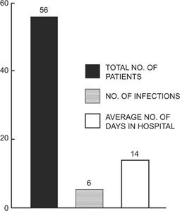
Figure 17.1. Incidence of hospital-acquired infections.
If the choice is not graph versus text but graph versus table, your choice might relate to whether you want to impart to readers exact numerical values or a picture of the trend or shape of the data. Rarely, there might be a reason to present the same data in both a table and a graph, the first presenting the exact values and the second showing a trend not otherwise apparent. Most editors would resist this obvious redundancy, however, unless the reason for it was compelling.
An example of an unneeded bar graph is shown in Figure 17.1. This figure could be replaced by one sentence in the text: “Among the test group of 56 patients who were hospitalized for an average of 14 days, 6 acquired infections.”
When is a graph justified? There are no clear rules, but let us examine some indications for their effective use.