Scientific writing 3.0: A reader and writer's guide - Jean-Luc Lebrun, Justin Lebrun 2021
Seven principles for good visuals
Visuals: the voice of your paper
Paper structure and purpose
A voice attracts attention; it announces, it warns. It is a substitute to writing: one can read a book or listen to a recorded version of it. Likewise, photos, tables, diagrams, and graphics attract attention even without words. They are worth a thousand words. The voice gets out of the body. It is not necessary to see the body to hear its voice. Visuals inform readers independently, even before they start reading the first paragraph. A voice has its own language, a universal and wordless language, like the one used by the child who babbles, laughs, and cries. Visuals have their own language, the universal language of scientific graphics. They tell a story directly and quickly with minimum text. Voice intonation reinforces the message expressed by the body. Visuals also reinforce the main message of the text, and are in synergy with it.
Just observe the title of this chapter for a few seconds and then bring your eyes back to this mark ![]()
Title, headings and subheadings shout, don’t they? They are so authoritative in their bold font suit. Framed by white space, nothing crowds them in their spacious surroundings. They are understood at a glance.
Tables and diagrams speak just as much as photos. Guided by a grid of vertical and horizontal lines, bold font, and arrows, the reader captures a large volume of information in little time and easily extracts trends and relationships between the visual elements. The visual story is told in few words.
Visuals excel at comparisons such as before versus after, or with versus without. More talents are featured in ![]() 1
1
Table ![]() 1
1
Typical use for visuals
To represent complexity |
To summarize |
To reveal sequence |
To classify |
To reveal patterns |
To establish relationships |
To compare and contrast |
To give precision and detail |
To provide context |
Readers prefer a visual to text for several reasons:
· In linear text, eyes walk like ants along the narrow path created by lined-up words. In visuals, eyes leap like crickets from one place of interest to another, probing with silent questions. Readers enjoy the speed and the freedom of selfguided exploration.
· Because the text part (title and caption) of a visual complements its graphical part, readers understand more easily.
Visuals have a loud and convincing voice, but only if you can make them speak. Their language is based on a special grammar that describes the correct use of fonts, blocking, kerning, framing, white space, line and color. This visual language is well understood by graphic designers. They can make a visual shout, whereas most of us can only make it whisper or croak. This chapter is not about graphic design, it is about the correct use of visuals in a scientific paper. It is also about principles that will help you design visuals that have an impact from a scientific perspective, even if the lines are a little thin, the white space is not quite well-distributed, or the kerning is an abomination. You may not get an Oscar in a design competition, but you will have visuals that do more than whisper or croak.
However loud and clear a voice may be, if it babbles or utters gibberish, it is not helpful. Visuals need to deliver a loud, clear, intelligible, and convincing message.
Seven principles for good visuals
After reading hundreds of papers, I have detected consistent error patterns. A bad visual breaks one or more of the following principles.
· A visual does not raise unexpected questions.
· A visual is custom-designed to support the contribution of only one paper.
· A visual keeps its complexity in step with readers’ understanding.
· A visual is designed based on its contribution, not on its ease of creation.
· A visual has its elements arranged to make its purpose immediately apparent.
· A visual is concise if its clarity declines when a new element is added or removed.
· Besides title and caption, a visual requires no external text support to be understood.
Principle 1: A visual does not raise unexpected questions
As soon as a visual appears, the eyes of the reader probe the visual. They are on a fact finding mission. Wouldn’t it be nice to track their path! Using eye-tracking hardware, we’ve done just that. Four participants were asked to look at a particular visual for five seconds (they did not know what to expect), and then to look at it again, this time in order to ask as many questions as the visual raised.
So, if you do not mind, we would love for you to do the same. Without the eyeball-tracking machine, you will have to remember where your eyes travel in the first five seconds. We are confident that, within that time, your brain will predictably direct your eyes to key parts of the visual; probing, evaluating, and asking silent questions. The first questions will be “what-am-I-looking-at” questions.
It is now time to put your eyes to the test, but do not look for information in the title and caption of the figure because we have removed them to help you focus on the visual itself. Look now at ![]() 2 for five seconds, blinking your eyes every second, each time memorizing what you were looking at. Afterward, return here and read the next paragraph.
2 for five seconds, blinking your eyes every second, each time memorizing what you were looking at. Afterward, return here and read the next paragraph.
In the first five seconds many things happened. The first one was the discovery of the overall image: an X-Y Diagram with a singular point of change which is meaningless unless you know the meaning and value of its coordinates. Your eyes then moved to one of the two axes. Some went to look at the X axis, maybe looked at the end value, then at the unit (hours), and then looked at the Y axis. The others looked first at the Y axis label and tried to decipher the obscure abbreviation, then moved their eyes down to the unit of the X axis (Time), and they moved past the 90 hours to go to the point of change on the curve, and then looked at the Y value for that point. Interestingly, not all went to the Y axis first, even though it is supposed to contain the dependent variable. Those who looked at the X axis first were not driven by logic but by the ease of reading. Horizontal information is easier to read than vertical information.
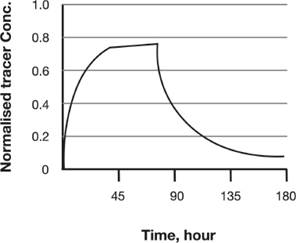
Figure ![]() 2
2
Look at the visual again, this time without a time limit and identify all the questions this visual raises. Before you look again at ![]() 2, let me answer the first two questions: What is the Conc. Abbreviation, and why is time so slow? The graph represents the evolution in concentration of a fluorescent tracer in a large tank containing some muddy toxic sludge. This explains the use of hours. Now it is your turn. What other questions do you have? When you are done with your questions, read the next paragraph.
2, let me answer the first two questions: What is the Conc. Abbreviation, and why is time so slow? The graph represents the evolution in concentration of a fluorescent tracer in a large tank containing some muddy toxic sludge. This explains the use of hours. Now it is your turn. What other questions do you have? When you are done with your questions, read the next paragraph.
This curve ![]() 3 looks like a quadratic curve but it isn’t. The differences need to be explained.
3 looks like a quadratic curve but it isn’t. The differences need to be explained.
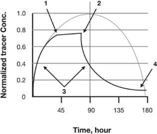
Figure ![]() 3
3
I have superposed a regular parabola on top of figure 2. This graph ’asks’ five questions. Each arrow corresponds to one question. Can you guess what the fifth question is?
· Question1: Why is the top of the curve linear between points 1 & 2?
· Question 2: What happens at point 2 to change the behavior of the phenomenon so drastically?
· Question 3: Why is the curve convex on the way up and concave on the way down?
· Question 4: Why is the curve asymptotic for high values of time?
· Question 5: What is the concentration normalized to, and why doesn’t the curve reach 1?
The readers will look for answers to these questions in the caption. If they are left unanswered, the readers will be frustrated because the visual raises more questions than the writer is willing to answer.
Chief among the visuals that raise unneeded questions is the screenshot. It is widely used to illustrate papers because a mouse click is all it takes to capture it ![]() 4.
4.
Figure ![]() 4
4
Visual gallery of errors exhibit. The cluttered screen ’dump’. If my objective is to show the content of the center window, what are the extra windows, circled files and folders and framed menus doing on this visual?
The screen capture includes all the artifacts of the software application: menu items, windows, icons, tool palettes, and other distracting elements that raise questions.
Naturally, to the writer who captured the screen, everything on the screen is clear and familiar. But is it also clear to the non-expert reader that you have in mind, the one who stands to benefit from your work? There are only two ways to know: ask a reader, or look at each visual of your own paper as if for the first time and pretend to be that reader.
Readers come up with the most unexpected questions! What is at their source?
You will often find that they are caused by the reader’s lack of knowledge. You see, the writer knows too much! That is why it is useful to ask someone else to do this exercise. You may be able to identify by yourself other sources of questions such as unfamiliar acronyms and abbreviations for example. Once you have identified all questions the reader might have (or has), you have five choices:
· Leave the visual as it is but answer the unanswered reader questions in the visual title, its caption, or in the body of the paper.
· Add to the visual. Add clarifying visual elements (boxes, arrows, links…)
· Take away from the visual. Remove whatever raises distracting questions to keep the focus on the essential point made by the visual.
· Divide the visual. Split it into two or more independent visuals that are less complex.
· Modify the visual elements (shape, size, order, font, etc) to clearly reveal the purpose of the visual.
The only choice you do not have, is to ignore these questions.
|
What are the questions raised by your visuals? Choose the key visual in your paper (the one which is the most representative of your contribution), and show it to one or two colleagues. HIDE the caption; show only the visual and its title. Ask them which questions the visual raises. As they tell you, write these questions down. When they have no more questions, DO NOT answer the questions. Uncover the hidden caption. Ask if their questions are answered in the caption or in the part of the paper referring to the visual. Once you have identified the problems, ask the reader whether the caption contains new information not illustrated (apart from the description of the visual’s context or the visual’s interpretation). If the caption does contain visually unsupported information, remove it; otherwise, it would be a claim unsupported by visual evidence. Show your modified visual to new colleagues and verify that the caption now answers ALL questions, and does not itself raise unwanted questions. |

Principle 2: A visual is custom-designed to support the contribution of only one paper
Do you remember this particular visual you worked on for hours? It was a work of art. Using Photoshop, you or the graphic artist had spent much time to make it look perfect. It had been admired at an internal technical presentation or at a previous conference. Part of it does illustrate a key point in your paper, but that part cannot easily be extracted from your original masterpiece without serious rework. You are tempted to reuse the whole drawing/diagram as it is. As a result, the visual includes information irrelevant to your purpose: names, curves, numbers, or acronyms foreign to the reader. All raise questions. Hence, the second principle: a visual is custom-designed to support the contribution of only one paper.
Redrawing is a small price to pay for a custom-designed visual in view of the benefits, not just to the readers, but also to you because (1) your contribution, unclouded by irrelevant details, is easier to identify; and (2) you do not have to ask for the permission to reuse the original if the reproduction rights belong to a journal.
Principle 3: A visual keeps its complexity in step with readers’ understanding
Visuals are your star witnesses. They stand in the witness-box to convince a jury of readers of the worth of your contribution. Their placement in your paper is as critical as the timing lawyers choose to bring in their key witness. To know where to place a visual in a paper, take into account the level of understanding of your reader. Complex visuals are more logically placed towards the end of the paper when the reader has filled the knowledge gap. Simpler visuals or self-contained visuals can be placed anywhere.
What happens when you refer to a visual more than once? Assuming readers read your paper linearly from introduction to conclusion, the first time they are asked to look at your visual, they may find it too complex because they have yet to acquire the knowledge that will make the visual totally understandable. A single visual explained here and there in the paper breaks principle #1. It will always raise more questions than the writer is willing to immediately answer.
So ask yourself, why is it necessary to refer to the visual more than once? Is it because you are making multiple points in one large or complex visual? If this is so, divide the one complex visual into several parts (a), (b), (c) to reduce its complexity. Next, make sure readers have enough information to understand everything in Figure 1(a) when reaching Figure 1(a) in the text, and do likewise for parts (b) and (c). But if after dividing the visual into parts you realize there is no value in having visuals 1(a), 1(b), and 1(c) next to one another, say for comparative reasons, then divide the visual into separate visuals and have them appear in a just-in-time fashion next to their respective references.
When you send your paper to a journal, its figures and tables are usually at the back of the paper after the references (unless you submit the paper as a PDF file). The person in charge of the page layout will look for the first reference to the visual in your text, and try to place the visual as close to its reference as possible. This is often well done. But a large visual creates page layout problems. For this reason, if you want your visual to be properly placed, 1) design it so that its width matches an integer number of the journal column width — use a template if provided by the journal; and 2) avoid using small serif fonts (Times for example) that cannot be made smaller without a significant reduction in readability, thus limiting the range of options for the placement of your visual. Use fonts without serifs (also called sans serif fonts) like Helvetica, or Arial because of their uniform thickness. When shrunk, their thicker lines do not disappear as fast as the thin lines always present in serif fonts.
Principle 4: A visual is designed based on its contribution, not on its ease of creation
Information with visual impact requires creativity, graphic skill, and time. Because most of these are in short supply, software and hardware producers have provided skill-enhancing, and time-saving tools: statistical packages that crank out tables, graphs, and cheesy charts in a few mouse clicks; digital cameras that, in one click, capture poorly lit photos of experimental setups replete with noodle wires (I suppose the more awful they look, the more authentic they are); and screen capture programs that effortlessly lasso and shrink your screen to make it fit in your paper. The ease of creation of visuals contributes to their abundance—mouse-produced becomes massproduced. When I show you the photo of a keyboard with the caption “keyboard on which this book was typed,” as in ![]() 5, does it contribute greatly to the usefulness of this book?
5, does it contribute greatly to the usefulness of this book?
Such irrelevant photos are found in scientific papers. They are not useful. They only prove that the writer conducted an experiment using real equipment. To ensure that each visual is critical to your paper, ask yourself whether it replaces much text or strongly supports your contribution. Conciseness applies to both text AND visuals.
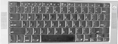
Figure ![]() 5
5
Gallery of errors exhibit. A Qwerty keyboard, but who wants to know. This photo speaks volumes, doesn’t it? It tells you that I used a Macintosh Powerbook with a titanium casing, that I did not use a French keyboard even though I am French, that my right SHIFT key was broken in two, and finally that I am not much of a photographer! What does this have to do with the book itself? Nothing.
The abundance of visuals is a source of unpleasant side effects, the main one being the reader’s inability to identify the key visual in a paper. When I ask researchers to read a paper and designate the one key graph/figure/table that represents the contribution of the paper, they often disagree with one another and even disagree with the author of the paper. Surely, it should not be so! All should agree on which visual is the most important. Why is there disagreement? It may be due to the author’s inability to make his contribution clear visually, but the cause may also lie elsewhere. The more visuals you have, the more your contribution is hard to find, and the more difficult it is for the reader to grasp your whole contribution succinctly. This unpleasant side effect hides another. Removing a visual will weaken your contribution if your contribution is dispersed (diluted) across many visuals.
To summarize, if weak (diluted) visual circumstantial evidence dominates your paper at the expense of succinct but detailed convicting evidence, your article loses clarity and conciseness.
|
How many visuals do you have in your paper? Could you identify the one that encapsulates the core of your contribution? Could other people? Are you verbose or concise when it comes to visuals? What do your readers think? |
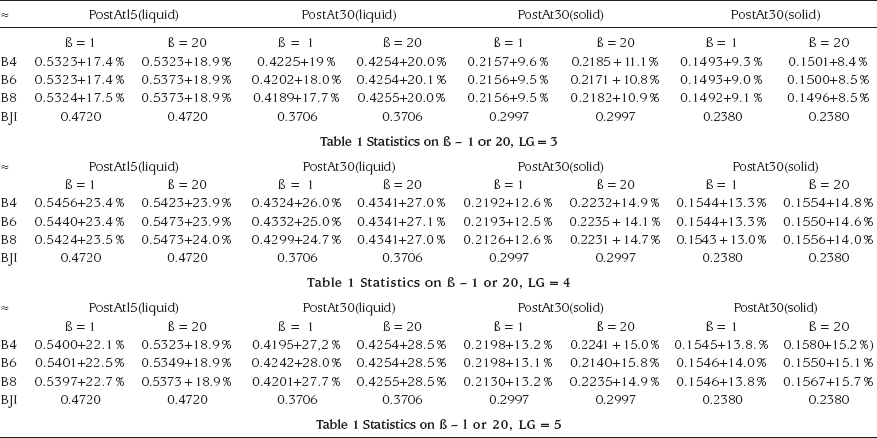
Figure ![]() 6
6
Visual gallery of errors exhibit. The visual salvo. A large number of visuals are set side by side; each one is marginally different from the one that precedes, so much so that the eye can barely see the difference between them. In this case the visuals are tables, but they could be graphs or images also.
Principle 5: A visual has its elements arranged to make its purpose immediately apparent
The visual salvo is a popular classic in the gallery of errors leading to complex visuals (![]() 6).
6).
Visual ![]() 6 is impressive, but the reader is not impressed. The principle — a visual has its elements arranged to make its purpose immediately apparent — is certainly not applied here.
6 is impressive, but the reader is not impressed. The principle — a visual has its elements arranged to make its purpose immediately apparent — is certainly not applied here.
Clarity of purpose on the writer’s side is essential to achieve clarity of meaning on the reader’s side. Clouding the meaning is easy: simply bury the key information in the midst of other data so that its purpose does not stand out. For example, writers could inadvertently camouflage key information by presenting the data in the wrong sorting order, by aggregating it in classes that absorb the interesting variance, or by placing it in the midst of loosely related data.
Key data must stand out. They are your crown jewels, but they need a crown; and the role of the crown is not to hide the jewels, but to make them stand out by giving them the appropriate structure. That structure is the arrangement of data that makes clear a purpose. So when visuals fail to reveal their purpose, it is for several reasons:
· The writer has no specific purpose — the visual is a data dump.
· The writer has a purpose, but leaves to the expert the work of identifying that purpose from the data presented. The writer has not considered that the non-expert reader is not able to identify the purpose without his or her help.
· The writer has a clear purpose (it is even mentioned in the caption), but the arrangement of the data does not support the purpose, and the reader struggles to reconnect purpose and data.
To highlight the main point of a visual, its elements need to be organized. In table ![]() 7, the caption asks the reader to compare onestep with two-steps methods. Even though the arrangement of the table elements is not haphazard with all one-step methods grouped at the end of the table, the reader is lost. What is to be compared? The average value of one-step methods to the average value of two-step methods? Each one-step method with its corresponding two-step method where it reappears as the second step (for example, MO compared to BN&MO, COR&MO, and PSY&MO)? The best one-step method with the best two-step method?
7, the caption asks the reader to compare onestep with two-steps methods. Even though the arrangement of the table elements is not haphazard with all one-step methods grouped at the end of the table, the reader is lost. What is to be compared? The average value of one-step methods to the average value of two-step methods? Each one-step method with its corresponding two-step method where it reappears as the second step (for example, MO compared to BN&MO, COR&MO, and PSY&MO)? The best one-step method with the best two-step method?
Table ![]() 7
7
Visual gallery of errors. The table without a clear message. Comparison of all combinations of one — two step methods
Methods |
True positive rate (%) |
False positive rate (%) |
BN&BN |
22.0 |
1.3 |
BN&MO |
24.9 |
1.9 |
BN&MSV |
39.2 |
0.2 |
PSY&BN |
27.1 |
2.6 |
PSY&MO |
27.0 |
2.7 |
PSY&MSV |
66.9 |
0.3 |
COR&BN |
23.0 |
1.9 |
COR&MO |
25.8 |
2.5 |
COR&MSV |
38.1 |
0.2 |
BN |
21.8 |
1.2 |
MO |
24.8 |
1.9 |
MSV |
35.9 |
0.2 |
The table, filled with acronyms defined elsewhere in the paper, is unfriendly to the memory. What point did the writer want to make? What do you think? Look again at ![]() 7, and then return to the next paragraph.
7, and then return to the next paragraph.
Most readers thought the writer wanted to show that one combination of two steps, PSY and MSV, has the highest true positive and a very low false positive score. If the writer had wanted to make that point immediately clear, it would have been better to sort the scores in ascending order as in table ![]() 8.
8.
Table ![]() 8
8
The table’s message is clearer. Best method for all combinations of one — two step methods
Methods |
True positive rate (%) |
False positive rate (%) |
BN |
21.8 |
1.2 |
BN&BN |
22.0 |
1.3 |
COR&BN |
23.0 |
1.9 |
MO |
24.8 |
1.9 |
BN&MO |
24.9 |
1.9 |
COR&MO |
25.8 |
2.5 |
PSY&MO |
27.0 |
2.7 |
PSY&BN |
27.1 |
2.6 |
MSV |
35.9 |
0.2 |
COR&MSV |
38.1 |
0.2 |
BN&MSV |
39.2 |
0.2 |
PSY&MSV |
66.9 |
0.3 |
But if the writer had indeed wanted the reader to compare methods where the one step reappears as a second step, then the following table (![]() 9) would have been more to the point.
9) would have been more to the point.
Table ![]() 9
9
The table’s layout is better to help the reader compare one and two step methods.
Methods |
True positive % |
False positive % |
BN (1-step) |
21.8 |
1.2 |
BN&BN |
22 |
1.3 |
COR&BN |
23 |
1.9 |
PSY&BN |
27.1 |
2.6 |
MO (1-step) |
24.8 |
1.9 |
BN&MO |
24.9 |
1.9 |
COR&MO |
25.8 |
2.5 |
PSY&MO |
27 |
2.7 |
MSV (1-step) |
35.9 |
0.2 |
COR&MSV |
38.1 |
0.2 |
BN&MSV |
39.2 |
0.2 |
PSY&MSV |
66.9 |
0.3 |
What if the writer was not strictly interested in comparing steps, but in a new point altogether? What if the author was interested in highlighting the most effective second step? The accent is now on the difference between one step and two steps. Look at table ![]() 10.
10.
From table ![]() 10, the reader immediately sees that the PSY method is systematically the best method as a second step, and that MSV is the best one step method to accompany it. Compared to the original table
10, the reader immediately sees that the PSY method is systematically the best method as a second step, and that MSV is the best one step method to accompany it. Compared to the original table ![]() 7, much raw data has disappeared, and in particular the false positive rates. The writer has not left them out. Their maximum value is given in a footnote.
7, much raw data has disappeared, and in particular the false positive rates. The writer has not left them out. Their maximum value is given in a footnote.
Table ![]() 10
10
The table’s message is clear and more instructive even though less data is displayed. Comparison of all combinations of one — two step methods
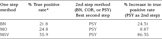
* Maximum false positive rate for all one step / two steps combinations is less than 2.7%
Imagine now that each step is a complex clustering algorithm, so that adding a second step requires additional computational resources. The author wants to answer the question “is adding a second step worthwhile?” Two visuals would rapidly make that point (![]() 11, and
11, and ![]() 12). Note how the caption has been rewritten to help the reader.
12). Note how the caption has been rewritten to help the reader.
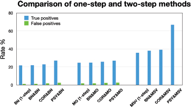
Figure ![]() 11
11
The comparison of one and two-step methods reveals that the one-step MSV method (36,5% true positives) is superior to the BN and MO methods. MSV also acts in synergy with the PSY method to nearly double the score with 67.5% true positives while keeping false positive rates low.
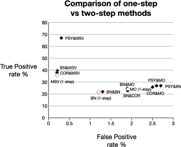
Figure ![]() 12
12
The comparison of one and two-step methods reveals that the one-step MSV method (36,5% true positives) is superior to the BN and MO methods. MSV also acts in synergy with the PSY method to nearly double the score with 67.5% true positives while keeping false positive rates low. (One-step method is empty diamond, twostep method is full diamond)
In summary, for each point you want to make, find the most appropriate visual. A specific visual makes a specific point; a different point would be made by a different visual. Choose your data based on their added value towards your contribution and based on their conciseness (i.e. they make the same point with less elements). Once chosen, arrange your data until their organization clearly makes your point. This usually takes many drafts. Granted, improvement takes time, but it is time well spent: a visual is so much more convincing than a paragraph.
Principle 6: A visual is concise if its clarity declines when a new element is added or removed
Each visual has an optimum conciseness. Visuals ![]() 11 and
11 and ![]() 12 include the false-positive values. Are these critical to the point the author wants to make? Is it possible to come to the same conclusion without them as in
12 include the false-positive values. Are these critical to the point the author wants to make? Is it possible to come to the same conclusion without them as in ![]() 10?
10?
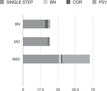
Figure ![]() 13
13
Look at ![]() 13. It contains all of the same information as Figure 11, but is considerably more compact. It makes the same point with three bars instead of twelve. Orienting it horizontally instead of vertically also ensures that it will always fit within one column.
13. It contains all of the same information as Figure 11, but is considerably more compact. It makes the same point with three bars instead of twelve. Orienting it horizontally instead of vertically also ensures that it will always fit within one column.
To add visual elements to a graph is tempting; to merge two graphics to make room for more text is irresistible. The resulting visual is so complex that it is no longer understandable. It becomes the “everything but the kitchen sink” visual. The density of its elements per square inch hinders rather than facilitates understanding.
The draft diagram in ![]() 14 had attractive rainbow colors, 3D elements, arrows, links and much more. Some may recognize the yeast cell growth cycle at its center.
14 had attractive rainbow colors, 3D elements, arrows, links and much more. Some may recognize the yeast cell growth cycle at its center.
It required much time to design and was a masterpiece. It established a parallel between two phenomena that shared the same cell cycle. It would have been perfect, but for a small problem: only its authors understood it. This figure was later simplified, and clarity returned when visual elements were taken away.
Figure ![]() 14
14
Visual gallery of errors. The overly complex visual. This beautiful visual combines two related visuals into one. The resulting increase in complexity greatly reduces clarity and understanding.
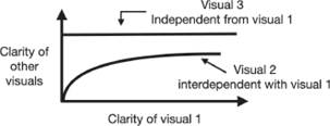
Figure ![]() 15
15
If the clarity of a visual is dependent on the existence of another visual, then the two visuals are interdependent, and as a result, the clarity of one visual will affect the clarity of the other.
If adding or subtracting elements in one visual affects the clarity of another visual, then these two visuals are clearly interdependent (![]() 15). They have to be redesigned to increase their independence.
15). They have to be redesigned to increase their independence.
To summarize this point, complexity is born out of (1) a lack of discrimination in the choice of the elements included in a visual, (2) a lack of clear relationship between the various elements in a visual, and (3) a lack of independence between visuals.
Simplification decreases visual conciseness whereas consolidation increases it. But conciseness is always the servant of clarity, not its master; that is why a visual can be considered concise if its clarity declines when a new element is added or removed.
|
Examine each visual. What makes it difficult to understand? Is there a better way to make the same point with less elements? Visuals come in many types: chart, diagram, table, photo, list, etc. Would replacing one type with another make your visual clearer? Would dividing one visual into two make things clearer? Would combining two visuals make things clearer? Would reorganizing the information in your visual make the relationships between its elements more obvious (using arrows, colors, words, or sorting the data in a different order)? |
Principle 7: Besides caption and title, a visual requires no external text support to be understood
The strange oasis
An old Bedouin likes to tell the tale of a strange oasis he once came across in the Sahara desert where a sand storm had stranded his caravan. The tallest man, who was perched on top of the tallest camel in the caravan, saw it first. “Oasis straight ahead!” he shouted. They pressed ahead. A short distance away from heat and thirst relief, the travelers noticed that clusters of full coconuts were sitting on the sand dunes, away from the coconut trees in the oasis. Their skin was soft, but they were hot to the touch, so the people took them inside the oasis to drink later. The oasis was small, it had no well, and all its coconut trees were barren, so the only refreshment would have to come from the coconuts found on the sand dunes. Unfortunately, these coconuts were not ordinary. Their soft skin hardened like steel as soon as they were inside the oasis in the shade. The sharpest dagger could not cut them open. So people had to go back out into the desert to open them, and return to the oasis to drink them, a process they found most unpleasant.
The oasis is still there, the Bedouin claims. It is now an attraction for tourists who go and visit it by helicopter (camel rides are just too slow nowadays).
In our story, the oasis is the refreshing visual and its caption, the desert is paragraph text, and the coconuts are what should have been in the caption, but was turned into paragraph text instead. Nowadays, readers are pressed for time. So they parachute themselves directly into your paper with a marked preference for the pleasant visuals, which are far more refreshing that paragraph text. However, they are frustrated because, to understand them, 1) they need to refer back to the text and search for the ’see Figure X,’; 2) they then need to locate the beginning of the sentence; and finally 3) they need to go back and forth between the explanatory text, the visual, and its caption, until their understanding is complete. This timeconsuming and iterative process is most unpleasant. In the immortal words of the Bedouin, “Coconuts are meant to be inside the oasis”. We no longer live in the days of silent movies. A visual must “tell all” by itself, without the need for text outside of its caption. To accommodate the non-linear reading behavior of scientists, each visual should be self-contained, which means self-explanatory. Some will object that this creates redundancy because the text in the paragraph is then repeated in the caption. They assume that the text in the body of the paper remains the same once the caption of the visual makes it selfexplanatory. This is not the case. The paragraph in the main section, now shorter, only states the key contribution of the visual without detail, repeating only what is necessary to move the story along. Doing so has two advantages: (1) the visual can be understood without the need to read the whole article and (2) the body of the paper is shorter (and thus faster to read) because it keeps to the essential.
In the original visual in ![]() 16, the CALB and MCF-C18 acronyms are undefined.
16, the CALB and MCF-C18 acronyms are undefined.
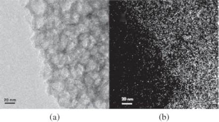
Figure ![]() 16
16
A visual that does not stand alone and is not self-contained.
(Caption) Figure 5. (a) TEM micrograph of CALB/MCF-C18 from pressuredriven method, and (b) the corresponding ELS elemental mapping of N.
Readers have to go back and forth several times between text, visual, and caption before they understand and “get the full picture.” (Text in body of paper)
“Figure 5 illustrates the uniform nitrogen mapping over the CALB/MCF-C18 sample, indicating the homogeneous distribution of the nitrogencontaining enzymes within the mesoporous silica matrix. CALB/MCF-C18 also showed PAFTIR peaks at 1650 cm-1 and 3300 cm-1 (Figure 3c), which were associated with the amide groups of the enzymes, confirming the enzyme incorporation.”
Compare the visual with the modified one in ![]() 17. The new visual is now autonomous, its caption is longer, but the description in the body of the paper is cut down to the bare essentials.
17. The new visual is now autonomous, its caption is longer, but the description in the body of the paper is cut down to the bare essentials.
(Modified caption) Figure 5. (a) Transmission electron micrograph of the Candida Antarctica Lipase B enzyme (CALB) immobilized by pressure in the porous matrix of hydrophobic mesocellular siliceous foam (MCF-C18), and (b) the corresponding electron energy loss spectroscopy map of nitrogen. Nitrogen is abundant in enzymes. Its detection is used as evidence of their presence. Here, Nitrogen, and therefore the CALB enzyme, is seen as uniformly incorporated and distributed in the porous matrix.
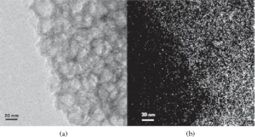
Figure ![]() 17
17
A visual that is now stand alone and self-contained.
(Modified text in body of paper)
“Both electron energy loss spectroscopy (Figure 5b) and FT-IR spectrum of CALB/MCF-C18 (Figure 3c) confirm the incorporation of the enzyme in the Siliceous foam.”
The captions of Figure 5 (a) and (b) are now self-contained, while the text in the body of the paper is cut to focus only on the point the writer wishes to make (the enzyme is trapped in the porous matrix). Even if the reader goes straight to Figure 5 and bypasses the text, the same message is given.
|
Examine each visual in your paper. Rewrite the caption to make your visual self-contained. Revise the description of the visual in the body of your paper to shorten it by stating only the purpose of the visual, or its key contributive point. |