Practical models for technical communication - Shannon Kelley 2021
Principles of document design
Layout and design
Document design brings together elements of page layout so users can solve a problem. Technical communication design differs from what you may have learned in academic courses about page layout. In most college courses, your assignments require a double-spaced page with 1-inch margins in 12-point Times New Roman font with indented paragraphs.
However, in technical communication, your user’s needs come first. Some documents’ design will be more straightforward, as in a business letter. Others will have more design decisions. The key to effective design is simplicity and consistency. A document that is unnecessarily complex makes it harder for users to get what they need.
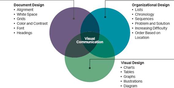
Design is the deliberate organization of text and images on a page. A children’s book is full of colorful images, short blocks of text, and larger font sizes. The book designer, in cooperation with the writer and publisher, chooses the book’s design to ensure the audience (children) can easily understand and use the material. As you can see in figure 3.4, the many elements of document design, visual design, and organizational design must work together to create a functional document.
Figure 3.4. Elements of Visual Communication. Effective visual communication involves the overlapping areas of document design, organizational design, and visual design.
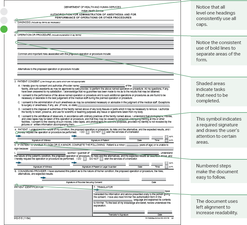
Design is equally important in the forms you fill out, such as the ones found at the doctor’s office. These black-and-white forms contain standard options: multiple choice, fill in the blank, or basic yes-no questions. The forms might ask you to write out your name, starting with your last name first. Official forms often use this layout because it makes it easier for the doctor and office manager to keep track of and file multiple forms filled with patient health information. The form leads with the critical information, your last name, to which all your medical records are attached. Take a look at the medical form in figure 3.5. The form appears straightforward, but all the elements are intentionally placed.
Figure 3.5. Design Choices in Medical Form. Even a simple form has “hidden” design elements that influence the user’s experience.
Design choices are not limited to printed documents. Website designers also make choices that help users find information. If the purpose of a website is to sell you remote control cars, for example, the designer might place an image of the car on the left-hand side of the page where our eyes naturally land. The designer might then orient the image of the car so that it points to the purchase button, which is set off by white space on the right-hand side of the page. Every design choice is made to drive the user toward the site’s main purpose: a sale.
Principles of design should inform your decisions as you create documents. As you read, you’ll notice that some elements show up multiple times under different principles. In the following sections, we look at how the general design principles of readability, emphasis, organization, and visual accessibility make for a more pleasant user experience.