Practical models for technical communication - Shannon Kelley 2021
Design for emphasis
Layout and design
Design in technical documents is functional, not decorative. Emphasis is one design principle that technical communicators employ to guide users. Specific design elements, such as white space, contrast, proximity, and headings, emphasize parts of a document for better understanding.
Consistency, consistency, consistency. You need to have clear, repeated design choices to give stability and structure to your document. The human brain works by pattern recognition, so much so that we sometimes see patterns where there aren’t any. It’s why a bunch of random craters on the moon look like a face to us. It’s also why it’s so hard to proofread your own work—you see what you expect to be there rather than what is.
By using repetition to create emphasis, you give the user confidence in interpreting a document. Repetition works by using any single element multiple times. For example, can you see how this page, this chapter, this textbook use repetition? Repetition is one way to create consistency and stability. Repetition can include color, shape, font, placement, line thickness, headers and footers, images, etc. Any element could be repeated to create this stabilizing effect. In Kenji’s brochure, he uses the repetition of color, shape, and font to unify the document’s design.
White Space
White space is any empty space surrounding figures, tables, visuals, or text. When used appropriately, it can direct a user’s eye by isolating or emphasizing elements of document design (figure 3.14).
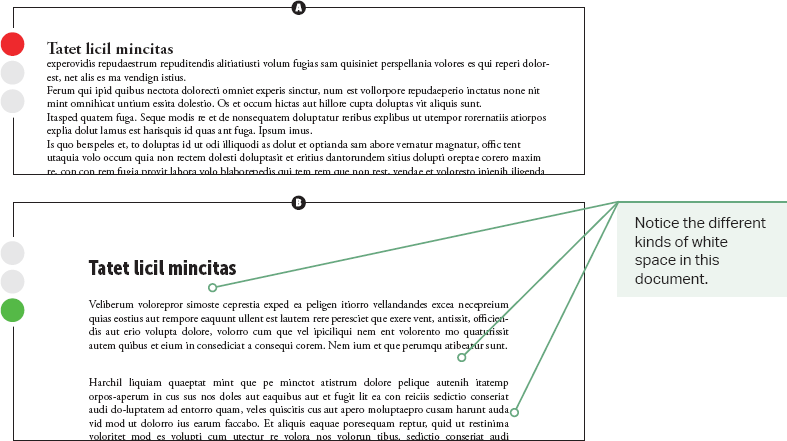
Don’t neglect the invisible element of white space. You have probably centered the title of an academic paper, thus creating white space on each side. The white space draws attention to the title, as shown in figure 3.15.
Kenji uses white space in his brochure design around the date and location of the conference. The white space draws a user’s eye to the visual element more quickly. White space guides a user through a document without distracting them with unnecessary information. Don’t tell a user where to look—show them.
Contrast
In any document, you will see elements of marked space (text, images, shading, boxes, etc.) and unmarked space (white space). Contrast is an element of visual emphasis that makes a distinction between marked and unmarked space through intentional differences in size, color, or appearance.
If a document has too little contrast, its design will look muddy or indistinct. For instance, using multiple serif fonts in a single document looks odd because the fonts are too similar. Lack of variety leads to a lack of contrast, which reduces the document’s effectiveness.
The same holds true if you use a 13-point font for your headings and 12-point font for your body text. Too much similarity in the heading styles means your user will not be able to tell them apart.
On the other hand, use contrasting elements selectively. You could also go too far and have too much contrast. You have likely seen some PowerPoint presentations with an overload of colors, fonts, text boxes, words, and animated graphics. Too much contrast ends up being more distracting than useful.
Figure 3.14. White Space for Readability. Use white space in technical documents to draw the user’s eye to important information. These examples use placeholder text to emphasize the document’s white space.
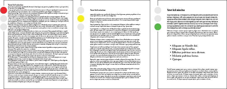
Figure 3.15. White Space for Emphasis. White space creates emphasis, but you may not notice it until it’s missing (example A). In example B, white space can be found between the title and the text, between lines of text, between paragraphs, and even between words.
Proximity
Proximity has to do with where items are placed in relation to one another. Similar ideas should be close to each other. Dissimilar ideas should be farther apart. White space and grids separate and group different elements. When proximity is logical in a document, the physical closeness of similar types of information contributes to the user’s understanding.
Kenji uses proximity in the brochure by keeping topics logically grouped. For example, the brochure will list contact information such as a phone number and a web address for the conference. Kenji will keep this information together in close proximity. Users expect all contact information to be in one place, not spread around the brochure. Kenji will also put similar content nearby, such as the address for the conference or directions. If Kenji hasn’t created this kind of document before, he’ll probably want to look at examples to get a sense of what’s typical. That way, he’ll use proximity in a way that’s familiar to users.
Headings
Headings are words or phrases used as labels to group information within a document. The human brain likes to chunk information for understanding and retention, and headings allow the user to see where one section ends and a new one begins.
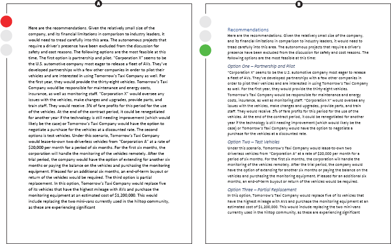
Headings can help you avoid the “wall of text” effect, as shown in figure 3.16a. The audience can use headings like road signs to guide them through a document. Headings make the information more organized and scannable. That way, users can glance through the sections and see the structure and relationship of information.
Headings also create a hierarchy of ideas, with main concepts receiving a top-level heading and subtopics receiving a lower level heading, or subheading. When headings and subheadings are done well, you should be able to read just those elements and understand the scope and sequence of the document. Figure 3.16b breaks up the “wall of text” using a first-level heading for “Recommendations.” The document identifies three recommendations with a second-level heading.
Figure 3.16. “Wall of Text” vs. White Space. A document with no paragraph or section breaks (see example a) is hard to read. Example b shows the same text with headings and subheadings to break up the “wall of text” and increase readability.
The contrasting size and font in the headings give users an immediate sense of the document’s organization. Headings should be parallel to create consistency. Parallelism is the consistent balance and structure of words or phrases. For example, if you have a level one heading with two words, then your other level one headings should be of similar length. Users expect this level of consistency. Plus, if you want to create a table of contents for your document later, using consistent and parallel headings is essential. The design elements of white space, contrast, proximity, and headings all contribute to the organization of a document.