Practical models for technical communication - Shannon Kelley 2021
Types of visuals
Layout and design
Elements of visual design help users understand and remember pertinent information in a document. Visual design often follows social conventions that make material more user-friendly. Common visuals include images, photographs, tables, charts, and graphs. Visuals balance out text, provide another format for understanding, and connect the visual learning areas of the brain.
See Chapter 2 for more on distorted or misleading information.
Tables, charts, and graphs are ways of displaying complex information in more accessible ways. You can think of each visual display as a tool with a specific use. Each tool gives us a unique way of understanding the information. If you choose the wrong visual display, you risk confusing the user or even misrepresenting the facts.
As a professional, your job is to make ethical choices in the visual presentation of data. Not doing so could cause a legal problem for you and your employer. Remember that visual data can be deliberately distorted, but it can also be misrepresented through sloppy work. In either case, the technical communicator is at fault, so pay attention to the accuracy and appropriateness of your visual communication.
Tables
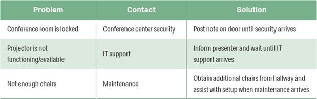
Tables organize data visually in columns and rows for easy comparison. Tables can be used to organize numbers or words (figures 3.19a and 3.19b). When is it best to use a table? If your purpose is to show multiple facts and figures, a table might be your best bet. It’s an efficient tool for organizing information so that the user can quickly scan and compare.
Figure 3.19a. Numerical Table. Kenji uses a numerical table to show conference attendance in recent years and its relationship to the registration fee. The table shows trends and allows for easy comparison of information.
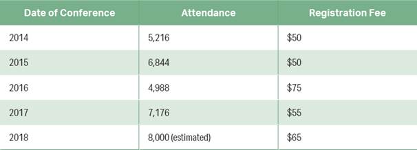
Figure 3.19b. Prose Table. Kenji provides a prose table that allows conference volunteers to troubleshoot the most common problems they might encounter during the event.
Charts
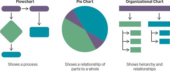
Charts organize data to show relationships by using shapes, arrows, lines, and other design elements. There are many types of charts. Common examples include flowcharts, pie charts, and organizational charts (figure 3.20).
Pie charts are useful for displaying data for about six categories or fewer. Kenji chooses a pie chart to show the types of activities that will be available at the conference. Since Tavent is trying to increase its attendance numbers, Kenji breaks down the events as a way to persuade more people to attend.
Figure 3.20. Different Types of Charts. Different charts serve different needs. Flowcharts are a good choice to illustrate a sequence of events or process. Pie charts make it clear how all the parts add up to a whole. Organizational charts help us see who reports to whom and the hierarchy of roles and responsibilities within an institution or company.
Graphs
A graph translates numbers into shapes, shades, and patterns. Graphs can display approximate values, a main point about those values, or the relationship between the two. There are generally two types of graphs: bar graphs and line graphs.
In a simple bar graph, horizontal bars or vertical bars represent the number of items in a particular category. A bar graph shows trends or changes over time. In Kenji’s example of a bar graph, he defines the category he wants to measure: the types of engineers who attended last year’s conference (figure 3.21).
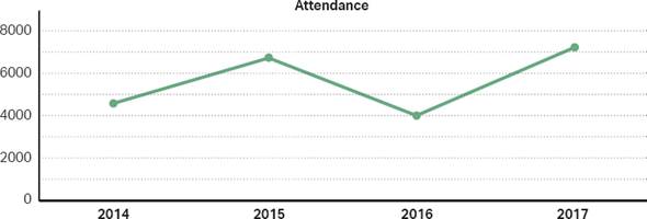
A bar graph that displays its information horizontally is sometimes called a line graph. Line graphs display how one part, or variable, is affected as another rises or falls. In Kenji’s market research, his line graph shows how conference attendance fluctuated over the past four years (figure 3.22).
Illustrations and Diagrams
Illustrations rely on drawings and sketches rather than data or words. Technical illustrations often depict what words cannot. Diagrams show how parts of an object fit together. Common diagrams include cutaway, cluster, and cycle diagrams. Eventually, the conference organizers will need an illustration for their website and conference guide that shows the location of events in the multilevel convention center.
See Chapter 7 for more on collaboration.
Kenji didn’t make all of this happen on his own. First, he met with his client, Tavent, to figure out their needs. In that conversation, Tavent most likely relayed the needs of their clients, the potential attendees. Once Kenji had information to work with, he then returned to his team to conduct market research. Next, he got his graphic designers on board to design the brochure and PDF. Lastly, he organized writers to create the content. As you can see, it takes a team of people to create reliable and trustworthy content.
Figure 3.21. Bar Graph. This simple bar graph shows who attended the conference. To show attendance over time, a multiple bar graph would have a bar for each year in each category.
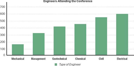
Figure 3.22. Line Graph. Kenji’s line graph examines one data point: how many people attended the conference year by year. In a multiline graph, Kenji could examine the numbers of different types of engineers who attend year by year, assuming he has that data.
![]() Case Study
Case Study
Develop a Document Plan
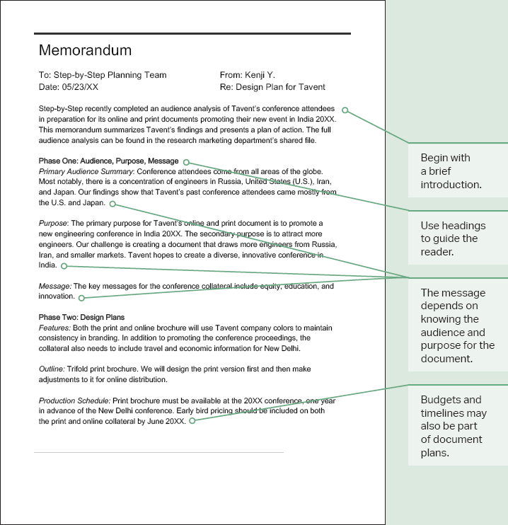
This case study is an opportunity for you to put into practice what you’ve learned. Part of this chapter focuses on creating readable, useful documents so the user can find what they need and understand the message. Look at the following case study to consider how creating a document plan keep you on track and provides a consistent layout for the user:
See Chapter 7 for more on workplace documents.
A document plan comes after you identify an issue in need of a solution. This process leads you to the purpose, audience, and message of your document. Think of a document plan like an outline that helps you organize your ideas.
Document plans come in different shapes and sizes. They can be as short as a basic memo or as long as a multipage report. In figure 3.23, Kenji begins with a statement of the issue (his purpose). After establishing his audience and purpose, Kenji asks himself the following questions:
” Setting: Where will the user most likely access the document? On the go? In their office?
” Potential obstacles: What are some potential problems of this document plan?
” Format: What kinds of text, visuals, and layout are most useful for conference goers?
” Timing: What design deadlines will keep the team on track?
” Budget: How might the available funds from the client affect the final product?
When planning is complete, Kenji is ready to write, test, revise, and proofread a document. Because he works with a team of people, this planning document prepares his team to be successful as they move into the next phase of the project.
Discussion
” Print and online documents have different requirements. What three features of design are vital for effective online design?
” Look up effective sentence and paragraph length for the type of document Kenji’s team is preparing. What did you find?
” What message should Kenji and his team aim to convey to the audience?
Figure 3.23. Document Plan Model. A basic document plan can be as short as a memo.
![]() Checklist for Document Design
Checklist for Document Design
Readability
![]() Have you chosen a readable font (most likely sans serif font for technical documents)?
Have you chosen a readable font (most likely sans serif font for technical documents)?
![]() Do you vary your sentence length and avoid fragment sentences or sentences that are too lengthy?
Do you vary your sentence length and avoid fragment sentences or sentences that are too lengthy?
![]() Have you used a grid to align elements within your document?
Have you used a grid to align elements within your document?
Organization
![]() Have you arranged your document according to user needs (such as chronologically or sequentially)?
Have you arranged your document according to user needs (such as chronologically or sequentially)?
![]() Is the organizational pattern easily detectable?
Is the organizational pattern easily detectable?
![]() Have you grouped content logically to help your user navigate?
Have you grouped content logically to help your user navigate?
Emphasis
![]() Have you used white, or empty, space to draw attention to certain design features?
Have you used white, or empty, space to draw attention to certain design features?
![]() Have you used contrast selectively to avoid overwhelming the user?
Have you used contrast selectively to avoid overwhelming the user?