Practical models for technical communication - Shannon Kelley 2021
Creating user-friendly content
Technical communication fundamentals
While many examples of technical content adequately convey ideas, the best forms of technical communication present information in easy-to-understand formats. This does not mean “dumbing down” information for your user. It means meeting the user where they are. The responsibility for creating user-friendly content is yours.
When you write clearly, you show respect for your user’s time and attention. You can improve technical documents’ usability by making content clear, concise, precise, accurate, and both scannable and skimmable. The following sections will explore these ideas in more detail.
Be Clear
Clarity means creating understandable content through your words, sentences, and organization so users can take action with as little effort as possible. Users come to you, or a document you created, with a goal in mind. They want to accomplish a task, learn something new, or fix a problem. When a document isn’t clear, the user may give up in frustration.
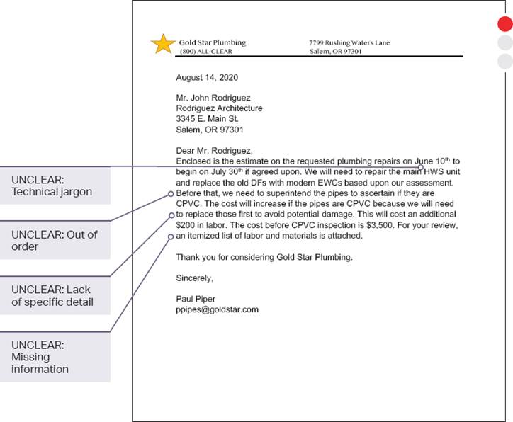
To avoid frustrating your users, you need to keep in mind what they already know and what they need to know. Specialized terminology—something you’ll encounter frequently in technical communication—can frustrate a general audience. Experts often develop their own language when they talk to each other, and your job as a technical communicator is to translate this expertise into language that non-experts can understand. Just like in the shoe-tying example at the beginning of the chapter, technical communicators must break down new information into smaller, incremental steps that someone else can follow. Notice the difference in usability and clarity between these two examples (figures 1.8a and 8b).
Clear writing also means presenting content in a logical sequence. An organized sentence presents information in the order the user needs it. Sentences written in active voice tend to be clearer because they state directly who is doing what. For instance, take a second look at the final paragraphs in Figure 1.8a. The first letter reads, “For your review, an itemized list of labor and materials is attached.” Who has provided this list, and what should be done once it is reviewed?
This textbook uses streetlights to show the usefulness of each example.
![]() A red light indicates a problematic example.
A red light indicates a problematic example.
![]() A yellow light indicates the example is close but still lacks effective elements.
A yellow light indicates the example is close but still lacks effective elements.
![]() A green light indicates an example with useful elements.
A green light indicates an example with useful elements.
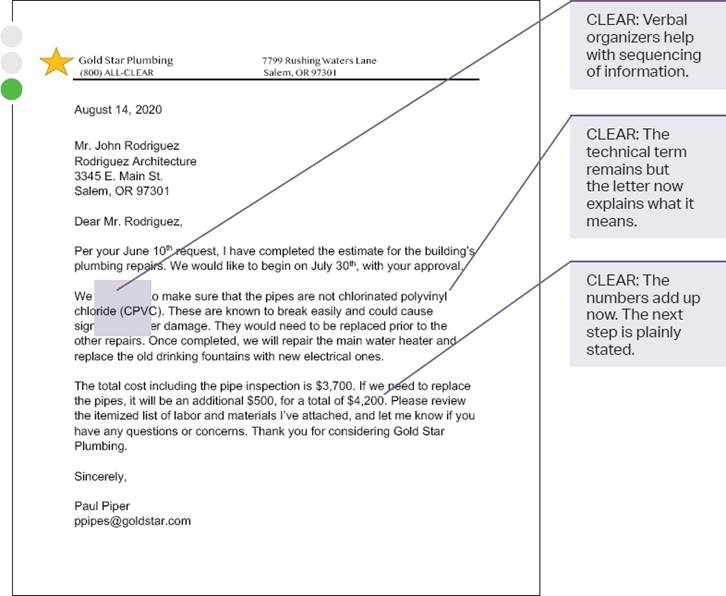
Figure 1.8a. Letter Draft. Your first draft of any technical document is likely to need some revision.
A more direct and active rewrite of this sentence can be found in the revised letter in Figure 1.8b: “Please review the itemized list of labor and materials I’ve attached.” Now the user knows what to do with the list and who to get in touch with if they have any questions. Clear organization begins at the sentence level and extends throughout the entire document.
Figure 1.8b. Revised Letter. Notice how the second letter takes a step back, considers the audience, and organizes information in a way that is easy to read and understand.
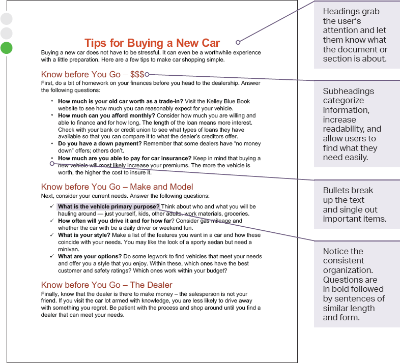
Most users won’t read every word in a technical document, which is why clear organization is essential. Headings, subheadings, numbers, bullets, and verbal organizers help users track the information and find what they need. Take a look at the two versions of this flyer to see how simple changes can clarify your message, even if you don’t change a word (figures 1.9a and 9b).
Figure 1.9a. Document Draft. In this first example, no effort has been made to enhance the document’s appearance or break up the text.
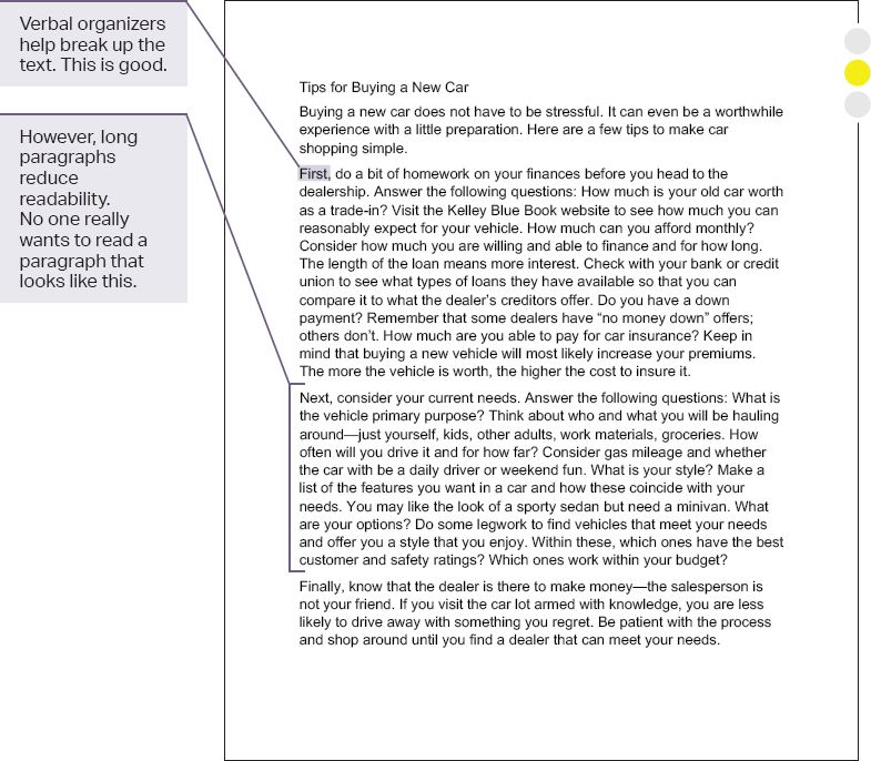
Figure 1.9b. Revised Document. In this revised example, the use of headings, subheadings, bold text, and bullets makes the content easier to read.
Be Concise
Conciseness means that your document has enough detail and information without unnecessary content. For example, your first draft of an email to your boss might look like this: “The first widget worked better than the second one because it was faster and easier to use.” There’s nothing wrong with this sentence, but consider your audience. If your boss receives over two hundred emails a day, wouldn’t she prefer something more to the point? Your second draft gets you there: “The first widget outperformed the second.”
The first time you describe a process or give instructions you might use more words than necessary. That’s normal. Make a game out of hunting for every opportunity to trim your sentences, even by a word or two. With time, you can cultivate a habit of rewriting for conciseness.
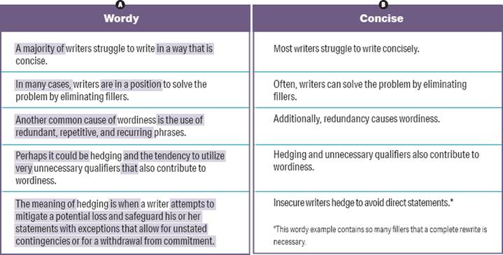
New writers sometimes over-explain or use more words than necessary to describe a concept. The same can be true of writers who are familiar with a topic—they might struggle to decide what is necessary for the audience. The examples in figure 1.10 translate wordy sentences into more concise versions. Look again, and you’ll notice that it’s the tiny words that often set up a writer for wordiness: “of,” “in,” “it,” “is,” “that,” and “to.” These are some of the most common words in the English language. You need these words to hold a sentence together. Too many of them, however, can overwhelm the words that carry information and overburden your user.
Technical communication gets to the point. When your content is concise, it means that you have removed redundancy, which is the unnecessary repetition of words, phrases, or ideas. It also means that you’ve cut out anything unrelated or irrelevant, no matter how clever it seemed when you first wrote it. Think of your sentences like a simple machine. Avoid additional parts that don’t help to move it forward.
Be Precise
To make your content precise, focus it like a laser. You should focus on the overall organization of your documents, paragraphs, and sentences, but precision is most evident in the words you choose. When you express your meaning through laser-focused words that meet your audience’s needs, you achieve precision.
Figure 1.10. Revising for Concision. Study how these sentences move from wordy to concise. Technical communication uses clear, efficient language.
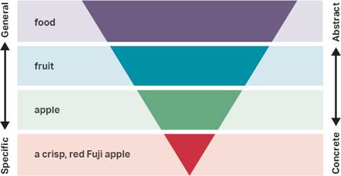
You can make your writing precise by using the ladder of abstraction, a concept developed by English professor S. I. Hayakawa in his book Language in Thought and Action. You can think of an actual ladder or an inverted pyramid like the one in figure 1.11 with words on four levels. At the bottom level are words that are specific and concrete. As you move up the ladder, the words become more general and abstract. Precise language often includes words lower on the ladder of abstraction that can be understood through the senses. For example, you know what food is, but you can taste and see a crisp, red Fuji apple.
A thesaurus can also be a great way to find the exact word you need. You can find this reference guide as a book, online tool, or built-in feature of your word-processing program. This resource contains lists of synonyms that can help you expand your vocabulary.
A thesaurus must be used with caution, though. New writers often select random words from the thesaurus to make their writing sound more intelligent. This practice decreases your clarity and precision. Writer Stephen King warns against the use of a thesaurus because “any word you have to hunt for in a thesaurus is the wrong word.” The best word, in his opinion, is the word you already know and the word you know your audience knows.
Figure 1.11. From General to Specific. Precision in writing requires words that we can see clearly and recognize. The inverted pyramid illustrates how you can move from general to specific language.
Consider the different meanings for each of these synonyms for “old”:
” Obsolete
” Vintage
” Old-fashioned
” Neolithic
” Classic
If you are talking about a piece of software, calling it “obsolete” would imply that it is no longer in use and has lost its value. Calling it “vintage” means it may have accrued value for collectors and is still being used in some fashion. Either of these words is more precise than the word “old,” but they imply different qualities.
While native and nonnative speakers of English know thousands of words, a person’s daily use of English is most certainly a fraction of that total. Rather than looking in the thesaurus for fancy new words, search for the familiar word that conveys precisely what you want to say.
Be Accurate
While precision deals with using the most appropriate content for the situation, accuracy refers to using content based on verifiable information. Accuracy means that a document is free of errors. Keeping a document accurate requires that you avoid making assumptions or telling yourself that it’s “close enough.” This means you need to research any gaps in your knowledge before you try to instruct, inform, or persuade someone to do something. As you aim for accuracy, make sure you have a clear distinction among facts, inferences, and judgments.
Facts
Facts are verifiable. When you write a college paper or a researched report, you provide documentation of your sources so your audience (your teacher) can check that your information is factual. In many technical fields, facts are data. Data are the bits of information—typically numbers—a communicator uses to support a larger idea.
A single data set needs context and explanation to be factual in a useful sense. For example, try to make meaning out of this data: The National Highway Traffic Safety Administration (NHTSA) states that there were 34,439 fatal crashes in 2016. This single data point is interesting, but it needs more context to be useful. Is that number an increase or decrease from years prior? What is the distribution of these fatal crashes? Are fatalities more common in certain states than others?
Inferences
Inferences are conclusions based on data. When you make an inference from the available facts, you make meaning of the data. You need more than one data set to reach any reasonable conclusions; otherwise you risk making false statements. In many technical fields, it’s expensive or dangerous to make recommendations based on insufficient data.
As you saw in the previous example, the 2016 statistic about fatal auto crashes can’t support an accurate inference. The fact merely exists. If you add another fact to the first one, you can begin to make connections that lead to a reasonable inference. For example, of the 34,439 fatal crashes in 2016, 10,111 were caused by speeding. What do these facts, side by side, tell you?
Judgments
When you form an opinion based on facts, inferences, and values, you express a judgment in the form of a recommended course of action. As a technical communicator, you need to share judgments that are accurate and ethical.
Based on the fatal crash data on speeding, you could make a judgment that “if fewer people drove above legal speed limits, fewer crashes might occur, so people should not speed in their cars.” This would be a reasonable and accurate judgment, given this data.
Be Scannable and Skimmable
Today’s users expect technical documents to be easily scannable and skimmable. Scanning means to look for a specific piece of information in a document. If you need to call your doctor, you might scan the doctor’s website for different ways to contact the office. Or you might search for the return policy on a receipt for a sweater that didn’t fit right. In both cases, you know the information is available—you just need to find its specific location.
Skimming is different. Skimming means to look for the general or main ideas of a document. Readers do this to get a sense of the overall organization or key ideas in a document. Newspaper headlines are a great example: if you skimmed a newspaper and read only the headlines, you would have a general idea of that day’s news. You can use this tactic with scholarly articles and studies, which can be long and dense. If you skim the abstract, introduction, and discussion, you can get a sense of what the study covers and whether it applies to your research.
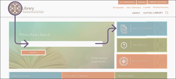
Web pages are often designed to be scanned. Take a moment to notice how your eyes move across this screenshot of a web page in figure 1.12. The visual elements on this page allow your eyes to scan for useful information. Your eye will most likely land first in the top left-hand corner of the page because that is where our eyes have been trained to go ever since we learned how to read. Where does your eye go next? The icons on the right draw the user to the most frequently accessed information on the site. And next? Your eye bounces to the search bar where you can begin looking for materials for your next report.
Figure 1.12. Design for Scannability. Web pages are designed to be scanned. The directional lines show how the structure of the page helps you find what you need.
Consider the way a potential employer reviews a résumé. Headings, subheadings, bullet points, lists, bold, italics, and white space can help direct the employer’s eye to important information that will make the résumé stand out. This concept connects basic design with content. Effective design allows the user’s eye to move over the page and grasp the major points without sustained effort. It is a new form of literacy. Developing your ability to create clear, precise, accurate, and usable content is why you’re here.
See Chapter 3 for more on design and layout and Chapter 6 for more about effective design of job materials.
![]() Case Study
Case Study
User-Focused Content
This case study is an opportunity for you to put into practice what you’ve learned. Part of this chapter focuses on the end user and creating user-friendly documents. Look at the following case study to consider what happens when the user’s experience is not taken into account:
In her second year at Acme Community College, Maribel began looking at four-year universities. She found a school in Southern California that looked like a good fit. So Maribel scheduled a tour of the campus, purchased a flight into the Orange County airport, and rented a car with Speedy Car Rental.
At Ground Transportation, she saw a sign for “Rental Cars” with an arrow pointing to the left and for “Shuttles” pointing to the right (figure 1.13). The sign was clear. The only problem was that Speedy Car Rental was not listed.
Figure 1.13. Signage Example. Ineffective signage can cause confusion.

She checked her email from Speedy again but found no further instructions. After asking at the Cheap-O-Cars counter, Maribel dragged her suitcase back to the “Shuttles” location and asked for help again.
While waiting, she noticed a bulletin board with several papers pinned to it. One torn sheet of white paper announced that “Speedy Car Rental has arranged to partner with Holiday Hotel shuttle.”
Discussion
” How many instances of technical communication can you identify in this scenario?
” What could have been done to make these technical documents more user-friendly?
” What human factors or environmental conditions contributed to the failed modes of communication you identified?
![]() Checklist for Technical Communication
Checklist for Technical Communication
Problem-Solution
![]() Have you identified the purpose of your document?
Have you identified the purpose of your document?
![]() Have you established who your audience is by creating a user profile?
Have you established who your audience is by creating a user profile?
![]() Have you checked that your message is consistent with your purpose and audience?
Have you checked that your message is consistent with your purpose and audience?
Multimodal Communication
![]() Have you selected the mode or modes (visual, aural, gestural, spatial, and linguistic) that are most meaningful for your user?
Have you selected the mode or modes (visual, aural, gestural, spatial, and linguistic) that are most meaningful for your user?
![]() Can your user interact with the document, not just read it?
Can your user interact with the document, not just read it?
![]() Have you determined the best medium (output) for your document according to the user’s needs?
Have you determined the best medium (output) for your document according to the user’s needs?
Characteristics
![]() Is your document clear, understandable, and easy to navigate?
Is your document clear, understandable, and easy to navigate?
![]() Do you use facts that are verifiable and accurate to increase your credibility?
Do you use facts that are verifiable and accurate to increase your credibility?
![]() Do you avoid unnecessary information that isn’t consistent with the document’s purpose?
Do you avoid unnecessary information that isn’t consistent with the document’s purpose?