AMA Manual of Style - Stacy L. Christiansen, Cheryl Iverson 2020
Typefaces, Fonts, and Sizes
Editing, Proofreading, Tagging, and Display
A typeface is a design for a set of characters (eg, Times Roman, Arial). A font of type is the complete assortment of characters, qualities (eg, size, pitch, and spacing), and styles (eg, bold, italics) of a particular typeface. Note: The term font is often used incorrectly as a synonym for typeface.
A family of type:
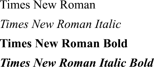
There are 2 common forms of typeface: serif and sans serif. Serif typefaces (eg, Times Roman) have a short, light line (serif) projecting from a letter’s main strokes. Sans serif typefaces (eg, Arial) are unadorned letters without the short line projections. Serif type is generally believed to be more readable than sans serif type for large amounts of printed text because serifs on the letters guide the eyes along a line of copy and the modulated thick and thin strokes of serif types help distinguish individual letters and words to be read. Thus, for print publications, serif type is generally used for body text because of its readability; sans serif type is used for contrasting and complementary elements and to attract attention (eg, titles, headings).1,3,4 For electronic display, sans serif typefaces often display better and are more legible than serif typefaces.1
The font for a publication typically includes 7 styles:
roman capitals (uppercase letters) |
ABCD |
roman lowercase letters |
abcd |
boldface capitals |
ABCD |
boldface lowercase letters |
abcd |
italic capitals |
ABCD |
italic lowercase letters |
abcd |
small capitals |
ABCD |
Each of these styles may also include different weights or heaviness of stroke (eg, light, regular, heavy, black, extra bold, condensed). Each font also includes numerals, punctuation marks, symbols and diacritical marks (eg, accents, tildes, umlauts), and ligatures and diphthongs (≥2 letters joined together; ligatures [eg, æ and fi] may be vowels and consonants, whereas diphthongs [eg, æ] are vowels only). Not all serif and sans serif typefaces share similar characteristics, and not all typefaces include all font characteristics. For more discussion on typeface characteristics, see Bringhurst’s The Elements of Typographic Style.7
Increasingly, web fonts are being created that are designed for electronic display, particularly on low-resolution devices, such as smartphones and tablets.5 Two examples of such typefaces are Georgia and Verdana. These feature better character fitting and larger x-height,5 both qualities that offer better onscreen readability (but not necessarily for print).
The size of type is conventionally referred to as its point size. The height of characters in a specific font is measured in points; each point is approximately 1/72 inch (0.35 mm), 12 points equals 1 pica, and 6 picas equals 1 inch (25.4 mm). Picas are used in the dimensions of a page, including spacing between columns and other elements. However, the overall dimensions of a page may be provided in inches by publishers and printers who still work with conventional (nonmetric) units.3
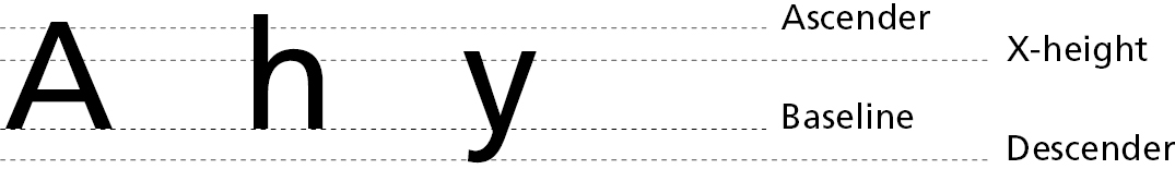
The height of a letter in a specific font is measured by its x-height (so named because it is derived from the height of a lowercase x). The x-height is the distance between the baseline of a line of type and the top of the main part of the lowercase letter, not including ascenders and descenders. An ascender is the part of a letter that rises above the x-height of the font as seen in the letters b, d, f, h, k, and t. A descender refers to the part of the letter that dips below the baseline (eg, p, q, y, and Q) (Figure 21.6-2). The width of a specific character is measured by pitch, which refers to how many characters can fit in an inch.
Figure 21.6-2. The x-Height, Ascenders, and Descenders of Letters
Typefaces are commonly available and used in 6-point to 72-point sizes. In print, type sizes below 14 points are generally used for body text, and sizes of 14 points and above are generally used for display types (eg, titles and headlines). Optimal text type sizes vary, depending on the medium and the content.8 The JAMA Network journals, for example, use Guardian Egyptian 8 point for regular body text and Guardian Sans 15 point, medium weight, for article titles.
Online, the lower resolution of display would make smaller point sizes difficult to read. Thus, 14-point type is often used onscreen, which causes the reader to scroll more but makes the copy more legible.5
Points are also used to measure the space between lines of type (leading). The pica is used to measure the length of a line and the depth of the type area.
The horizontal spacing of type is measured in ems, which is a measure for each size of type whose value varies with size, specifically the size of a lowercase m. For example, in 9-point type, the em is 9 points; for 12-point type, the em is 12 points.7 Multiple conventions suggest an optimal number of characters per line for speed and comprehension of reading of journal articles and books and to avoid excessive hyphenation or a page spotted with erratic and distracting white spaces between words (eg, ladders, rivers).5,7 The optimal number varies according the typeface, type size, column format (eg, 3-, 2-, or 1-column format), and publication (journal vs book). One convention suggests that readability is best when 45 to 75 characters (including punctuation and spaces) fit on 1 line of the column.7,8 Higher numbers of characters are best suited to single-column designs. For multiple-column formats, such as those used in scholarly journals, conventions suggest that 40 to 50 characters per line is ideal or that the column width should accommodate 1½ alphabets (approximately 39 characters) of the typeface per line. In each case, a column width that is too narrow results in excessive hyphenation at line endings, whereas one that is too wide results in a line too long for the eye to easily complete.