PSAT/NMSQT Prep 2022 - Eggert M.D., Strelka A. 2022
Tables and graphs
Tables, statistics, and probability
Data analysis
Learning objective
After this lesson, you will be able to:
· Draw inferences about data presented in a variety of graphical formats
· Find an unknown value given the average
To answer a question like this:
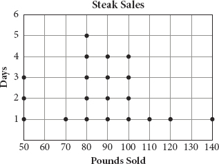
A restaurant owner wants the restaurant’s grand opening to go well and sets a goal of selling an average of 90 pounds of steak per day for the first three weeks. The dot plot shows the number of pounds sold in the first 20 days. What is the minimum number of pounds the restaurant would need to sell on the last day to meet the goal?
A. 60
B. 80
C. 100
D. 140
You need to know this:
The PSAT uses some straightforward methods of representing data sets that you are certainly already familiar with. You likely don’t need to review, for example, how to look up information in a table or read a bar chart. There are, however, some less common types of plots that show up from time to time that can be confusing at first glance.
· Tables, bar charts, and line graphs show up all the time in the Math sections (and in the Reading and Writing & Language sections, too). They shouldn’t be difficult to interpret, but it’s helpful to keep in mind that the test maker often includes more information than you actually need. It’s important to consider what the question asks for so that you find only the information that you need.
· Frequency tables and dot plots are ways of representing how many times a data point appears within a data set. Here is a data set (the number of appliances sold by a single sales person over some time frame) presented as a dot plot:
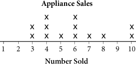
Each “X” represents one instance in the data set of each “number sold.” So, for example, there were two different days on which this person sold 3 appliances, three different days on which this person sold 4 appliances, and so on. The data could just as easily be written as a data set {3, 3, 4, 4, 4, 5, 6, 6, 6, 7, 8, 10, 10}, or placed in a frequency table:
|
Number Sold |
Frequency |
1 |
0 |
2 |
0 |
3 |
2 |
4 |
3 |
5 |
1 |
6 |
3 |
7 |
1 |
8 |
1 |
9 |
0 |
10 |
2 |
· Histograms look a lot like bar charts and can be read in the same way, but they are similar to frequency tables and dot plots in that they show how many times a certain value shows up in a data set for a variable. The histogram for the appliances data set would look like this:
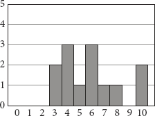
Notice that the histogram is basically the same as the dot plot for this data set. Histograms are better for representing larger data sets for which individual dots would be difficult to count.
You need to do this:
· When presented with a question that uses a graph or table to present information, first inspect the format of the graph or table. What kind of graph or table is it? What information is presented on each axis? What information do you need to find in order to answer the question?
· Find the information you need from the table or graph and then use the information for any calculation the question might require, such as taking the average, finding the median, or thinking about standard deviation.
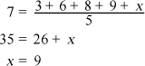
· Use the average formula, ![]() , to find unknowns. For example, if you know that the average of five terms is 7, and you know that four of the terms are 3, 6, 8, and 9, you can call the last term x and plug into the equation, then solve for x:
, to find unknowns. For example, if you know that the average of five terms is 7, and you know that four of the terms are 3, 6, 8, and 9, you can call the last term x and plug into the equation, then solve for x:
Explanation:
This question gives you an average and asks for a missing value. First, set up a general equation for the average:
![]()
The event takes place over three weeks, which is 21 days, and the average is given as 90 pounds per day. Use the dot plot to calculate how many pounds were sold in the first 20 days by adding all the numbers given, which is 1,750 pounds. Let p represent the missing number of pounds sold:
![]()
Multiply both sides by 21 to get rid of the fraction and then subtract 1,750 from both sides to isolate p:
![]()
The correct answer is (D).
Try on Your Own
Directions: Take as much time as you need on these questions. Work carefully and methodically. There will be an opportunity for timed practice at the end of the chapter.
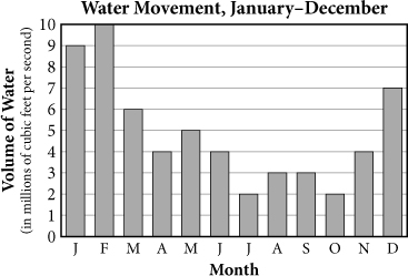
1. A researcher placed a fluid motion sensor in the Atlantic Ocean along the North Carolina coast to study the movement of the water. Every morning at 6:00 a.m., the movement of the water past the sensor was recorded. The figure above shows the results. Based on the data, which of the following would be a valid conclusion? (Assume that the summer months are June, July, and August and the winter months are December, January, and February.)
A. In general, a greater volume of water moves per month in the Atlantic Ocean during the winter months than during the summer months.
B.In general, a greater volume of water moves per month in the Atlantic Ocean during the summer months than during the winter months.
C.In general, a greater volume of water moves per month in the oceans around the world during the winter months than during the summer months.
D. In general, a greater volume of water moves per month in the oceans around the world during the summer months than during the winter months.
HINT: Focus on the parts of the table that are required to answer Q2 and ignore the rest.
|
Cars |
Trucks |
SUVs |
Total |
|
No Service |
39 |
20 |
13 |
72 |
Rotate |
48 |
36 |
60 |
144 |
Replace |
7 |
8 |
17 |
32 |
Total |
94 |
64 |
90 |
248 |
2. ![]() When a consumer gets an oil change for a vehicle, the service technician typically checks the tread depth and wear condition of the tires. The technician then recommends one of the following: no service needed, rotate tires, or replace one or more tires. The table above shows one technician’s recommendations for the month of June. For what fraction of cars and trucks did this technician recommend a tire rotation?
When a consumer gets an oil change for a vehicle, the service technician typically checks the tread depth and wear condition of the tires. The technician then recommends one of the following: no service needed, rotate tires, or replace one or more tires. The table above shows one technician’s recommendations for the month of June. For what fraction of cars and trucks did this technician recommend a tire rotation?
A. ![]()
B.![]()
C.![]()
D. ![]()
Questions 3 and 4 refer to the following information.
|
Group |
Proportion |
A: inert, mild or no side effects |
34.5% |
B: inert, moderate side effects |
9.2% |
C: inert, severe side effects |
6.2% |
D: drug, mild or no side effects |
9.5% |
E: drug, moderate side effects |
12.8% |
F: drug, severe side effects |
27.8% |
Dr. Hunter is overseeing a treatment-resistant influenza Phase I trial with 400 healthy participants: half are given the drug and half are given an inert pill. The table shows a distribution of the severity of gastrointestinal side effects.
3. ![]() How many trial participants did not have severe side effects?
How many trial participants did not have severe side effects?
HINT: Use the calculation you did for Q3 to answer Q4.
4. ![]() Of those who had severe side effects, what percent were administered the drug? (Round to the nearest whole number and omit the percent sign when gridding in your answer.)
Of those who had severe side effects, what percent were administered the drug? (Round to the nearest whole number and omit the percent sign when gridding in your answer.)
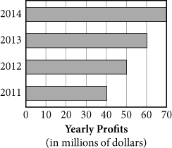
5. The graph above shows the yearly profits of an organic produce company. If the company’s profits continue to grow at the same rate, in which year will it have a yearly profit that is 100% greater than its profit in 2013?
A. 2019
B.2020
C.2021
D. 2022
|
TV Owners |
Thursday Viewing Audience (all channels) |
|
Under age 35 |
4,100 |
1,900 |
Age 35 or older |
3,400 |
1,600 |
6. ![]() The table above displays data that show the number of TV owners in the town of Jonesville and how many of these owners had their televisions on during a particular Thursday evening. On that evening, 20 percent of TV owners in Jonesville tuned in to a certain channel. If a channel’s nightly rating is reported as a fraction and is defined as
The table above displays data that show the number of TV owners in the town of Jonesville and how many of these owners had their televisions on during a particular Thursday evening. On that evening, 20 percent of TV owners in Jonesville tuned in to a certain channel. If a channel’s nightly rating is reported as a fraction and is defined as ![]() , then what was the channel’s nightly rating?
, then what was the channel’s nightly rating?