PSAT/NMSQT Prep 2020 - Princeton Review 2020
Tables, statistics, and probability
Data analysis
Learning Objectives
After completing this chapter, you will be able to:
· Draw inferences about data presented in a variety of graphical formats
· Find an unknown value given the average
· Calculate mean, median, mode, and range
· Describe standard deviation and margin of error
· Determine whether a survey is valid or biased
· Draw inferences about surveys and data samples
· Calculate probabilities based on data sets
60/600 SmartPoints®
How Much Do You Know?
Directions
Try the questions that follow. Show your work so that you can compare your solutions to the ones found in the Check Your Work section immediately after this question set. The “Category” heading in the explanation for each question gives the title of the lesson that covers how to solve it. If you answered the question(s) for a given lesson correctly, and if your scratchwork looks like ours, you may be able to move quickly through that lesson. If you answered incorrectly or used a different approach, you may want to take your time on that lesson.
Questions 1 and 2 refer to the following information.
|
French |
German |
Italian |
Japanese |
Total |
|
|
Freshmen |
342 |
261 |
489 |
103 |
1,195 |
|
Sophomores |
276 |
199 |
324 |
54 |
853 |
|
Juniors |
190 |
108 |
252 |
29 |
579 |
|
Seniors |
158 |
97 |
219 |
24 |
498 |
|
Total |
966 |
665 |
1,284 |
210 |
3,125 |
1. Assuming that all students are required to take exactly one language, which student class contains the greatest percentage of students enrolled in a Romance (French or Italian) language?
1. Freshmen
2. Sophomores
3. Juniors
4. Seniors
2. A group of 150 freshmen were randomly selected for a survey that asked whether they were excited to continue their foreign language studies in the next school year. Of this group, 93 said they were excited to continue, 37 said they were not excited to continue, and 20 said they did not know yet whether they were excited to continue. Using the data from this survey and the table, which of the following is most likely a valid conclusion?
1. About 130 freshman students do not know yet whether they are excited to continue foreign language studies next year.
2. About 240 freshman students are not excited to continue foreign language studies next year.
3. About 440 freshman students are not excited to continue foreign language studies next year.
4. About 740 freshman students are excited to continue foreign language studies next year.
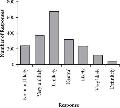
3. Liam is conducting a market research study to determine the effectiveness of advertisements on social networking sites. He surveyed a randomly selected group of 2,000 young adults on how likely they are to purchase from a company based on its advertisements on social networking sites. Respondents rated their likelihood to purchase on a scale from 1 to 7, with 1 being “Not at all likely” and 7 being “Definitely.” The results are summarized in the bar graph above. Which of the following statements is NOT true based on the survey results?
1. mode = 3
2. median = 3
3. mean < median
4. 2 < mean < 5
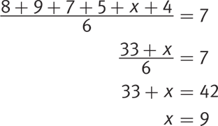
4. The average (arithmetic mean) of the data list {2, 4, 5, 8, 9, x, 3} is 5. What is the value of x ?
5. Questions 5 and 6 refer to the following information.
6. The table below summarizes the results of a survey about the favorite sports of a group of high school students. Assume that every student has a favorite sport and that students could select only one favorite.
|
Freshmen |
Sophomores |
Juniors |
Seniors |
Total |
|
|
Football |
441 |
414 |
388 |
450 |
1,693 |
|
Baseball |
317 |
343 |
249 |
283 |
1,192 |
|
Soccer |
222 |
284 |
347 |
316 |
1,169 |
|
Basketball |
370 |
314 |
365 |
291 |
1,340 |
|
Total |
1,350 |
1,355 |
1,349 |
1,340 |
5,394 |
7. The research group that conducted the survey wants to select one participant at random for a follow-up survey. Given that the selected participant is not a freshman, what is the probability of the research group randomly selecting someone who chose baseball as his or her favorite sport?
1. 0.1622
2. 0.2164
3. 0.2399
4. 0.2948
8. Based on the table provided, which of the following is NOT a true statement?
1. About 27% of the entrants in the freshman prize drawing voted for basketball as their favorite sport.
2. About 23% of the entrants in the sophomore prize drawing voted for basketball as their favorite sport.
3. About 27% of the entrants in the junior prize drawing voted for basketball as their favorite sport.
4. About 30% of the entrants in the senior prize drawing voted for basketball as their favorite sport.
9.
Check Your Work
1. C
Difficulty: Medium
Category: Tables and Graphs
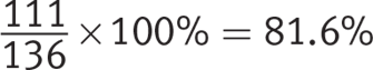
Getting to the Answer: Focus on the columns of the table that you need and block out the rest. Start by identifying how many students in each class are enrolled in either French or Italian (freshmen: 342 French, 489 Italian; sophomores: 276 French, 324 Italian; juniors: 190 French, 252 Italian; seniors: 158 French, 219 Italian). Next, extract the total foreign language enrollment of each class from the table (freshmen: 1,195; sophomores: 853; juniors: 579; seniors: 498). To find the percentages, divide the Romance language part by the language total, then multiply by 100% to convert to a percent:
Freshmen:  69.54%
Sophomores:  70.34%
Juniors: 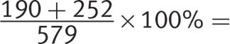 76.34%
Seniors: 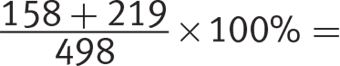 75.70%
The junior class has the highest percent enrollment in Romance languages, so (C) is correct.
2. D
Difficulty: Medium
Category: Surveys and Data Samples
Strategic Advice: Find what you need about the group from the follow-up survey. Then, extrapolate to see which answer choice matches your calculations.
Getting to the Answer: First, determine the number of freshmen who fall into each of the three groups of the follow-up survey:
Percent excited to continue: 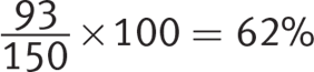
Percent not excited to continue: 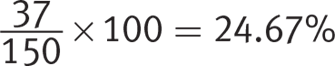
Percent who do not know yet whether they are excited to continue: 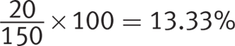
There are 1,195 freshmen in the original survey, making the number excited to continue ![]() ; the number not excited to continue
; the number not excited to continue ![]() ; and the number who do not know yet whether they are excited to continue
; and the number who do not know yet whether they are excited to continue ![]() . Choice (D) states that about 740 freshmen are excited to continue their foreign language studies, which matches these findings. Choice (D) is therefore correct.
. Choice (D) states that about 740 freshmen are excited to continue their foreign language studies, which matches these findings. Choice (D) is therefore correct.
3. C
Difficulty: Medium
Category: Statistics
Getting to the Answer: Examine the bar chart to evaluate the choices.
(A): The bar for “Unlikely” (which is 3 on the scale given in the question) is clearly the tallest, so this is the mode. Eliminate (A).
(B): There are 2,000 responses, so the median is the average of responses 1,000 and 1,001. The total of the first two bars is about 600. Since the third bar is about 700, that means that the median response is indeed within this bar. Eliminate (B).
(C): The data is skewed to the right, meaning that the extreme values on the right will weight the mean calculation to make the mean greater than the median. Thus, (C) is not true and is the correct choice.
(D): If you were not certain that (C) was the correct choice, you could see that the substantial majority of values are between 2 and 5 inclusive, so the mean has to be somewhere within that wide range. Eliminating (D) confirms (C) as correct.
4. 4
Difficulty: Medium
Category: Statistics
Strategic Advice: When the goal is to find a missing value in a set of data and the average is given, consider using the balance approach. We’ll demonstrate both approaches starting with the average formula.
Getting to the Answer: The question requires finding the value of x in the given data set using the average of the data set. The values given in the data, besides x, are: 2, 4, 5, 8, 9, and 3. The average is given as 5. To find the missing value x, plug the known values into the average formula and solve for x:
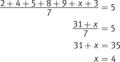
Grid in 4 as the correct answer.
Alternatively, to use the balance approach, write down how much each value is above or below the average of 5. For example, the first value of 2 is 3 below the average: 2 − 5 = −3.
Now, observe that, excluding the variable, the values are −3 + (−1) + 0 + 3 + 4 + (− 2) = 1. Without the variable, the total is 1 more than what you’d expect based on the average. So for the values to balance out to the average, the variable value must be one less than the average of 5, or 5 − 1 = 4. Grid in 4.
5. B
Difficulty: Medium
Category: Probability
Getting to the Answer: The question says that the selected candidate is not a freshman, so focus on the sophomore, junior, and senior columns. This makes the total possible outcomes for this drawing 1,355 + 1,349 +1,340 = 4,044. The total number of upperclassmen who voted for baseball as their favorite sport (number of desired outcomes) is 343 + 249 + 283 = 875. Divide this by the total to find the probability: 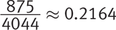 , which makes (B) correct.
6. D
Difficulty: Easy
Category: Tables and Graphs
Getting to the Answer: The question asks for the answer choice that is NOT a true statement, so test each one. Use the table to determine the correct percents for each choice. Notice that all choices are about the estimated percent of students in each class who voted for basketball as their favorite sport, so use the percent formula,  . In each case, the part is the number of students in each class who voted for basketball, while the whole is the total number of students in that class:
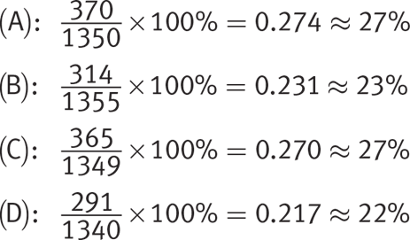
Hence, (D) must be correct since the statement was about 30% and NOT about 22%.
Tables and Graphs
Learning Objective
After this lesson, you will be able to:
· Draw inferences about data presented in a variety of graphical formats
To answer a question like this:
1. 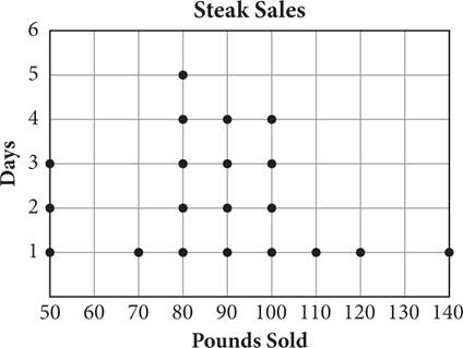
A restaurant owner wants the restaurant’s grand opening to go well and sets a goal of selling an average of 90 pounds of steak per day for the first three weeks. The dot plot shows the number of pounds sold in the first 20 days. What is the minimum number of pounds the restaurant would need to sell on the last day to meet the goal?
1. 60
2. 80
3. 100
4. 140
You need to know this:
The PSAT uses some straightforward methods of representing data sets that you are certainly already familiar with. You likely don’t need to review, for example, how to look up information in a table or read a bar chart. There are, however, some less common types of plots that show up from time to time that can be confusing at first glance.
· Tables, bar charts, and line graphs show up all the time in the Math sections (and in the Reading and Writing & Language sections, too). They shouldn’t be difficult to interpret, but it’s helpful to keep in mind that the test maker often includes more information than you actually need. It’s important to consider what the question asks for so that you find only the information that you need.
· Frequency tables and dot plots are ways of representing how many times a data point appears within a data set. Here is a data set (the number of appliances sold by a single sales person over some time frame) presented as a dot plot:
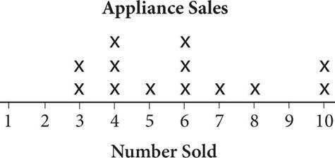
Each “X” represents one instance in the data set of each “number sold.” So, for example, there were two different days on which this person sold 3 appliances, three different days on which this person sold 4 appliances, and so on. The data could just as easily be written as a data set {3, 3, 4, 4, 4, 5, 6, 6, 6, 7, 8, 10, 10}, or placed in a frequency table:
|
Number Sold |
Frequency |
|
1 |
0 |
|
2 |
0 |
|
3 |
2 |
|
4 |
3 |
|
5 |
1 |
|
6 |
3 |
|
7 |
1 |
|
8 |
1 |
|
9 |
0 |
|
10 |
2 |
· Histograms look a lot like bar charts and can be read in the same way, but they are similar to frequency tables and dot plots in that they show how many times a certain value shows up in a data set for a variable. The histogram for the appliances data set would look like this:
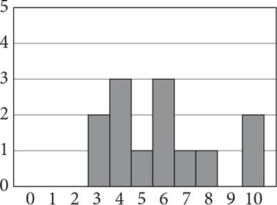
Notice that the histogram is basically the same as the dot plot for this data set. Histograms are better for representing larger data sets for which individual dots would be difficult to count.
You need to do this:
· When presented with a question that uses a graph or table to present information, first inspect the format of the graph or table. What kind of graph or table is it? What information is presented on each axis? What information do you need to find in order to answer the question?
· Find the information you need from the table or graph and then use the information for any calculation the question might require, such as taking the average, finding the median, or thinking about standard deviation.
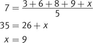
· Use the average formula,  , to find unknowns. For example, if you know that the average of 5 terms is 7, and you know that 4 of the terms are 3, 6, 8, and 9, you can call the last term x and plug into the equation, then solve for x:
Explanation:
This question gives you an average and asks for a missing value. First, set up a general equation for the average:

The event takes place over three weeks, which is 21 days, and the average is given as 90 pounds per day. Use the dot plot to calculate how many pounds were sold in the first 20 days by adding all the numbers given, which is 1,750 pounds. Let p represent the missing number of pounds sold:
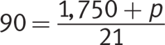
Multiply both sides by 21 to get rid of the fraction and then subtract 1,750 from both sides to isolate p:

The correct answer is (D).
Try on Your Own
Directions
Take as much time as you need on these questions. Work carefully and methodically. There will be an opportunity for timed practice at the end of the chapter.
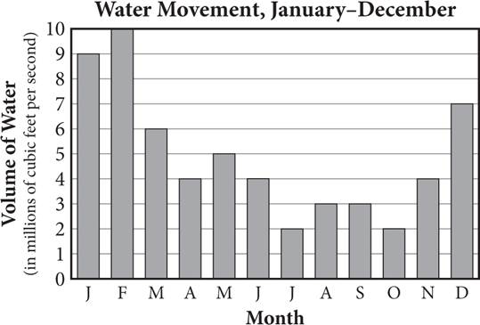
1. A researcher placed a fluid motion sensor in the Atlantic Ocean along the North Carolina coast to study the movement of the water. Every morning at 6:00 a.m., the movement of the water past the sensor was recorded. The figure above shows the results. Based on the data, which of the following would be a valid conclusion? (Assume that the summer months are June, July, and August and the winter months are December, January, and February.)
1. In general, a greater volume of water moves per month in the Atlantic Ocean during the winter months than during the summer months.
2. In general, a greater volume of water moves per month in the Atlantic Ocean during the summer months than during the winter months.
3. In general, a greater volume of water moves per month in the oceans around the world during the winter months than during the summer months.
4. In general, a greater volume of water moves per month in the oceans around the world during the summer months than during the winter months.
2. HINT: Focus on the parts of the table that are required to answer Q2 and ignore the rest.
|
Cars |
Trucks |
SUVs |
Total |
|
|
No Service |
39 |
20 |
13 |
72 |
|
Rotate |
48 |
36 |
60 |
144 |
|
Replace |
7 |
8 |
17 |
32 |
|
Total |
94 |
64 |
90 |
248 |
3. When a consumer gets an oil change for a vehicle, the service technician typically checks the tread depth and wear condition of the tires. The technician then recommends one of the following: no service needed, rotate tires, or replace one or more tires. The table above shows one technician’s recommendations for the month of June. For what fraction of cars and trucks did this technician recommend a tire rotation?
1. ![]()
2. ![]()
3. ![]()
4. ![]()
4.
1. Questions 3 and 4 refer to the following information.
2.
|
Group |
Proportion |
|
A: inert, mild or no side effects |
34.5% |
|
B: inert, moderate side effects |
9.2% |
|
C: inert, severe side effects |
6.2% |
|
D: drug, mild or no side effects |
9.5% |
|
E: drug, moderate side effects |
12.8% |
|
F: drug, severe side effects |
27.8% |
3. Dr. Hunter is overseeing a treatment-resistant influenza Phase I trial with 400 healthy participants: half are given the drug and half are given an inert pill. The table shows a distribution of the severity of gastrointestinal side effects.
4. How many trial participants did not have severe side effects?
5. HINT: Use the calculation you did for Q3 to answer Q4.
6. Of those who had severe side effects, what percent were administered the drug? (Round to the nearest whole number and omit the percent sign when gridding in your answer.)
5. 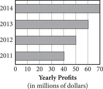
6. The graph above shows the yearly profits of an organic produce company. If the company’s profits continue to grow at the same rate, in which year will it have a yearly profit that is 100% greater than its profit in 2013 ?
1. 2019
2. 2020
3. 2021
4. 2022
|
TV Owners |
Thursday Viewing Audience (all channels) |
|
|
Under age 35 |
4,100 |
1,900 |
|
Age 35 or older |
3,400 |
1,600 |
7. The table above displays data that show the number of TV owners in the town of Jonesville and how many of these owners had their televisions on during a particular Thursday evening. On that evening, 20 percent of TV owners in Jonesville tuned in to a certain channel. If a channel’s nightly rating is reported as a fraction and is defined as  , then what was the channel’s nightly rating?
8.
Statistics
Learning ObjectiveS
After this lesson, you will be able to:
· Calculate mean, median, mode, and range
· Define standard deviation and margin of error
To answer a question like this:
1. 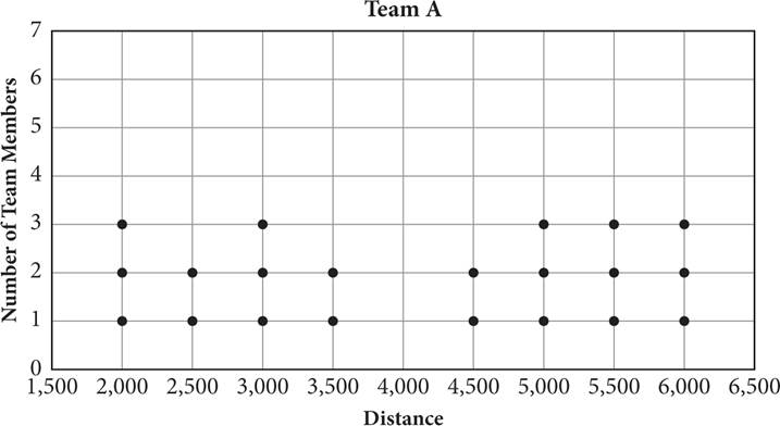
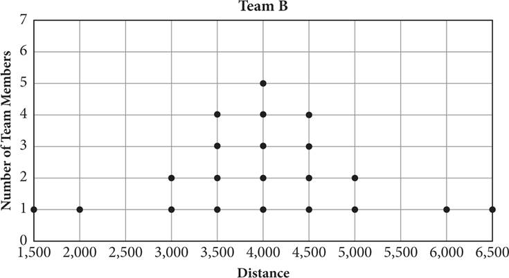
Two different schools record how many meters their running teams can run. Each school has 21 members on its team, and the distances in meters run by each member are recorded above. If MA and SA are the median and standard deviation, respectively, of team A, and MB and SB are the median and standard deviation, respectively, of team B, then which of the following statements is true?
1. MA < MB and SA < SB
2. MA > MB and SA < SB
3. MA > MB and SA > SB
4. MA < MB and SA > SB
You need to know this:
Suppose a nurse took a patient’s pulse at different times of day and found it to be 75, 78, 71, 71, and 68. Here are six fundamental statistics figures you can determine for this data set:
· Mean (also called arithmetic mean or average): The sum of the values divided by the number of values. For this data set, the mean pulse is 
· Median: The value that is in the middle of the set when the values are arranged in ascending order. The pulse values in ascending order are 68, 71, 71, 75, and 78. The middle term is the third term, making the median 71. (If the list consists of an even number of values, the median is the average of the middle two values.)
· Mode: The value that occurs most frequently. The value that appears more than any other is 71, which appears twice (while all other numbers appear only once), so it is the mode. If more than one value appears the most often, that’s okay; a set of data can have multiple modes. For example, if the nurse took the patient’s pulse a sixth time and it was 68, then both 71 and 68 would be modes for this data set.
· Range: The difference between the highest and lowest values. In this data set, the lowest and highest values are 68 and 78, respectively, so the range is 78 − 68 = 10.
· Standard deviation: A measure of how far a typical data point is from the mean. A low standard deviation means most values in the set are fairly close to the mean; a high standard deviation means there is much more spread in the data set. On the PSAT, you will need to know what standard deviation is and what it tells you about a set of data, but you won’t have to calculate it.
· Margin of error: A description of the maximum expected difference between a true statistics measure (e.g., the mean or median) for a data pool and that same statistics measure for a random sample from the data pool. A lower margin of error is achieved by increasing the size of the random sample. As with standard deviation, you will need to know what a margin of error is on the PSAT, but you won’t be asked to calculate one.
You need to do this:
· To compare two standard deviations, look at how spread out the data set is. The more clustered the data, the lower the standard deviation.
· To find the median, arrange all values in order. In a dot plot or frequency distribution table, that means finding the group with the middle value.
Explanation:
Start with the standard deviation. The scores in team B are more clustered around the mean, so the standard deviation for team B will be smaller than that for team A, where the scores are more spread out. Eliminate (A) and (B).
To calculate the medians of the two classes, you need to find the middle value in each data set. Each class has 21 students, so the middle score will be the 11th term. Count from the left of each dot plot to find that the 11th score for team A is 4,500 and for team B is 4,000. So the median for team B is smaller, which makes (C) correct.
Try on Your Own
Directions
Take as much time as you need on these questions. Work carefully and methodically. There will be an opportunity for timed practice at the end of the chapter.
1. HINT: For Q7, think about what standard deviation means.
|
Huiping |
Deanna |
Katya |
|
|
Dive 1 |
8.2 |
9.0 |
7.7 |
|
Dive 2 |
7.3 |
7.1 |
8.4 |
|
Dive 3 |
8.6 |
6.5 |
7.5 |
|
Dive 4 |
8.0 |
8.6 |
8.1 |
|
Dive 5 |
9.1 |
6.1 |
8.1 |
|
Dive 6 |
8.4 |
8.9 |
7.2 |
|
Mean Score |
8.27 |
7.70 |
7.83 |
|
Standard Deviation |
0.61 |
1.29 |
0.45 |
2. Huiping, Deanna, and Katya are three varsity divers who recently competed in an exhibition diving meet. Their diving scores for each of their six dives are shown in the above table. According to the data, which of the following is a valid conclusion?
1. Huiping dived the most consistently because her mean score is the highest.
2. Katya dived the most consistently because her standard deviation is the lowest.
3. Katya dived the least consistently because her mean score is the lowest.
4. Deanna dived the most consistently because her standard deviation is the highest.
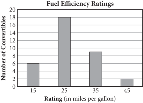
3. The bar graph above shows the number of convertibles made by several manufacturers with various fuel efficiency ratings. What is the mean fuel efficiency rating for these convertibles?
1. 25
2. 27
3. 30
4. 32
4. HINT: For Q9, start by determining the sum of the number of miles for all 10 days.
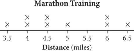
5. A runner is training for a marathon. His goal is to run an average of 5 miles per day for the first 10 days of his training. The dot plot above shows the number of miles he ran each day during the first 9 days. How many miles must he run on the 10th day to reach his goal?
1. 5
2. 5.5
3. 6
4. 6.5
|
Year |
Number of Eligible Employees |
|
2010 |
n |
|
2011 |
874 |
|
2012 |
795 |
|
2013 |
732 |
|
2014 |
821 |
6. The table above shows the number of employees at a certain company who were eligible for group health insurance each year from 2010 to 2014. If the median number of eligible employees for the five years was 821, and no two years had the same number of eligible employees, what is the least possible value for n ?
1. 733
2. 796
3. 822
4. 875
7. In a local rock climbing group, the mean novice member age is 22 years and the mean experienced member age is 26 years. Which of the following can be concluded about the average age, a, of the experienced and novice members of this rock climbing group?
1. 22 < a < 26
2. a = 24
3. a > 24
4. a < 24
8. HINT: Arrange the values in Q12 in ascending order to find the median and quickly identify the mode.
9. Data set K consists of the values 11, 4, 0, 7, 14, 1, 3, 7, and 13. Which of the following has the least value?
1. The mode of data set K
2. The median of data set K
3. The mean of data set K
4. One-half the range of data set K
Surveys and Data Samples
Learning Objectives
After this lesson, you will be able to:
· Determine whether a survey is valid or biased
· Draw inferences about surveys and data samples
To answer a question like this:
1. A county commerce department conducted a survey of 200 customers of one of the county’s pizzerias. The purpose of the survey was to estimate the average number of take-out pizzas purchased each year by residents of the county. The average number of pizzas purchased per year by these 200 customers was 43. Which of the following statements must be true based on this information?
1. The survey is representative, so 43 is a reasonable estimate of the average number of pizzas purchased annually by the county’s residents.
2. The survey is not representative of the target population due to a bias inherent in the sampling method.
3. The average number of pizzas purchased by the county’s residents is fewer than one per week.
4. The average number of pizzas purchased per county resident per year cannot be determined from such a small sample.
You need to know this:
You will see occasional questions on the PSAT Math sections that do not require any calculations or even test your ability to interpret numerical data. Instead, these questions test your ability to draw logical conclusions about surveys and data sampling methods.
Answering these questions correctly hinges on your ability to tell whether a data sample is representative of the larger population. A representative sample is a small group that shares key characteristics with a larger group you are trying to draw conclusions about.
A sample that is selected truly at random is generally representative of the larger group. For example, a scientist who wants to learn the average height of the penguins in a colony of 200 might measure the heights of a random sample of only 20 penguins. As long as the 20 penguins are selected at random, their average height will approximate the average height of the birds in the entire colony.
On the other hand, a sample that is not selected at random may not be representative and may lead to a biased conclusion. For instance, imagine that a small town uses volunteer firefighters and that a stipulation for becoming a volunteer firefighter is living within a mile of the fire station. If you wanted to know what percent of households in the town include at least one volunteer firefighter, you would need to survey a random sample of households from the entire town, not just a sample of households within a mile of the fire station. A sample of households within a mile of the fire station would be a biased sample and would lead to an erroneous conclusion (namely, that the percent of households in the town that include at least one volunteer firefighter is higher than it actually is).
You need to do this:
· Check whether the data sample represents the larger population. If it doesn’t, the survey is biased.
· In questions that ask you to draw a conclusion from a random (unbiased) sample, look for the answer choice for which the representative sample accurately reflects the larger population. For example, in a question asking for a conclusion based on a sample of librarians, the correct answer will match the sample to a larger population of librarians, not to a population of, say, accountants.
Explanation:
The sample in this question consists of the 200 customers of a pizzeria. This is not a randomly selected sample. It is likely that frequent purchasers of pizza will be overrepresented at a pizzeria. Thus, the survey is biased, so (B) is correct.
Try on Your Own
Directions
Take as much time as you need on these questions. Work carefully and methodically. There will be an opportunity for timed practice at the end of the chapter.
1. A polling company wanted to determine whether American voters would support a constitutional amendment that requires a person running for the U.S. Senate to have a minimum of a bachelor’s degree. To do this, the company conducted a survey by sending 20,000 text messages across the entire United States to randomly selected phones with text-messaging capabilities. For every text that the company sent, it received a response to the survey. Which of the following best explains why this random sample is unlikely to be a representative sample of the American population’s opinion in an actual election?
1. The survey was biased because most Americans who own a cell phone have a bachelor’s degree.
2. Most Americans don’t care about this issue, which is likely to skew the results.
3. Surveys conducted via text messaging are illegal and as such are not considered reliable.
4. There is no way to verify whether the respondents to the survey were U.S. citizens who were registered to vote.
2.
3. A medical testing company conducted an experimental study to determine which of three antihistamines is most effective for alleviating allergy symptoms. If the only allergies treated in the course of the study were pollen allergies, which of the following is true?
1. The antihistamine that is found to be the most effective will work for all allergies.
2. The antihistamine that is found to be the most effective will work only for pollen allergies.
3. The study will be able to produce results concerning the effects of the antihistamines only on pollen allergies.
4. The study is clearly biased and, therefore, not relevant to determining which antihistamine is most effective.
4. HINT: For Q15, first find the percent of the 200 students polled who want to see movies.
5. The PTA is planning to sponsor a cultural arts day at school. It asked 200 randomly selected students what the focus of the day should be. Of those students asked, 42 recommended having a speaker, 48 asked for an art display, 60 wanted to taste foods from around the world, and the rest said they would like to watch cultural movies. If there are 1,260 students in the school, about how many would you expect to want to watch cultural movies?
6. HINT: For Q16, make sure you’re answering the question you’re actually being asked.
7. SoFast Internet is hoping to expand its services to three new counties in rural Virginia. According to its research, a total of approximately 86,400 homes in the three counties currently have Internet service. SoFast surveys a sample of 500 randomly selected households with Internet service and finds that 225 are not satisfied with their current provider. SoFast would be the only other Internet service provider in the area, and it is confident that it will be able to acquire 80% of the dissatisfied households. Based on this information and the results of the sample survey, about how many new customers should SoFast be able to acquire?
1. 31,104
2. 38,880
3. 41,608
4. 69,120
8. A psychology professor at a large university is conducting a research project on pre-law students’ study habits for courses required for their majors versus their study habits for strictly elective courses. His original plan was to randomly select 250 third-year pre-law students and 250 fourth-year pre-law students and ask them to estimate the amount of time they spend studying for the two course types. Due to a printing error, only 200 survey copies were made; 50 of these went to third-years and 150 went to fourth-years. Assuming 100% of the surveys are returned, what effect(s) will the printing error have on the data collected?
1. The mean study times will be skewed toward third-year students and the margins of error will increase.
2. The mean study times will be skewed toward fourth-year students and the margins of error will increase.
3. The mean study times will be skewed toward third-year students and the margins of error will decrease.
4. The mean study times will be skewed toward fourth-year students and the margins of error will decrease.
9.
Probability
Learning Objectives
After this lesson, you will be able to:
· Calculate probabilities based on data sets
To answer a question like this:
Levels Passed in Video Game
|
Name |
Levels Passed |
|
Imani |
3 |
|
Micah |
7 |
|
Corentin |
5 |
|
Marco |
4 |
|
Dikembe |
1 |
|
Rachel |
10 |
1. The above table shows how many levels each player passed in the same video game. If these players represent a random sample, what is the probability that a given player will pass at least four levels in this game?
1. 25%
2. 33%
3. 50%
4. 67%
You need to know this:
Probability is a fraction or decimal between 0 and 1 comparing the number of desired outcomes to the number of total possible outcomes. A probability of 0 means that an event will not occur; a probability of 1 means that it definitely will occur. The formula is as follows:

For instance, if you roll a six-sided die, each side showing a different number from 1 to 6, the probability of rolling a number higher than 4 is  , because there are two numbers higher than 4 (5 and 6) and six numbers total (1, 2, 3, 4, 5, and 6).
To find the probability that an event will not happen, subtract the probability that the event will happen from 1. Continuing the previous example, the probability of not rolling a number higher than 4 would be:
The PSAT tends to test probability in the context of data tables. Using a table, you can find the probability that a randomly selected data value (be it a person, object, etc.) will fit a certain profile. For example, the following table summarizing a survey on water preference might be followed by a question asking for the probability that a person randomly selected for a follow-up survey falls into a given category.
|
Tap |
Carbonated |
Bottled |
Total |
|
|
Urban |
325 |
267 |
295 |
887 |
|
Rural |
304 |
210 |
289 |
803 |
|
Total |
629 |
477 |
584 |
1,690 |
If the question asked for the probability of randomly selecting an urbanite who prefers tap water from all the participants of the original survey, you would calculate it using the same general formula as before:

If the question asked for the probability of randomly selecting an urbanite for the follow-up survey, given that the chosen participant prefers tap water, the setup is a little different. This time, the number of possible outcomes is the total participants who prefer tap water, which is 629, not the grand total of 1,690. The calculation is now:

Conversely, if you needed to find the probability of selecting someone who prefers tap water for the follow-up survey, given that the chosen participant is from an urban area, the new number of possible outcomes would be the urban participant total (887). The calculation becomes:

You need to do this:
· Determine the number of desired and total possible outcomes by looking at the table.
· Read the question carefully when determining the number of possible outcomes: do you need the entire set or a subset?
Explanation:
Use the probability formula:  . The numerator is the number of people who can pass at least four levels, which is 4. The total number of people in the data table are 6. So,
  . The closest answer to this is (D).
Try on Your Own
Directions
Take as much time as you need on these questions. Work carefully and methodically. There will be an opportunity for timed practice at the end of the chapter.
|
Apples |
Berries |
Pears |
Oranges |
Exotics |
Total |
|
|
Frankie |
30 |
32 |
22 |
18 |
13 |
115 |
|
Bao |
18 |
28 |
27 |
24 |
15 |
112 |
|
Craig |
37 |
31 |
18 |
31 |
22 |
139 |
|
Ekanta |
28 |
35 |
32 |
15 |
24 |
134 |
|
Total |
113 |
126 |
99 |
88 |
74 |
500 |
1. Frankie, Bao, Craig, and Ekanta are selling boxes of fruit to raise money for a senior class trip. The summary of their sales is provided in the table above. The students decide to give away a free box of fruit to someone who purchased from them. Assuming no buyers purchased more than one box of fruit, what is the probability that the randomly selected buyer had previously purchased a box of berries or exotic fruit?
2.
1. Questions 19 and 20 refer to the following information.
2.
|
Winter |
Spring |
Summer |
Fall |
Total |
|
|
Apples |
38 |
40 |
52 |
85 |
215 |
|
Bananas |
47 |
53 |
50 |
30 |
180 |
|
Oranges |
43 |
66 |
82 |
44 |
235 |
|
Pineapples |
22 |
41 |
46 |
11 |
120 |
|
Total |
150 |
200 |
230 |
170 |
750 |
3. The table above shows the number of apples, bananas, oranges, and pineapples sold at Freddie’s Fruit Stand during each of the four seasons in 2018.
4. Of the following, which is closest to the percentage of all the pieces of fruit sold that were bananas?
1. 15
2. 20
3. 24
4. 30
5. HINT: See if you can answer Q20 without actually calculating exactly what percentage of fruit sold is pineapples.
6. For which season did pineapples make up the largest percentage of the total pieces of fruit sold?
1. Winter
2. Spring
3. Summer
4. Fall
|
Strongly Disagree |
Disagree |
Agree |
Strongly Agree |
Total |
|
|
Freshmen |
35 |
40 |
24 |
36 |
135 |
|
Sophomores |
37 |
28 |
12 |
23 |
100 |
|
Juniors |
24 |
22 |
36 |
38 |
120 |
|
Seniors |
30 |
40 |
21 |
24 |
115 |
|
Total |
126 |
130 |
93 |
121 |
470 |
3. Students at Fairview High School were asked to rate their level of agreement with the school’s decision to change the school colors from blue and white to maroon and orange. The results are shown in the table above, by level of agreement and class of student. If underclassmen are defined as freshmen and sophomores, what percentage of underclassmen agree or strongly agree with the new policy? Round your answer to the nearest whole number and ignore the percent sign when gridding your response.
4. HINT: Take the time to make sure you’re pulling the correct information from the table and graph for Q22.
|
Age of Orange Trees |
Percent Distribution |
|
Less than 3 years old |
15% |
|
3—5 years old |
20% |
|
6—10 years old |
25% |
|
Older than 10 years |
40% |
|
Table 1 |
|
5. A large fruit orchard has 2,500 orange trees. Table 1 above shows the distribution of ages of the orange trees in the orchard. A county inspector has been notified that a highly contagious bacterial disease called citrus canker has infected some of the orange trees. The inspector randomly tests 4% of each age group of the trees. Her findings are shown in Table 2 below.
|
Age of Orange Trees |
Number with Citrus Cankers |
|
Less than 3 years old |
8 |
|
3—5 years old |
6 |
|
6—10 years old |
8 |
|
Older than 10 years |
3 |
|
Table 2 |
|
6. What is the probability that an orange tree selected at random from the tested trees less than 3 years old will have citrus canker?
1. 0.03
2. 0.12
3. 0.15
4. 0.53
7.
On Test Day
The PSAT tests the concept of average (arithmetic mean) fairly heavily. The average formula will serve you well on questions that ask about a sum of values or the average of a set of values, but for questions that give you the average and ask for a missing value in the data set, there is an alternative that can be faster: the balance approach.
The balance approach is based on the the idea that if you know what the average is, you can find the totals on both sides of the average and then add the missing value that makes both sides balance out. This approach is especially helpful if the values are large and closely spaced. Imagine that a question gives you the set {976, 980, 964, 987, x} and tells you that the average is 970. You would reason as follows: 976 is 6 over the average, 980 is 10 over, 964 is 6 under, and 987 is 17 over. That’s a total of 6 + 10 − 6 + 17 = 27 over, so x needs to be 27 under the average, or 970 − 27 = 943.
Try solving the question below both ways, using first the average formula and then the balance approach. If you find the latter to be fast and intuitive, add it to your test day arsenal.
|
Jerseys |
Shorts |
T-Shirts |
Tank Tops |
Sweatshirts |
Sweatpants |
|
|
Red |
6 |
3 |
4 |
7 |
8 |
8 |
|
Green |
2 |
7 |
5 |
3 |
5 |
4 |
|
Blue |
8 |
9 |
7 |
5 |
4 |
1. The table above shows the types and colors of sportswear in stock at a sporting goods store. If the mean number of blue articles of clothing in stock is 7, then what is the number of blue sweatshirts the store has in stock?
The correct answer and both ways of solving can be found at the end of the chapter.
How Much Have You Learned?
Directions
For testlike practice, give yourself 15 minutes to complete this question set. Be sure to study the explanations, even for questions you got right. They can be found at the end of this chapter.
1. Questions 24 and 25 refer to the following information.
2. The table below shows the distribution of applicants by age and level of education for a management trainee program offered at a retail store.
|
Age Group |
High School Diploma Only |
2-Year Degree |
4-Year Degree |
Total |
|
18-25 |
23 |
12 |
3 |
38 |
|
26-35 |
16 |
19 |
9 |
44 |
|
36-45 |
11 |
13 |
2 |
26 |
|
Older than 45 |
2 |
2 |
0 |
4 |
|
Total |
52 |
46 |
14 |
112 |
3. According to the data, which age group had the smallest percentage of people with a high school diploma only?
1. 18-25
2. 26-35
3. 36-45
4. Older than 45
4. Based on the table, if a single applicant is selected at random from all the applicants, what is the probability that he or she will have a 2-year degree and be at least 26 years old?
1. 
2. ![]()
3. ![]()
4. ![]()
5. Questions 26 and 27 refer to the following information.
6. The Kp Index measures the energy added to Earth’s magnetic field from the Sun on a scale of 0—9, with 1 representing a solar calm and 5 or more indicating a magnetic storm, or solar flare. The magnetic fluctuations are measured in three-hour intervals (12 a.m.—3 a.m., 3 a.m.—6 a.m., and so on). The bar graph below shows the measurements for a five-day period in September.
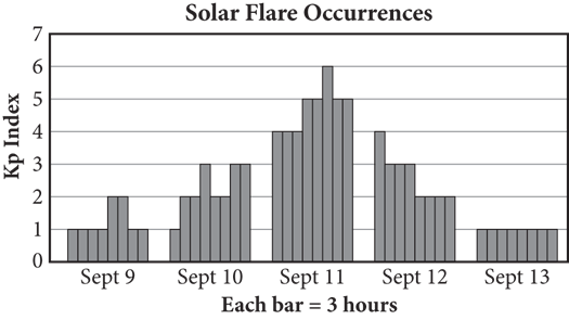
7. Based on the graph, a solar flare lasted for how many hours on September 11 ?
8. If a single 3-hour time period between September 9 and September 13 (including the start and end dates) is chosen at random, what is the probability that a solar flare occurred during that time?
9. Questions 28 and 29 refer to the following information.
10.Most cinemas have multiple movie theaters, each running a variety of movies all day. The following table shows the daily costs associated with keeping each theater open.
|
Expense per Theater |
Amount |
|
Electricity |
$150/day |
|
Trash Disposal and Cleaning |
$80/day |
|
Operational Staff |
$11/hour |
11.Cinema XV has 15 movie theaters, each of which averages 600 customers per day. If the cinema closes six of the theaters during the winter months but total theater attendance stays the same, what is the average daily attendance per theater among the remaining theaters?
12.If each theater requires one operational staff member for 14 hours, how much money does Cinema XV save per day during the winter months by closing six theaters?
13.Questions 30 and 31 refer to the following information.
14.The following table shows the number of babies born in a certain hospital in October 2018. The table categorizes the births by whether the mother participated in a new prenatal program and whether the baby was below, above, or within the healthy weight range as defined by the World Health Organization.
|
Below Range |
Within Range |
Above Range |
Total |
|
|
Participant |
1 |
55 |
10 |
66 |
|
Not a Participant |
8 |
49 |
5 |
62 |
|
Total |
9 |
104 |
15 |
128 |
15.The at-risk group is defined as all babies above or below the healthy weight range. What percent of the babies born at this hospital in October 2018 were considered at-risk? Round your answer to the nearest whole number and ignore the percent sign when gridding your response.
16.The hospital decides to focus its study on the two at-risk groups with the highest number of babies: Not a Participant/Below Range and Participant/Above Range. If a baby is randomly selected from all those born at this hospital in October 2018, what is the probability that the baby belongs to one of those two groups?
17.Questions 32 and 33 refer to the following information.
18.A team of researchers studied the effect of sleep masks on rapid eye movement (REM) sleep. Study participants were divided into three groups: the first group did not wear sleep masks, the second group wore regular sleep masks, and the third group wore sleep masks that were contoured away from the eyes and lashes. The results of the study are shown in the following table.
|
No Mask |
Regular Mask |
Contoured Mask |
Total |
|
|
Experienced REM Sleep |
14 |
33 |
78 |
125 |
|
Did Not Experience REM Sleep |
34 |
29 |
22 |
85 |
|
Total |
48 |
62 |
100 |
210 |
19.What percent of the participants who experienced REM sleep during the study wore a contoured mask?
1. 37.1%
2. 47.6%
3. 59.5%
4. 62.4%
20.Based on the results of this study, if a company sold 12,000 of the contoured sleep masks, about how many of the consumers should experience REM sleep using the mask, assuming the participants in the study were a good representative sample?
1. 4,457
2. 5,714
3. 7,488
4. 9,360
21.
Reflect
Directions: Take a few minutes to recall what you’ve learned and what you’ve been practicing in this chapter. Consider the following questions, jot down your best answer for each one, and then compare your reflections to the expert responses on the following page. Use your level of confidence to determine what to do next.
What are some common ways the PSAT may present data?
What is the difference between median, mode, and range?
What does the standard deviation of a data set tell you?
When can you generalize the results of a survey of a small group to a larger group?
What are two ways to calculate the probability of a single event?
EXPERT RESPONSES
What are some common ways the PSAT may present data?
The PSAT may present data in tables, bar charts, line graphs, dot plots, and histograms.
What is the difference between median, mode, and range?
The median of a set is the middle value, whereas the mode is the most common value. The range of a set is the distance between the smallest value and the largest one.
What does the standard deviation of a data set tell you?
A data set’s standard deviation reflects how far apart the numbers are from each other. The standard deviation of a set whose numbers are all the same—for example, {5, 5, 5, 5}—is 0. The greater the distance between the numbers, the greater the standard deviation.
When can you generalize the results of a survey of a small group to a larger group?
A survey can be generalized to a larger population if the data sample is representative. To be representative, the data sample needs to be drawn at random from the larger population.
What are two ways to calculate the probability of a single event?
One way is to use the basic probability formula:
Alternatively, the probability that an event happens is 1 minus the probability that it doesn’t happen.
NEXT STEPS
If you answered most questions correctly in the “How Much Have You Learned?” section, and if your responses to the Reflect questions were similar to those of the PSAT expert, then consider Tables, Statistics, and Probability an area of strength and move on to the next chapter. Come back to this topic periodically to prevent yourself from getting rusty.
If you don’t yet feel confident, review those parts of this chapter that you have not yet mastered, then try the questions you missed again. In particular, make sure that you understand the six terms explained in the Statistics lesson and the probability formulas explained in the Probability lesson. As always, be sure to review the explanations closely.
Answers and Explanations
1. A
Difficulty: Easy
Getting to the Answer: The question states that the data were collected in the Atlantic Ocean, so any conclusion drawn can be generalized only to that particular geographic region. Eliminate (C) and (D). The question defines the winter months as December, January, and February. According to the data, a greater volume of water moved during those months than during the summer months of June, July, and August, so (A) is correct.
2. B
Difficulty: Easy
Getting to the Answer: The question asks only about cars and trucks, so ignore the column for SUVs. The technician recommended a tire rotation for 48 cars and 36 trucks (a total of 84) out of the 94 + 64 = 158 cars and trucks that he serviced. This represents  of the cars and trucks, making (B) correct.
3. 264
Difficulty: Easy
Getting to the Answer: You know from the table that 27.8% of participants who were administered the drug experienced severe side effects. Add this to the 6.2% who had severe side effects while given the inert pill to get 34.0% total with severe side effects, meaning 100% − 34.0% = 66.0% did not have them. Using the three-part percent formula, you find ![]() participants did not sustain severe side effects. Grid in 264.
participants did not sustain severe side effects. Grid in 264.
4. 82
Difficulty: Medium
Getting to the Answer: From the previous question, you know that 264 trial participants did not have severe side effects; therefore, 400 − 264 = 136 participants did. The table indicates that 27.8% of the 400 participants were given the drug and sustained severe side effects, which equates to ![]() participants. So, 111 out of the 136 participants who had severe side effects were given the drug:
participants. So, 111 out of the 136 participants who had severe side effects were given the drug:
Be sure to round this up to the nearest whole percent, as indicated in the question. Grid in 82.
5. A
Difficulty: Medium
Getting to the Answer: According to the bar graph, the company’s yearly profits have been growing by about $10 million annually. To reach yearly profits that are 100% greater than (or double) its profits in 2013, the company would need yearly profits of 2 × $60 million = $120 million. This is $50 million more than in 2014. At $10 million more per year, reaching this target would take 5 more years. Thus, the company should double its 2013 profits in 2014 + 5 = 2019, which is (A).
6. 3/7 or .428
Difficulty: Medium
Getting to the Answer: According to the expression provided, you need the number of viewers and the total viewing audience:
Channel’s viewers = 20% of TV owners
= 0.20(4,100 + 3,400) = 0.2(7,500) = 1,500
Total viewing audience = 1,900 + 1,600 = 3,500
Nightly rating = 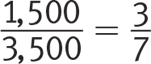
Grid in 3/7 or .428.
1. B
Difficulty: Easy
Getting to the Answer: Consider the difference between mean and standard deviation: mean is a measure of center, while standard deviation is a measure of spread. The four answers all involve diving consistency, which means the explanation should involve standard deviation. Eliminate (A) and (C). Higher diving consistency means lower standard deviation (and vice versa); the only choice that reflects this—and correctly represents the data in the table—is (B).
2. B
Difficulty: Easy
Getting to the Answer: The mean of a set of numbers is the same as the average, which is the sum of the values divided by the number of values. Use the graph to find the sum of the fuel efficiency ratings and then calculate the mean. To save time, multiply the frequency in each category by the rating and then divide by the total number of convertibles: (6 × 15) + (18 × 25) + (9 × 35) + (2 × 45) = 945, and there are 6 + 18 + 9 + 2 = 35 total convertibles, so 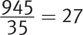 . Choice (B) is correct.
3. C
Difficulty: Medium
Getting to the Answer: Understanding how averages and sums are connected is the key to answering a question like this. If the average of 10 numbers is 5, then the sum of the 10 numbers must be 50 (because 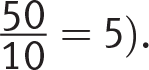 ). Use the dot plot to find the total number of miles the runner has already run. Then, subtract this number from 50. The runner has already run 3.5 + 2(4) + 2(4.5) + 5 + 2(6) + 6.5 = 44 miles, so he needs to run 50 − 44 = 6 miles on the 10th day. Choice (C) is correct.
4. C
Difficulty: Hard
Getting to the Answer: The median is the middle number in a series of numbers. Arrange the number of employees from least to greatest, making sure that 821 is in the middle. Use n to balance out the number of eligible employees on either side of 821:
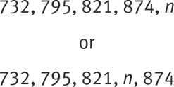
Because there are two numbers below the median (732 and 795), there must be two numbers above the median, 874 and n. Be careful—n could be on either side of 874. Since no two years had the same number, n could be anything greater than 821. Its least possible value is 822. Choice (C) is correct.
5. A
Difficulty: Hard
Getting to the Answer: To answer this question, you need to understand the assumptions each inequality makes to identify the correct one. Start with (A). This is a reasonable conclusion to draw because the question does not specify anything about the relative quantity of experienced and novice club members, so keep (A) as a possible correct answer for the moment. Choice (B) assumes there are equal numbers of experienced and novice members. Choice (C) assumes there are more experienced than novice members, while (D) assumes there are more novice than experienced members. Because no information on the relative numbers of each is given, (B), (C), and (D) are all incorrect, leaving (A) as the only option.
6. C
Difficulty: Medium
Getting to the Answer: First arrange the elements of data set K in increasing order: 0, 1, 3, 4, 7, 7, 11, 13, 14. The mode is 7 because that is the only value that appears twice. There are nine values, so the median is the 5th number, which is also 7. The mean is  . Finally, the range is 14 − 0 = 14. One-half of that is 7. The mean has the least value, so (C) is correct.
1. D
Difficulty: Medium
Getting to the Answer: A good representative sample is not only random but also a good representation of the population in question. Here, the population in question is American voters. Choice (A) could be tempting because it might be true that cell phone owners are more educated, and more educated voters may prefer more educated Senators, but not everyone with a cell phone is a registered voter. For example, minors, non citizens, and citizens who aren’t registered to vote are likely to make up at least a portion of the recipients of random texts sent out by the polling company. Since the survey is intended to sample voters, that is an important distinction. Thus, the inability to verify if the respondents were even registered to vote means that despite being randomly selected, the sample is unlikely to be a good representative sample. Choice (D) is correct.
2. C
Difficulty: Medium
Getting to the Answer: The study only looked at pollen allergies, so the sample was limited. You can eliminate (A) because not all allergies were included in the sample—you can’t say anything about them one way or the other. You can eliminate (B) by similar reasoning: the antihistamine found to be most effective for pollen allergies may or may not be the most effective one for other types of allergies as well; there is just no way to tell. You can eliminate (D) because the question doesn’t tell you anything about the data collection methods, so you can’t determine whether the study was biased. This means that (C) is correct—the study will be able to produce results concerning the effects of the antihistamines only on pollen allergies.
3. 315
Difficulty: Medium
Getting to the Answer: When making inferences about populations based on data from a random, representative sample, find the percent of the sample data that matches the given criterion and multiply by the total population. Of the 200 students in the sample, 200 − 42 − 48 − 60 = 50 students said they would like to watch cultural movies. This represents  or 25%. Multiply 0.25 × 1,260 to arrive at 315 students. Grid in 315.
4. A
Difficulty: Hard
Getting to the Answer: The sample of households was randomly selected, so if  (or 45%) of the surveyed households are not satisfied with their current providers, you can infer that 45% of the total households in the three counties are not satisfied with their providers. Multiply by the total number of customers in the population to find that 86,400 × 0.45 = 38,880 customers are not satisfied. Be careful—this is not the correct answer, so don’t choose (B). The company is confident that it can acquire 80% of these customers, or 38,880 × 0.80 = 31,104 customers. Choice (A) is correct.
5. B
Difficulty: Hard
Getting to the Answer: Fewer surveys than planned means a larger margin of error, so eliminate (C) and (D). And surveying significantly more fourth-year students than third-year students means the data will be skewed toward fourth-year students. Choice (B) is the only choice that specifies both effects.
1. 2/5 or .4
Difficulty: Easy
Getting to the Answer: According to the table, the students sold 126 boxes of berries and 74 boxes of exotic fruits. Add these together and divide by the total boxes sold to get  . Grid in 2/5 or .4.
2. C
Difficulty: Easy
Getting to the Answer: To calculate the percentage of all fruits that were bananas, simply find the total number of bananas sold, divide by the total pieces of fruit sold, and multiply by 100%:
Choice (C) is correct.
3. B
Difficulty: Medium
Getting to the Answer: You are asked about the percentage of sales of pineapples for each season. Thus, you will want to refer to the Pineapples row of the table. Use estimation strategies to determine percentages for each season:
Winter: 22 of 150 pieces of fruit sold in the winter were pineapples. Recognize that  , so slightly less than
 ![]() (or ~17%) of the fruit sold in the winter were pineapples.
(or ~17%) of the fruit sold in the winter were pineapples.
Spring: 41 of 200 pieces of fruit sold in the spring were pineapples. You should recognize that  , so the percentage of pieces of fruit sold that were pineapples is slightly above 20% in the spring.
Summer: 46 of 230 pieces of fruit sold in the summer were pineapples. The fraction  actually reduces to exactly
 ![]() , so exactly 20% of the pieces of fruit sold in the summer were pineapples.
, so exactly 20% of the pieces of fruit sold in the summer were pineapples.
Fall: Only 11 of 170 pieces of fruit sold in the fall were pineapples. This ratio is very similar to  , which is going to be much smaller than the percentages in the other three seasons.
Thus, (B) is the correct answer.
4. 40
Difficulty: Medium
Getting to the Answer: Read the question carefully to determine which rows and columns of the tables you will need. First, you are told that you are looking only at underclassmen, which are defined as freshmen and sophomores. Thus, you only need to consider the first two rows of the table. There are 100 + 135 = 235 underclassmen at the school. Next, you need to determine how many underclassmen either agreed or strongly agreed with the change of colors: 24 + 36 = 60 freshmen and 12 + 23 = 35 sophomores either agreed or strongly agreed with the change. Thus, the percentage of underclassmen who either agreed or strongly agreed with the new policy can be expressed as 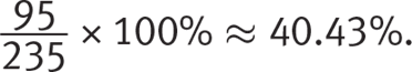 Round down and grid in 40.
5. D
Difficulty: Hard
Getting to the Answer: The probability that one tree less than 3 years old randomly selected from those that were tested would have cankers is equal to the number of trees less than 3 years old that had cankers divided by the total number of trees less than 3 years old that were tested. This means you need only two numbers to answer the question. One of those numbers is in the second table—8 trees less than 3 years old had cankers. Finding the other number is the tricky part. Use information from the question stem and Table 1. The inspector tested 4% of the total number of trees less than 3 years old, or 4% of 15% of 2,500 trees. Multiply to find that 0.04 × 0.15 × 2,500 = 15 trees less than 3 years old were tested. This means the probability is  , which matches choice (D).
1. 9
Difficulty: Medium
Category: Statistics
Strategic Advice: When the goal is to find a missing value in a set of data and the average is given, consider using the balance approach. We’ll demonstrate both approaches starting with the average formula.
Getting to the Answer: The question is about blue sportswear, so ignore the data for the other colors. The given numbers for blue sportswear are 8, 9, 7, 5, and 4. The average is given as 7. If you call the missing value x, plugging the known values into the average formula results in the following:
Grid in 9 as the correct answer.
Alternatively, to use the balance approach, write down how much each value is above or below the average of 7. For example, the value for jerseys is 1 above the average: 8 − 7 = 1.
|
Jerseys |
Shorts |
T-Shirts |
Tank Tops |
Sweatshirts |
Sweatpants |
|
8: +1 |
9: +2 |
7: 0 |
5: −2 |
4: −3 |
Now, observe that, excluding sweatshirts, the values are +1 + 2 + 0 − 2 − 3 = −2. Without the value for sweatshirts, the total is 2 less than what you’d expect based on the average. So for the values to balance out to the average, the sweatshirts’ value must be 2 more than the average of 7, or 7 + 2 = 9. Grid in 9.
1. B
Difficulty: Medium
Category: Tables and Graphs
Getting to the Answer: To calculate the percentage of people in each age group who had a high school diploma only, divide the number of people in that age group with only a high school diploma by the total number of applicants in that age group. Choice (B) is correct because 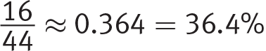 , which is a lower percentage than that of the other age groups (18 to 25 ≈ 60.5%, 36 to 45 ≈ 42.3%, and Older than 45 = 50%).
2. B
Difficulty: Hard
Category: Probability
Getting to the Answer: The first criterion is fairly straightforward—the applicant must have a 2-year degree, so focus on that column in the table. The second criterion is a bit trickier—at least 26 years old means 26 years old or older, so you’ll need to use the values in the rows for 26—35, 36—45, and Older than 45. There were 19 in the 26—35 age group who had a 2-year degree, 13 in the 36—45 age group, and 2 in the Older than 45 age group, resulting in a total of 19 + 13 + 2 = 34 out of 112 applicants. The probability of randomly selecting one applicant from any of these three groups is  , which reduces to
 ![]() , so (B) is correct.
, so (B) is correct.
3. 15
Difficulty: Easy
Category: Tables and Graphs
Getting to the Answer: Read the graph carefully, including the key at the bottom that tells you that each bar represents a 3-hour period. The question tells you that a Kp Index of 5 or more indicates a solar flare. On September 11, the graph shows 4 bars at a Kp Index of 5 and 1 bar at a Kp Index of 6, for a total of five 3-hour periods during which a solar flare occurred. This represents a total of 5 × 3 = 15 hours. Grid in 15.
4. 5/40 or 1/8 or .125
Difficulty: Medium
Category: Probability
Getting to the Answer: Probability compares the number of desired outcomes (number of 3-hour periods with a Kp index greater than or equal to 5) to the total number of possible outcomes (total number of 3-hour periods between September 9 and September 13).
Count the number of bars in the graph that have a height of 5 or more—there are 5. Count the total number of bars—there are 8 for each of the 5 days, for a total of 40. This means there were five 3-hour periods out of 40 during which a solar flare occurred, so the probability of randomly selecting one of those periods is 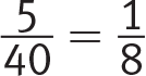 . You could also grid in the answer as .125.
5. 1000
Difficulty: Hard
Category: Statistics
Getting to the Answer: Originally there were 15 theaters and they averaged 600 customers each per day for a total attendance of 15 × 600 = 9,000 per day. Even after the 6 theaters closed, the total attendance remained the same. Then, however, the number of theaters was 15 − 6 = 9, so recalculate the average as follows:
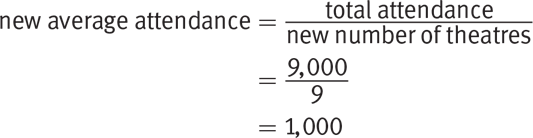
Grid in 1000.
6. 2304
Difficulty: Medium
Category: Tables and Graphs
Getting to the Answer: Use the information in the table to calculate how much it costs to run each theater—this will tell you how much the cinema saves by not running the theater. Then multiply by 6.
1. Electricity = $150
End-of-Day Cleaning = $80
Operational Staff = 1 at $11/hour × 14 hours = $154
Total = $150 + $80 + $154 = $384 per theater
The total savings is 6 × $384 = $2,304. Grid in 2304.
7. 19
Difficulty: Easy
Category: Tables and Graphs
Getting to the Answer: There are 9 babies below the healthy range and 15 babies above, so there are 9 + 15 = 24 total babies who fall above or below the range. There are 128 babies total, which means that  of all the babies born at this hospital in 2018 were considered at-risk. Grid in 19.
8. 9/64 or .141
Difficulty: Medium
Category: Probability
Getting to the Answer: From the table, the numbers for Not a Participant/Below Range and Participant/Above Range are 8 and 10, respectively, with a total of 8 + 10 = 18. There were 128 babies born in the hospital in October 2018, so the probability of randomly selecting one from the two specified groups is  . You could also grid this as .141.
9. D
Difficulty: Easy
Category: Tables and Graphs
Getting to the Answer: The question asks only about participants who experienced REM sleep, so focus on this row. Of the 125 participants who experienced REM sleep, 78 of them wore a contoured mask. This represents  , or 62.4%, which is (D).
10.D
Difficulty: Easy
Category: Surveys and Data Samples
Getting to the Answer: The question asks about consumers who purchase a contoured mask, so focus on that column in the table. Assuming the participants in the study were a good representative sample, 78 out of 100, or 78%, of the 12,000 consumers should experience REM sleep. Multiply 0.78 × 12,000 to arrive at 9,360, which is (D).