Practical models for technical communication - Shannon Kelley 2021
Why layout and design matters
Layout and design
Abstract: Technical communication requires that you understand how documents are constructed. At its core, document design is about organization. Words and images must work together to create a technical document. Whether you are a writer or a designer, your job involves gathering information into a meaningful format. This chapter explores design principles that produce accessible and inviting content to guide a user through a document. Ultimately, technical communication involves collaboration, not just among people who create the different parts of a technical document but also among the elements of document design, organizational design, and visual design.
Looking Ahead
1. Why Layout and Design Matters
2. Principles of Document Design
3. Design for Readability
4. Design for Emphasis
5. Design for Organization
6. Types of Visuals
Key Terms
” alignment (center, right, left, justified)
” chart
” chronological organization
” contrast
” design
” diagram
” document design
” font (serif, sans serif)
” graph (bar, line)
” grid
” heading
” illustration
” layout
” parallelism
” problem-solution organization
” proximity
” sequential organization
” subheading
” table
” white space
Why layout and design matters
More than ever before, how information is presented affects every aspect of our lives. Principles of layout and design determine how you navigate a website, how you use the self-checkout at a grocery store, and how you interpret the nutritional facts on the packaging of your favorite burrito. Even if you don’t think about the individual parts of product communication, you’re still influenced by the overall effectiveness of its layout and design. When a design strategy is successful, you likely won’t notice. But when these parts lack a clear message or purpose—such as when a user manual doesn’t clearly define the functions of your new electronic device—you might find yourself irritated and unable to complete a task.
A poorly designed document can become a source of frustration. Users must deal not only with the difficulty of the problem they are attempting to solve, but also with the challenge of an inadequate technical document. As a communicator, you need to consider how your organizational choices impact users. Thinking directly about document design will directly influence the success of your communication and significantly improve your users’ experience.
Layout and Design Defined
Layout describes the intentional placement of visual elements within a document. In general, design is the structure or plan of anything that is used. In particular, design is what guides a person’s interaction with an object and its features. The two terms are often linked as if they are one thing: layout-and-design. However, you can think of design as the big picture and layout as the details.
Consider how you use applications, or apps, on a phone or computer. Design is what makes the difference between an app that’s easy to use and one that isn’t. Layout can be seen in the designer’s choice to place the navigation on the top of the screen instead of the left. If you can easily find what you’re looking for, you can assume the layout and overall design of the app is effective. Simply put, design determines the quality of your experience.
Effective design in technical communication shares many qualities with a well-designed app: it should be easy to use, purposeful, and tailored to the user’s needs. These qualities don’t just happen. They result from the thoughtful application of design principles and layout elements that we’ll explore in this chapter.
Design isn’t just about how a document looks. Design refers to the underlying structure of your document and how you group and organize information to make it accessible to your user. While visuals are a part of that, other elements are equally important, such as balance, grouping, consistency, and contrast. This chapter takes a look at how these elements relate to readability, emphasis, and organization in technical communication.
Design and Structure
As discussed in previous chapters, designing for users instead of readers affects the choices you make in the design process of technical documents. With layout and design, just as with other elements, your goal is to provide users a solution to their problems. Your design choices should allow the user to navigate the document quickly and easily to find a solution. Layout and design factor into this solution.
Effective design is intentional. Haphazard or poor design choices create confusion. Consider the designer who chooses a font with a whimsical appearance, even though the subject matter is serious. In this case, the design might frustrate or mislead the user rather than clarify the purpose. Poor design choices actually make finding a solution more difficult for the user.
Effective layout allows a user to glance at a document and understand its purpose. In the case of instructions, for example, you should begin with the user’s need to complete a specific task. Design choices should support that goal. Consider how the order and arrangement can move users through each step of the process.
Figure 3.1. Signage — Ineffective. This sign’s design sends mixed messages.
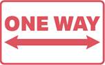
Figure 3.2. Signage — Effective. This sign clearly communicates what it wants.
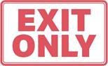
User expectations should be considered when making design choices. Be familiar with common design schemes, especially as they relate to the type of document you’re creating. For example, the color red, in the U.S., is associated with warnings or corrections in technical documents (figure 3.1). If you choose a red font just because you like the color, you might confuse users or in some cases offend them. Figure 3.2 uses a red font effectively to tell users what not to do.
Design at Work
The following scenario shows one example of how design is used in professional settings. Kenji works for Step-by-Step Advertising and PR. His client, Tavent Inc., wants to promote a new industry conference in India. Tavent has asked Kenji’s team to design a brochure in both digital and print formats to promote the new conference. The brochures need to be compelling and easy to understand. The layout needs to be organized and user-friendly.
Even the simplest trifold brochure requires the technical communicator to juggle multiple design elements. Kenji needs to make the information accessible and appealing through a combination of words and images.
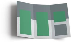
He needs to choose a layout to organize relevant information (figure 3.3). In this case, relevant information includes a description of the conference, the date, the schedule of events, registration details, and cost. People want to know when the new conference is happening, what it’s all about, and if it’s worth their time.
Figure 3.3. Brochure Template. This brochure template shows Kenji’s initial document design with areas in gray reserved for images and areas in green for text.
Thinking back to the relationship that design and readability share, Kenji’s team already has their purpose: to promote a new conference. And they know who the audience is: engineers. Knowing their purpose and audience helps the team identify the message or type of content needed: date, events, costs, etc. The team’s next step includes choosing a page layout and design elements that will invite and guide the user through the document.