Practical models for technical communication - Shannon Kelley 2021
Characteristics of effective job materials
Job materials
The principles of designing a user-centered document apply equally here as they do to all forms of technical communication. Presenting your information efficiently makes a positive impression on potential employers. Keep the following principles in mind to ensure your job materials give you the best chance at scoring an interview. Designing job materials is a practical way to put the following principles into practice.
Clarity
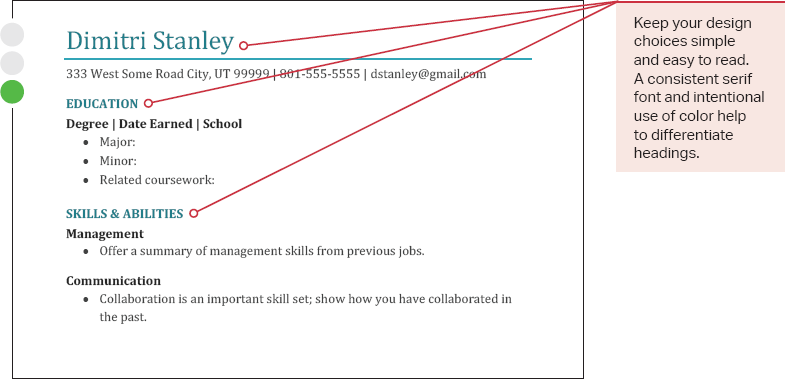
In the formatting of all job materials, clarity is king. You need to clearly display your credentials. Consistent formatting helps users find information efficiently (figure 6.10).
Figure 6.10. Alignment in Résumé Design. Use consistent alignment in résumés to create a clean, clear design.
Professional language does not need to show off. Keep it formal but accessible. Only use trade lingo or field-specific jargon if these terms are useful on job materials. The person doing the recruiting may not understand these terms. For instance, Connor spends time completing P&L reports for his current job. Most people in business understand that P&L stands for “profit and loss.” However, the person doing the initial scan of the materials may not be familiar with this term. The recruitment manager may be confused or annoyed rather than impressed.
Simplicity
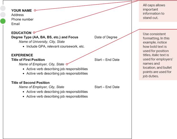
Clean-looking, standard fonts in one or two colors are preferable for most job materials (figure 6.11). Avoid pictures or images, and keep them to a minimum on web-based portfolios. Occasionally, applicants assume that elaborate page design will attract the attention of potential employers. We don’t recommend this strategy. Employers want to be impressed by the content of your materials, not overwhelmed by design features.
Figure 6.11. Simplicity in Résumé Design. Too many colors or fonts can distract from your résumé. Keep the design simple.
Employers typically see elaborate design as desperate, rather than creative. Stick to simple, familiar serif fonts that have a professional appearance, such as Times New Romans. The use of sans serif fonts, especially in headings and online résumés, is also acceptable. If you’re in doubt, research examples of job documents in your field. Not every job industry has the same standards or expectations when it comes to font choice, so do your homework.
Organization
Intentional organization helps others navigate your job materials quickly to find the information they need.
See Chapter 3 for more on using headings to chunk information.
Begin by thinking carefully about headings in your job materials. Use consistent and deliberate patterns with no more than three heading levels. These headings allow the user to scan the document easily. The content of your headings is equally important, so choose headings that draw attention to themes relevant to the position.
Heading preferences vary depending on the position. For example, if you’re preparing a résumé for a job at a nonprofit organization, it would be appropriate to list your previous volunteer work beneath a heading entitled “Volunteer Work.” In other jobs, listing volunteer work might be less relevant. Depending on the position, you might skip that heading and dedicate the space to a more appropriate category of experience like licensure.
Bullets and lists are valuable for sharing multiple related ideas that don’t require elaboration. Bulleted lists are easy to scan and useful for keeping the user’s eye moving down the page. As with all lists, use similar wording for the items that begin the list, and avoid a list longer than seven bullets.
White space groups related information together without fancy separators or text boxes. Be intentional with your use of white space. Effective white space has a few specific benefits:
” It keeps the user’s eye moving through the document in a logical pattern.
” It emphasizes the separation and organization of topics.
” It makes the document more attractive by improving visual balance.
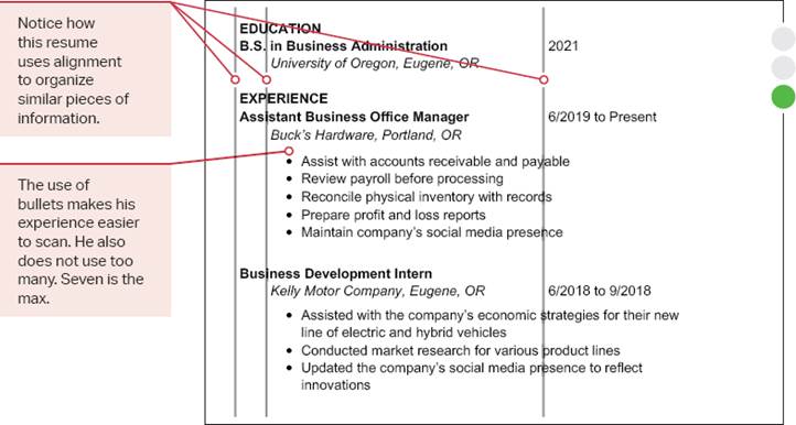
Alignment ensures that each element on the page lines up with other similar items on the page, such as dates and work locations. Don’t get too creative and make the user work to find the information. Give them a traditional layout that their eyes expect. The key is to use a consistent pattern of alignment so the user easily recognizes the different sections and locates information throughout the document. Notice how these organizational elements come to together in this model (figure 6.12).
Figure 6.12. Résumé Template. This sample résumé provides a pattern that you can use to organize your work experience.
Concision
Most résumés are a single page for a reason. Employers don’t have time to read your life story. Make sure your job materials include only what your audience needs to make an informed decision. Do not give them excessive or irrelevant information. Most importantly, avoid including personal data like your gender, race, age, or how many children you have. Employers should not ask for this information, and you should not volunteer it.
Most companies have policies in place to protect you from conscious or unconscious biases that may reduce your chances of getting an interview. But you can help. Leave off hobbies or clubs that don’t increase your qualifications for the job. Employers won’t be impressed by your knitting skills or Connor’s participation in a Dungeons and Dragons group. Anything unrelated to the job could be off-putting.