AMA Manual of Style - Stacy L. Christiansen, Cheryl Iverson 2020
Basic Elements of Design
Editing, Proofreading, Tagging, and Display
The rules of typography are centuries old, and although the technologies have changed, the goal has always remained the same: a beautiful setting in the service of a pleasant and fruitful reading experience.
James Felici5
Typography is broadly defined as the composed arrangement and appearance of text and other elements on a surface that involves elements of design. The editor and graphic designer often cooperate in the process of creating the typography and design for a book, monograph, or journal (print or digital), with the goal of achieving a balance of form and readability.
According to typographer Edmund Arnold, good design and typography for English-language publications should follow the linear flow of the Latin alphabet and support the act of reading.6 According to Arnold, when an individual reads in the English language (or others based on the Latin alphabet), the eyes first fall naturally to the top left corner and then move across and down the page, first from left to right and then in a right-to-left sweep to the next line, until reaching the bottom right corner. Any design or typographic element that forces the reader to work against this natural flow (reading gravity) interrupts the reading rhythm and should be avoided. Wheildon6 conducted a controlled study in which half of the participants read an article with a design that followed Arnold’s “reading gravity” principles and half read the same article but with a design that did not follow these principles. Rates of comprehension for those reading the article designed to comply with the principles of reading gravity were better (67% good, 19% fair, and 14% poor) than for those reading the same article when the principles of reading gravity were disregarded (32% good, 30% fair, and 38% poor).
Typography for reading on a computer or other digital medium should follow the basic principles of reading as described above. There are a number of shared design considerations (eg, consistency and size of typeface; use of boldface for emphasis, subheadings, or calling out citations to tables or figures in text; concerns about overly long or wide tables or figures). However, digital typography has additional attributes and concerns and must reflect standards that address a different set of reading, browsing, and searching habits. For example, a web page must work across different computer platforms, browsers, and screen sizes, and the publisher cannot control how the typographic elements (such as typeface, font, size, and color) appear on different users’ screens. The web is designed for interactivity and scrolling, so links and navigational buttons need to be clearly indicated.
This chapter focuses primarily on typography for the printed page and for Latin character sets. Resources for design and typography for the web are listed in the Additional Resources and General References at the end of the chapter. Whether print or digital, typography should follow standards, consistent hierarchy and display of elements, style rules, and style sheets.
Good design arranges text and objects in a manner that invites and leads the reader through the composed page or material and enhances legibility and comprehension.6,7 The basic elements of design that affect typography in print and digitally include the following:
■Contrast: This refers to the contrast between dark and light type and large and small units of information (such as title and byline, sideheads and subheads, and text). In addition, the evenness of darkness or blackness of letters and characters affects legibility; this evenness depends on the specific typeface used as well as spacing between letters, words, and lines (see 21.3, Spacing).7
■Rhythm: The rhythm of the design refers to repetition of similar units in both opposition and juxtaposition (eg, spacing and proportion of type to the page or screen and size of screen, eg, desktop or mobile) and other design elements and repetition of graphic contrasts or similarities.
■Size: The size of type and other elements affects legibility and the overall appearance of a composed page. The size relationships within the design refer to the optical images of the type and graphic elements and the relevant and proportional manners in which they appear on the page.
■Color: In this context, color has 2 meanings: (1) the darkness or density of the type (letters and characters) and the typeset page and (2) the use of contrasting nonblack colors, which attracts attention and creates associations.
■Movement and Focal Points: The elements of a page or screen should guide the reader’s eye along the lines of composition unconsciously, from large to small, from top to bottom, from left to right, and from dark to light, and should follow the gravity of reading.
In scholarly publishing, a number of typographic and design elements, such as prescribed text format, titles and headings, bylines, abstracts, tables, figures, lists, equations, block quotations, reference citations and lists, navigational elements, and internal and external links, must be considered and incorporated. Consistent use of typographic style within a specific work (eg, journal, book) enhances readability and is recommended for scholarly publications. This consistency often requires programmed style sheets based on standards for a specific publication.
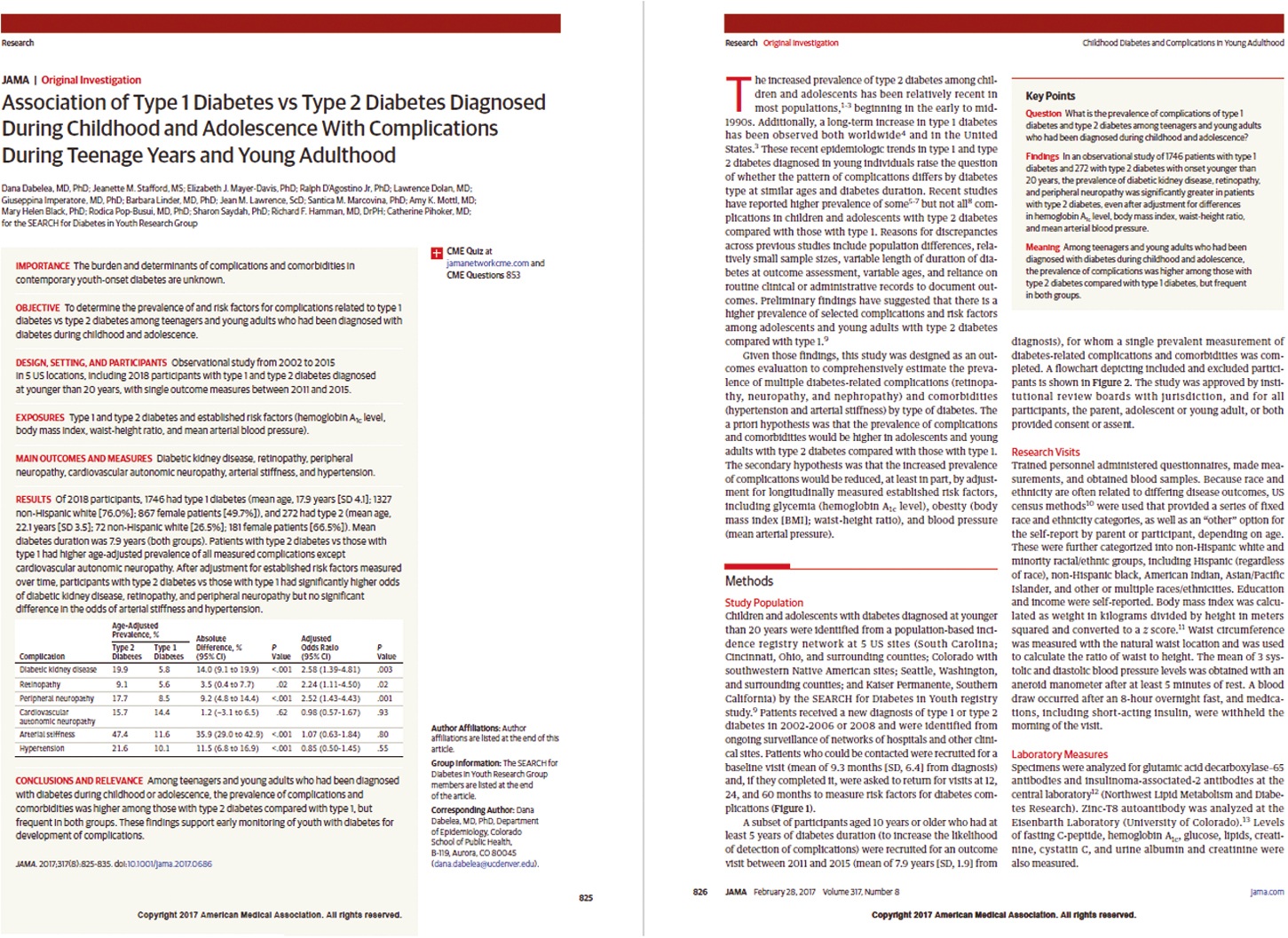
The examples of journal pages shown in Figure 21.6-1 include some of these typographic elements of design as they are used in the print and PDF versions of the JAMA Network journals.
Figure 21.6-1. Layout of Pages 1 to 2 of a JAMA Article